Quantcast
Channel: R-bloggers » Max Gordon
Viewing all 32 articles
Browse latest View live

Fast-track publishing using knitr: intro (part I)

$
0
0

(This article was first published on G-Forge » R, and kindly contributed to R-bloggers)
A beautiful old document. Probably state of the art in those days. The image is CC by storebukkebruse.

Fast-track publishing using knitr is a short series on how I use knitr to get my articles faster published. By fast-track publishing I mean eliminating as many of the obstacles as possible during the manuscript phase, and not the fast-track some journals offer. In this first introductory article I will try to (1) define the main groups of obstacles I have experienced motivating knitr, (2) options I’ve used for extracting knitted results into MS Word. The emphasis will be on general principles and what have worked for me.

Note: this introductory article contains no R-code. The next article in this series will show how to set-up a “MS Word-friendly” knitr markdown environment in RStudio and more (yes, there will be R-code).

Publishing obstacles

You (yes you) – in a stroke of brilliance, will realize that you want to re-categorize age into three groups instead of four… Keeping everything in knitr allows you to do this and more without even thinking twice.

Another common obstacle are your co-authors, these awesome people that unfortunately have a ton of useful input. Their input should in theory appear early in the process but are almost always late. A typical scenario is for instance that one of your co-authors realizes that you should exclude a few patients/observations, causing a chain-reaction in your document where you need to look through every table cell, every estimate and confidence interval, and every p-value. Having all these numbers auto-updating is therefore vital – a philosophy that is the foundation of knitr and its peers.

Once you’ve reached the phase of submitting your manuscript you will notice all the obstacles that the journal puts up. The main hint here is to look through the guidelines early on. If you’re uncertain what journal you’re submitting to, then start by reading the ICMJE preparing for submission guidelines that many follow. It is also good to follow either the CONSORT (RCT), PRISMA/QUORUM (meta-analysis), MOOSE (meta-analysis for observational studies), or STROBE (observational studies) statements. These guidelines are not journal specific, and following them makes switching journals simpler. Adhering to the statements will also make your article look more professional and reviewers will be faster in their response as they will be familiar with your document structure. When it comes to document demands, I’ve found a lot of journals to have two things in common: (1) Word-documents are always accepted (or at least PDF-converted), (2) as are TIFF/EPS(/JPEG) images. Adapting to Word format will make your life easier, while images are easily handled using knitr’s fig./dpi options.

The last and most important obstacle is reviewers’ input after submission – while often extensive (at least in my cases), addressing these will improve your article, and open the gates of publication. The worst part with these changes is that by the time you receive them you will have forgotten everything about your article. I cannot thank Yihui Xie and his predecessors/peers enough for making knitr that takes most of the pain out of the process. Knowing exactly where every number originates from, how you selected your final population etc. is gold when you try to go back into your masterpiece.

Options for getting text into Word

I have accepted the fact that my co-authors love Word and I therefore need to copy the text into a Word document as quickly as possible from markdown. There are a few options available that I’ve tried at one time or another, here’s the list and my experience with each and every one:

  • Copying HTML-document from a browser: This works actually OK with MS Word (ver. 2010) if you have the proper formatting. Unfortunately it seems to change the set font-size for paragraphs from 11 to 11.5 – an annoying feature that can cause unwanted effects. Libre Office (ver. 4.1.4), in turn, fails with basics such as retaining bold <strong>, paragraph margins etc.
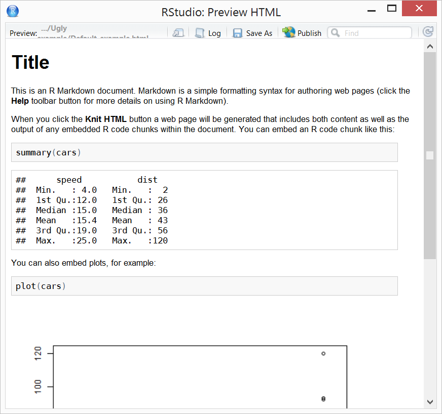
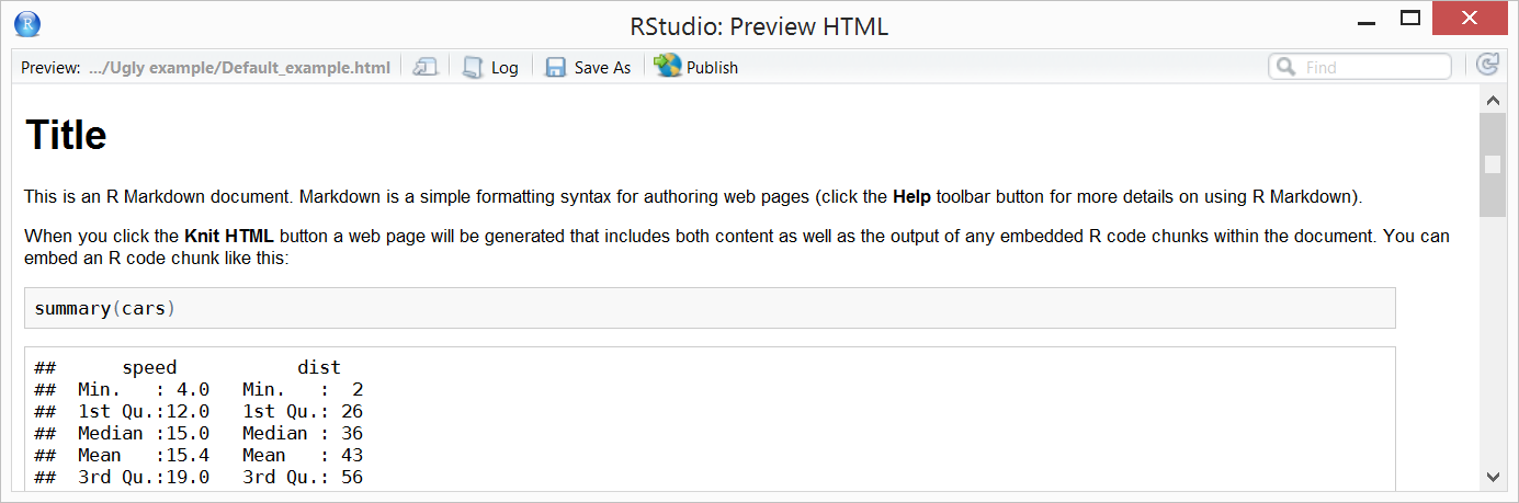
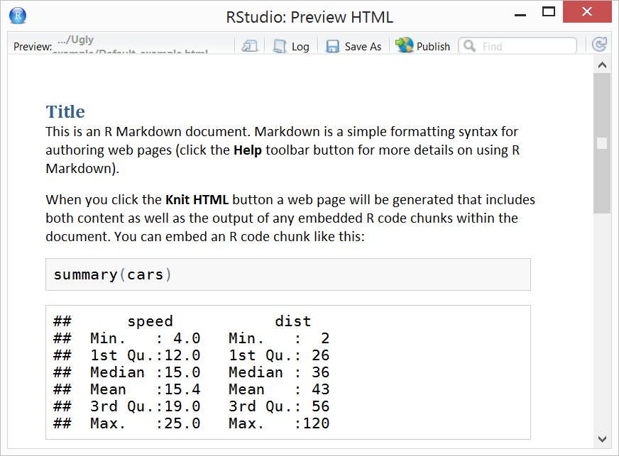
  • Opening an HTML-document in a word processor: This my current method of choice. The only caveat is that formatted tables are generally ruined by MS Word and I therefore strongly recommend going through Libre Office. Libre Office is free, open source, and could be my primary editor if it wasn’t for my co-authors extreme love of Word. My current workflow is Markdown > Libre Office > Word. It may seem like a strange way of doing it, but it is reliable and sufficient.
  • Using a markdown converter such as Pandoc: I have tried this once and it worked beautifully with the only exception that none of the HTML-tables worked. Markdown has its own limited table syntax, but since I find it insufficient I rely on HTML, and currently Pandoc does not support this when converting to Word. This is not that surprising as the layout options are endless for plain HTML-tables and building support for this is difficult. I hope that Pandoc in the future will support HTML-tables but until that time, it’s a deal breaker for me.
  • Using R2DOCX: This is an awesome alternative but as far as I’m aware of there is no available RStudio integration, the table layout is not as flexible as HTML, and it’s still early in its development cycle. If you need to generate reports using a specific Word template, and writing is minimal this can be a good choice.
  • Converting LaTeX-documents: I love LaTeX but converting it to Word is far from smooth. LaTeX is also bad at handling tables; it is great for text and formulas but the table solution is terrible – I’ve had countless documents fail to compile due to parts of a table being too wide.
  • Using Google Docs: I’ve tried both copy-pasting and opening the document directly in Google Docs with very poor results. The table layout is completely lost in process.

Summary

Using knitr will give you a better connection between the statistics and the actual manuscript, thereby: (1) allowing late changes, (2) reproducing your results on demand, and (3) easier porting to final publishing format. Furthermore, getting more advanced formatted knitr documents into MS Word can be challenging, although with a little help from Libre Office this is not that difficult.

In next few posts I will cover above and show how to, avoid dense, poorly formatted manuscripts, and to use the page/table layout to your advantage – reviewers should find your article visually appealing and easy to read. Even if the journal remakes everything prior to publications, the reviewers (and the editor) are the ones you need make happy to get published.

flattr this!

To leave a comment for the author, please follow the link and comment on his blog: G-Forge » R.

R-bloggers.com offers daily e-mail updates about R news and tutorials on topics such as: visualization (ggplot2, Boxplots, maps, animation), programming (RStudio, Sweave, LaTeX, SQL, Eclipse, git, hadoop, Web Scraping) statistics (regression, PCA, time series, trading) and more...

Fast-track publishing using knitr: the setup using .RProfile with custom CSS + some HTML goodies (part II)

$
0
0

(This article was first published on G-Forge » R, and kindly contributed to R-bloggers)
Flexing RStudio/knitr where you want can be a challenge. The image is CC by Ben Barnes.

Fast-track publishing using knitr is a short is a short series on how I use knitr to get my articles faster published. This is part II where I will show how you can tweak RStudio into producing seamless MS Word-integration by using the .RProfile together with CSS, a few basics about HTML that might be good to know, and lastly some special characters that can be useful. In the previous post, part I, I explained some of the more general concepts behind fast-track publishing and why I try to get my manuscript into MS Word instead of using LaTeX or other alternatives.

RStudio is in my opinion currently the best tool for using knitr. It allows code folding, navigating through chunks, direct knitr integration, spell checking, and is actively being developed. It is therefore a little odd that the default markdown document generated in knitr looks… terrible:

Default_example_w_default_width_scrdump

As you can see there are no margins, allowing no white space that would enhance the reading. As nicely put by Carrie Cousins:

“Don’t forget about the margins. Remember to leave some white space around the entire text frame, creating an almost invisible halo. This margin will help set text apart from other “noise,” easing the reader into the copy.”

This becomes even more difficult to read if we change the window width:

Default_example_w_wide_scrdump

The solution to this is to attach your own CSS file. RStudio has a basic help page that you can find here about changing the CSS. Important to remember is that changing the CSS-rendering must be done before knitting the document.

SIDE TIP

Inspired by LaTeX’ wide margins, I usually submit my manuscript with wide margins (2 inches/5.08 cm left and right) in order to keep the optimal character count between 65 and 75 characters per line. This helps reading the document and hinting how the paragraphs (more guidelines) will feel in the published article.

A RStudio/knitr .RProfile

The .RProfile is a document allowing you to execute code at startup. All you need to do is create a file called .RProfile in your home directory, If you are uncertain: then start RStudio (close any open project) and write getwd() = your home directory. The home directory is on OS X/Unix/Linux systems located at the “~/” directory, in Windows 8 this is the “Documents” or “My Documents” folder, Windows 7 it is your user folder (the one with your username).

My .RProfile has a few tweaks in it:

  • Use custom.css if exists: If there is a file at the same location as the knitr .Rmd document called custom.css it automatically switches to this alternative. As this runs at startup I don’t need to worry about running any code before knitting.
  • Skip embedded png: Libre Office can’t handle embedded png-images, it hangs as it tries to process them. You can still use embedded png-images by specifying: options(base64_images= "inline").
  • Fix headers: Libre Office “forgets” the margins for the headers object if they are specified in the CSS, I have therefore a crude gsub() fix for this, to skip it simply set the option options(LibreOffice_adapt= "skip").
?View Code RSPLUS
1
2
3
4
5
6
7
8
9
10
11
12
13
14
15
16
17
18
19
20
21
22
23
24
25
26
27
28
29
30
31
32
33
34
35
36
37
38
39
40
41
42
43
44
45
46
47
cat("\n ** Starting .RProfile **")
options(rstudio.markdownToHTML = 
  function(inputFile, outputFile) {      
    require(markdown)
    htmlOptions <- markdownHTMLOptions(defaults=TRUE)
    # LibreOffice hangs when the png is included in the html file
    # I have therefore this option where you actively 
    # have to choose inline if you want the png to be inline
    if (getOption("base64_images", "No") != "inline")
      htmlOptions <- htmlOptions[htmlOptions != "base64_images"]
 
    # Now in this section we skip writing to the outputfile
    # and keep the markdown text in the md_txt variable
    md_txt <- markdownToHTML(inputFile, options = htmlOptions,
                   stylesheet=ifelse(file.exists('custom.css'), 
                                     'custom.css',
                                     getOption("markdown.HTML.stylesheet")))
 
    if (getOption("LibreOffice_adapt", "Yes") == "skip"){
      writeLines(md_txt, con=outputFile)
    }else{
      # Annoyingly it seems that Libre Office currently 
      # 'forgets' the margin properties of the headers,
      # we therefore substitute these with a element specific
      # style option that works. Perhaps not that pretty but
      # it works and can be tweaked for most things.
      writeLines(
        gsub("<h([0-9]+)>", 
             "<h\\1 style='margin: 10pt 0pt 0pt 0pt;'>", 
             gsub("<h1>",
                  "<h1 style='margin: 24pt 0pt 0pt 0pt;'>",
                  md_txt)), 
        con=outputFile)
    }
  }
)
 
# I’ve  added some automated comments just as a reminder, remove
# the cat() if you want the .RProfile to be quiet (note, the output does
# not affect the knitr document)
cat("\n * If you want knitr markdown png-files to be inside the document",
    " then set the options(base64_images = 'inline') for it to work.")
cat("\n * If you don't want the Libre Office adaptations then set",
    " options(LibreOffice_adapt = 'skip')")
cat("\n * If you want knitr markdown to use a custom css then",
    " just input a 'custom.css' file in the Rmd file's directory.")
cat("\n ** End .RProfile **\n")

The custom.css file

CSS is extremely flexible although it is important to keep in mind that if you aim at Libre Office or MS Word import these are rather limited in their CSS abilities. I use the one below that is optimized to be as similar as possible to the Word template and imports nicely (copy the text into a file that you name custom.css):

Default_example_w_customcss_scrdump

1
2
3
4
5
6
7
8
9
10
11
12
13
14
15
16
17
18
19
20
21
22
23
24
25
26
27
28
29
30
31
32
33
34
35
36
37
38
39
40
41
42
43
44
45
46
47
48
49
50
51
52
53
54
55
56
57
58
59
60
61
62
63
64
65
66
67
68
69
70
71
72
73
74
75
76
77
78
79
80
81
82
83
84
85
86
87
88
89
90
91
92
93
94
95
96
97
98
99
100
101
102
103
104
105
106
107
108
109
110
111
112
113
114
115
116
117
118
119
120
121
122
123
124
125
126
127
128
129
130
131
132
133
134
135
136
137
138
139
140
141
142
143
144
145
146
147
148
149
150
151
152
153
154
155
156
157
158
159
160
161
162
163
164
165
166
167
168
169
170
171
172
173
174
175
176
177
178
179
180
181
182
183
184
185
186
187
/* Set the main font to Calibri, same 
   as My Word 2010 uses. Also set the 
   default font size to 11pt.
 
   The maximum width to 35em enhances 
   readability through optimal line 
   length. Note: this setting is ignored
   by Word/Libre Office*/
body  {
   font-family: Calibri;
   font-size: 11pt;
   background-color: white;
   padding-top: 1em;
   margin: auto;
   max-width: 35em;
}
 
/* Set the paragraph margin and 
   padding to 0 except for the bottom */
p {
  padding: 0;
  margin: 0;
  margin-bottom: 10pt;
}
 
/* Center the table and add top/bottom margins */
table{
  margin: auto;
  margin-top: 1em;
  margin-bottom: 1em;
  border: none;
}
 
/* The tr padding/margin 0 is important for table
   import, while the font needs to be specified as
   font and not font-family/font-size due to limiations
   in Libre Office */
td, tr{
  font: 10pt Arial;
  padding: 0px;
  margin: 0px;
}
 
/* The cell should have a little space to easy reading
   although this section is mostly ignored by the 
   Libre Office import */
td {
  padding: 4px;
  padding-bottom: 2px;
}
 
/* Set the headings to correspond to Word-style */
h1, h2, h3, h4, h5, h6 {
  margin: 10pt 0pt 0pt 0pt;
  font-family: Cambria;
  font-weight: bold;
}
 
/* h1 has a slightly larger top margins 
   so we re-set that from the other*/
h1 {
  margin: 24pt 0pt 0pt 0pt;
  font-size: 14pt;
  color: #365F91;
}
 
 
h2 {
  font-size: 13pt;
  color: #4F81BD;
}
 
h3 {
  font-size: 11pt;
  color: #4F81BD;
}
 
h4 {
  font-size: 11pt;
  font-weight: bold;
  font-style: italic;
  color: #4F81BD;
}
 
h5 {
  font-size: 11pt;
  font-weight: normal;
  color: #243F5D;
}
 
h6 {
  font-size: 11pt;
  font-weight: normal;
  font-style: italic;
  color: #243F5D;
}
 
/* The following sections are mostly 
   unrelated to Word/Libre Office imports */
tt, code, pre {
   font-family: 'DejaVu Sans Mono', 'Droid Sans Mono', 'Lucida Console', Consolas, Monaco, monospace;
}
 
a:visited {
   color: rgb(50%, 0%, 50%);
}
 
pre {  
   margin-top: 0;
   max-width: 95%;
   border: 1px solid #ccc;
   white-space: pre-wrap;
}
 
pre code {
   display: block; padding: 0.5em;
}
 
code.r, code.cpp {
   background-color: #F8F8F8;
}
 
blockquote {
   color:#666666;
   margin:0;
   padding-left: 1em;
   border-left: 0.5em #EEE solid;
}
 
hr {
   height: 0px;
   border-bottom: none;
   border-top-width: thin;
   border-top-style: dotted;
   border-top-color: #999999;
}
 
@media print {
   * {
      background: transparent !important;
      color: black !important;
      filter: none !important;
      -ms-filter: none !important;
   }
 
   body {
      font-size:11pt;
      max-width:100%;
   }
 
   a, a:visited {
      text-decoration: underline;
   }
 
   hr {
      visibility: hidden;
      page-break-before: always;
   }
 
   pre, blockquote {
      padding-right: 1em;
      page-break-inside: avoid;
   }
 
   tr, img {
      page-break-inside: avoid;
   }
 
   img {
      max-width: 100% !important;
   }
 
   @page {
      margin-top: 2cm;
      margin-bottom: 1.5cm;
      margin-left: 3cm;
      margin-right: 3cm;
   }
 
   p, h2, h3 {
      orphans: 3; widows: 3;
   }
 
   h2, h3 {
      page-break-after: avoid;
   }
}

If you want to generate your own custom CSS I suggest you start by tweaking the original CSS that you can find here. While I thought the heading colors were a little silly at the beginning I now like how they softly integrate into the text. Microsoft probably put top designers when generating the default style for Word and I think it is sensible to trust their judgment, their settings is probably a pretty safe starting point.

A few HTML basics

HTML (HyperText Markup Language) was developed in 80:s and has remained the main way to communicate documents on the web. Although it has been refined over the years the basic structure is mostly the same. The document markup consists of <start> </end> tags, where the text within <> contains the element type. The basic structure of the document is:

HTML doc structure

Everything is wrapped within the main document, the <html> corresponds to the grey area. Subelements to the <html> are the <head> and <body> elements. The <head> contains meta-data not shown in the document and the style sheet should be defined within this area. The <body> contains the actual text with all the paragraphs, tables, and images.

CSS and HTML

As you may have noticed the <body> element was also present in the CSS-elements above. CSS you can set the CSS properties of each <body> element, you can for instance see that the paragraph element, <p>, has the attributes:

1
2
3
4
p {
  padding: 0;
  margin: 0pt 0pt 10pt 0pt;
}

The above states that the padding should be 0 on all sides while the margin should be 10 points below. The 4-in-1 description of the different sides can be confusing although all you need to remember is TRouBLe (top, right, bottom, left). If you still feel a little queasy you can go with the specific parameter by expanding the above into:

1
2
3
4
5
p {
  padding: 0;
  margin: 0pt;
  margin-bottom: 10pt;
}

You can also find the headings <h1>, <h2>, <h3>, … (the number corresponds to the heading level), first with the common attributes:

1
2
3
4
5
h1, h2, h3, h4, h5, h6 {
  margin: 10pt 0pt 0pt 0pt;
  font-family: Cambria;
  font-weight: bold;
}

And then with specific attributes for each heading later on (although note that the margin setting is also overridden in the .RProfile due to the Libre Office incompatibility):

1
2
3
4
5
h1 {
  margin: 24pt 0pt 0pt 0pt;
  font-size: 14pt;
  color: #365F91;
}

Using this knowledge you should be able to tailor your document layout to your needs. Remember though that Word/Libre Office has not prioritized handling HTML and you may need to try some different alternatives before you get it to work.

Useful HTML-features

I’ve found that <sup> </sup> for superscript is very convenient although markdown has a shorthand for this ^ where you write 106 as 10^6. Perhaps more useful is subscipting <sub> </sub> with that currently doesn’t work as intended in default RStudio markdown (H~2~O does not translate into H2O while H<sub>2</sub>O does, note that the H~2~O works with Pandoc).

Special characters

Another thing that is very useful is special characters. Special characters basically any characters outside the English alphabet. Some very useful for tables are for instance the daggers and similar:

Code Glyph Description
&dagger; Dagger
&Dagger; Double dagger
&sect; § Section sign
&#8226; Bullet
&dot; &dot; Dot accent
&curren; ¤ General currency sign
&deg; ° Degree sign
&permil; Per mill sign (10-3)
&ap; &ap; Approximate sign
&plusm; ± Plus minus
Just enter the code and it should work, don’t forget the & and the ending ; without any intervening space

Well that’s it for this part, I hope you enjoyed it.

flattr this!

To leave a comment for the author, please follow the link and comment on his blog: G-Forge » R.

R-bloggers.com offers daily e-mail updates about R news and tutorials on topics such as: visualization (ggplot2, Boxplots, maps, animation), programming (RStudio, Sweave, LaTeX, SQL, Eclipse, git, hadoop, Web Scraping) statistics (regression, PCA, time series, trading) and more...

Fast-track publishing using knitr: exporting images for sharing and press (part III)

$
0
0

(This article was first published on G-Forge » R, and kindly contributed to R-bloggers)
Images can be a powerful medium if used right. The photo is CC by alemdag.
Images can be a powerful medium if used right. The image is CC by alemdag.

Fast-track publishing using knitr is a short series on how I use knitr to speedup publishing in my research. This is the third article in the series devoted to plots. Hopefully you will through this post have the need-to-know stuff so that you can (1) add auto-numbering to your figures, (2) decide on image formats, (3) choose image resolution, and (4) get anti-aliasing working.

Auto-numbering of figures

In knitr you use the chunks header to declare figure size, type, caption and more. Unfortunately the fig.cap does not work by default in markdown. There is a simple remedy for this by using knitr’s “hooks”:

?View Code RSPLUS
1
2
3
4
5
6
7
8
9
10
11
12
13
14
15
16
17
18
19
20
21
22
23
24
25
26
27
28
29
30
31
32
33
34
35
36
37
38
39
40
41
42
43
44
45
46
47
48
49
50
51
52
53
54
55
56
57
58
59
60
61
62
63
64
65
66
67
68
69
70
71
72
73
74
75
76
77
78
library(knitr)
 
# Notify that you want to use the counter,
# if you set the counter to 3 then it will use 
# that as starting number. You can also use strings
# if you for instance have a split figure with 
# a "1a" and "1b" setup
options(figure_counter = TRUE)
 
# If you want roman letters then set: 
# options(figure_counter_roman = TRUE)
 
# Evaluate the figure caption after the chunk, 
# sometimes you want to calculate stuff inside the
# chunk that you want to include in the caption and
# it is therefore useful to evaluate it afterwards.
opts_knit$set(eval.after='fig.cap')
 
# The actual hook
knit_hooks$set(plot = function(x, options) {
  fig_fn = paste0(opts_knit$get("base.url"), 
                  paste(x, collapse = "."))
 
  # Some stuff from the default definition
  fig.cap <- knitr:::.img.cap(options)
 
  # Style and additional options that should be included in the img tag
  style=c("display: block",
          sprintf("margin: %s;",
                   switch(options$fig.align, 
                          left = 'auto auto auto 0', 
                          center = 'auto',
                          right = 'auto 0 auto auto')))
  # Certain arguments may not belong in style, 
  # for instance the width and height are usually
  # outside if the do not have a unit specified
  addon_args = ""
 
  # This is perhaps a little overly complicated prepared 
  # with the loop but it allows for a more out.parameters if necessary
  if (any(grepl("^out.(height|width)", names(options)))){
      on <- names(options)[grep("^out.(height|width)", names(options))]
      for(out_name in on){
          dimName <- substr(out_name, 5, nchar(out_name))
          if (grepl("[0-9]+(em|px|%|pt|pc|in|cm|mm)", out_name))
              style=append(style, paste0(dimName, ": ", options[[out_name]]))
          else if (length(options$out.width) > 0)
              addon_args = paste0(addon_args, dimName, "='", options[[out_name]], "'")
      }
  }
 
  # Add counter if wanted
  fig_number_txt <- ""
  cntr <- getOption("figure_counter", FALSE)
  if (cntr != FALSE){
    if (is.logical(cntr))
      cntr <- 1
    # The figure_counter_str allows for custom 
    # figure text, you may for instance want it in
    # bold: <b>Figure %s:</b>
    # The %s is so that you have the option of setting the
    # counter manually to 1a, 1b, etc if needed
    fig_number_txt <- 
      sprintf(getOption("figure_counter_str", "Figure %s: "), 
              ifelse(getOption("figure_counter_roman", FALSE), 
                     as.character(as.roman(cntr)), as.character(cntr)))
 
    if (is.numeric(cntr))
      options(figure_counter = cntr + 1)
  }
 
  # Put it all together
  paste0("<figure><img src='", fig_fn, "'", 
         " ", addon_args,
         paste0(" style='", paste(style, collapse="; "), "'"),
         ">",
         "<figcaption>", fig_number_txt, fig.cap, "</figcaption></figure>")
})

That’s it, put this in your first knitr-chunk and all your images with a caption will have a figure counter. If you want to reference the number you can always call getOption("figure_counter") and you can insert the next images number into your text. If you want to use roman numbers just set options(figure_counter_roman=TRUE).

Image formats

When preparing your manuscript you will need images for two different purposes; small and portable for sharing, and images suited for press. Knitr allows you to quickly convert from one to the other by adjusting the fig.dev and dpi settings. As a general rule of thumb you want PNG for including images in your Word document and EPS for press. Below I’ll try to go into these formats and more.

Basics

There are two major image formats that you need to be aware of:

  • Vector formats: A vector image is a set of connections between points. These connections can generate lines or fills (polygons, shapes etc.), and are therefore well suited for plots. The major advantage with vector graphics is that you can scale it losslessly to any desired size.
    Common vector file formats: SVG (Scalable Vector Graphics), PDF (Portable Document Format), PS (PostScript), and EPS (Encapsulated PostScript) files. Out of these the EPS is most commonly supported by journals, I’ve had unfortunately trouble sharing (my favorite) SVG-files.
  • Raster formats: This is the dominating image type, useful for photos and similar applications but less suited for plots. Here you have a grid where each cell is a pixel with a set color and the size of the grid is the resolution. The major downside with raster images is that if you make them larger the squared pixel shape will become visible, i.e. you will have rough edges like in the old video games. This group can further be divided into lossy formats, such as JPEG, and lossless formats such as PNG. This simply indicates if the image compression looses information or retains every detail, it is not the same as the lossless resizing of vector formats.
    Common raster file formats: PNG (Portable Network Graphics), JPEG/JPG (Joint Photographic Expert Group), and TIFF (Tagged Image File Format).

Sharing images

Although SVG is my favorite format you can’t insert these into your Word document (at least my 2010 version). I therefore rely on the PNG format in 96 DPI for sharing. Telling knitr to use this for all your images in the document is really easy, just add this code before any plots (add it only once in your document):

?View Code RSPLUS
1
2
3
4
library(knitr)
opts_chunk$set(dev="png", 
               dev.args=list(type="cairo"),
               dpi=96)

If you browse you figure-folder (located in the same folder as your Rmd-document) you will find all the PNG images after knitting. An important detail is that you want to disable including these images in the HTML-document that knitr generates as Libre Office/Word can’t handle these, see my previous post on setting up an .RProfile.

Note: you can also set the fig.dev option for each chunk but since you usually want all images to be the same type then I prefer to use the opts_chunk option. For this to work smoothly even when I don’t knit the document I make sure to load the knitr-package to avoid any

Error: object 'opts_chunk' not found

.

Press

Vector graphics are excellent for publication and my preferred way of exporting for publication. Unfortunately few journals accept SVG and you are often stuck with the EPS format that is somewhat limited. Setting up EPS formatting is really easy, just change previous into:

?View Code RSPLUS
1
2
library(knitr)
opts_chunk$set(dev='postscript')

If you browse you figure-folder you should now see all the EPS images after knitting. The main problem I’ve had with EPS is that the format does not handle transparencies. For instance, you may have generated a beautiful X and using the PNG-format you get this:

x_mark

But when you open your EPS image in Inkscape the transparent polygon has suddenly been removed:

x_mark_trnsp_eps

If you remove the image transparency you can get a nice image but with less finesse:

x_mark_no_trnsp_eps

If you have transparencies and want to retain these, I recommend that you try the TIFF format when submitting to journals. They usually support it although make sure you compress the images using the compression="lzw" argument or your images may become huge, they can actually surpass the journal’s maximum image size.

?View Code RSPLUS
1
2
3
4
library(knitr)
opts_chunk$set(dev="tiff", 
               dev.args=list(compression="lzw"),
               dpi=300)
?View Code RSPLUS
1
2
3
4
5
6
7
8
9
10
11
12
13
# The code for the x-mark
library(ggplot2)
polygon_df1 <- data.frame(x=c(0,0.75,1,.25), y=c(0,1,1,0))
polygon_df2 <- data.frame(x=c(0,0.75,1,.25), y=c(1,0,0,1))
ggplot(polygon_df1, aes(x=x, y=y)) +
  geom_polygon(fill="steelblue", col="steelblue") +
  geom_polygon(data=polygon_df2, fill="#55558899", col="#55558899") +
  scale_x_continuous(expand = c(0,0)) + 
  scale_y_continuous(expand = c(0,0)) +
  xlab("") + ylab("") +   theme(line = element_blank(),
        text = element_blank(),
        line = element_blank(),
        title = element_blank())

Resolution (DPI)

For screen output use 96 or 120 DPI while for print you either use 300 or 600 DPI. DPI stands for Dots Per Inch and apply only to rasterized images. R combines the image width with the DPI and produces a corresponding graphic. While you may have specified a certain width the resulting image will have a certain number of pixels giving it its size, a low DPI will appear small since there are few pixels while a high DPI will result in a large image.

DPI come with a long history and it is important to remember that there is a difference between print and screen. Originally Macintosh (Apple) used 72 DPI, this was later on increased on Microsoft computers to 96.

I use the 96 DPI for screen resolution as it gives in my opinion images of roughly the size that I want. Paper/print on the other hand is always high-resolution and anything below 300 will appear as poor quality.

Anti-aliasing

Anti-aliasing is probably the simplest change you can add to your plots for a professional look. While all vector-images are automatically anti-aliased you need to add this to rasterized images using the option type="cairo". I have previously dedicated a whole post on how to deal with the Cairo and cairoDevice packages just to find out that these are obsolete in more recent R-versions. To get this into knitr all you need to add is a dev.args list that contains the type="cairo":

?View Code RSPLUS
1
2
3
opts_chunk$set(dev="png", 
               dev.args=list(type="cairo"),
               dpi=96)

Note that the antialias-argument seems to do nothing for the actual graphics, you can compare the three alternatives below:

not_anti_aliased anti_aliased_ct anti_aliased
dev.args = list(type=”windows”) dev.args = list(type=”windows”,
    antialias=”cleartype”)
dev.args = list(type=”cairo”)

It is a subtle difference but without it the plot looks unrefined, especially if you have a poor screen. Another thing that is good to know is that fills are not anti-aliased. You therefore need to add a thin line to your fills in the same color to get the desired anti-aliasing. Plain and lattice-plots both have the thin line by default while for ggplot2 you need to explicitly declare that you want the line, see how I use the col= and fill= arguments to generate the plots above.

?View Code RSPLUS
1
2
3
4
5
6
7
8
9
10
11
12
13
14
15
library(ggplot2)
line <- data.frame(x=c(0.25,1), y=c(1,.45))
polygon <- data.frame(x=c(0,0.75,1,0), y=c(.75,.20,.20,1))
aa <- ggplot(line, aes(x=x, y=y)) +
  geom_line(fill="steelblue", col="steelblue", lwd=2) +
  geom_polygon(data=polygon, fill="#555588", col="#555588") +
  scale_x_continuous(expand = c(0,0)) + 
  scale_y_continuous(expand = c(0,0)) +
  theme_bw() + 
  xlab("") + ylab("") + 
  theme(line = element_blank(),
        text = element_blank())
 
aa + annotate("text", label="Not\nanti-\naliased", 
           size=6, y=.93, x=.7)

Or compare these two plots:

Basic plots two images with and without line colors. Note that the one to the right is properly anti-aliased.

Previous post in this series

Fast-track publishing using knitr: table mania (part IV)

$
0
0

(This article was first published on G-Forge » R, and kindly contributed to R-bloggers)
Constructing tables is an art - maximizing readability and information can be challenging. The image is of the Turning Torso in Malmö and is CC by Alan Lam.
Constructing tables is an art – maximizing readability and information can be challenging. The image is of the Turning Torso in Malmö and is CC by Alan Lam.

Fast-track publishing using knitr is a short series on how I use knitr to speedup publishing in my research. While illustrations (previous post) are optional, tables are not, and this fourth article is therefore devoted to tables. Tables through knitr is probably one of the most powerful fast-track publishing tools, in this article I will show (1) how to quickly generate a descriptive table, (2) how to convert your regression model into a table, and (3) worth knowing about table design and anatomy.

Data set preparation

To make this post more concrete I will use the melanoma data set in the boot package. Below I factor the variables:

?View Code RSPLUS
1
2
3
4
5
6
7
8
9
10
11
12
13
14
15
16
17
18
19
20
21
22
23
library(boot)
 
# Set time to years instead of days
melanoma$time_years <- 
  melanoma$time / 365.25
 
# Factor the basic variables that 
# we're interested in
melanoma$status <- 
  factor(melanoma$status, 
         levels=c(2,1,3),
         labels=c("Alive", # Reference
                  "Melanoma death", 
                  "Non-melanoma death"))
melanoma$sex <- 
  factor(melanoma$sex,
         labels=c("Male", 
                  "Female"))
 
melanoma$ulcer <- 
  factor(melanoma$ulcer,
         labels=c("Present", 
                  "Absent"))

Descriptive tables

Generating descriptive tables containing simple means, medians, ranges, frequencies, etc. should be fast and efficient. Decide on what you want in your columns and then structure your data into sections; I try to use the following structure:

  • Basic stats: e.g. sex, age.
  • Article specific stats: e.g. hip function, degree of osteoarthritis, type of surgery.
  • Outcomes: e.g. number of re-operations, mobility, pain.

After deciding on the variables I often use the getDescriptionStatsBy function from my Gmisc-package to get the statistics into columns. I’ve found that you almost always have more than one column, thereby comparing different groups. In an RCT you want to compare the treatment groups, in a case-control study you want to compare the cases to the controls, and in an observational survival study you usually want to compare those that survived with those that died (as in this example). If you are uncertain what groups to compare in your Table 1, then just compare those with complete data to those with missing data.

The getDescriptionStatsBy function has several settings that you may want to use:

  • P-values: While some despise the use of p-values in tables, I believe they can be useful in some cases and my function can therefore fetch fisher.test or wilcox.test p-values depending on the variable type by simply specifying statistics=TRUE.
  • Total-column: Adding a total-column may sometimes be useful, e.g. if you have by alive/dead it is of interest to quickly get a total-column, while if you present your data by RCT-group then a total-column makes little sense.
  • Percentages for categorical variables: depending on the setting you may want your percentages to sum up horizontally or vertically, e.g. in an alive/dead setting it makes sense to sum up the columns horizontally using hrzl_prop=TRUE while an RCT is better to sum up vertically where you want to show how many cemented, uncemented, mixed hip replacements were in each treatment arm.

As the getDescriptionStatsBy has plenty of options, I usually use a wrapper function like this:

?View Code RSPLUS
1
2
3
4
5
6
7
8
9
10
11
12
13
14
15
16
17
18
19
20
21
22
23
# A function that takes the variable name,
# applies it to the melanoma dataset
# and then runs the results by the status variable
getT1Stat <- function(varname, digits=0){
  getDescriptionStatsBy(melanoma[, varname], 
                        melanoma$status, 
                        add_total_col=TRUE,
                        show_all_values=TRUE, 
                        hrzl_prop=TRUE,
                        statistics=FALSE, 
                        html=TRUE, 
                        digits=digits)
}
 
# Save everything in a list
# This simplifies the row grouping 
table_data <- list()
 
# Get the basic stats
table_data[["Sex"]] <- getT1Stat("sex")
table_data[["Age"]] <- getT1Stat("age")
table_data[["Ulceration"]] <- getT1Stat("ulcer")
table_data[["Thickness<sup>a</sup>"]] <- getT1Stat("thickness", 1)

There is of course a myriad of alternatives for generating descriptive data. My function is trying to resemble the format for Table 1 in major medical journals, such as NEJM and Lancet. You can easily tailor it to your needs, for instance if you want to use median instead of mean for continuous variables, you provide it a different continuous function:

?View Code RSPLUS
1
2
3
4
5
6
7
8
9
10
11
12
13
14
# A function that takes the variable name,
# applies it to the melanoma dataset
# and then runs the results by the status variable
getT1Stat <- function(varname, digits=0){
  getDescriptionStatsBy(melanoma[, varname], 
                        melanoma$status, 
                        add_total_col=TRUE,
                        show_all_values=TRUE, 
                        hrzl_prop=TRUE,
                        statistics=FALSE, 
                        html=TRUE, 
                        digits=digits,
                        continuous_fn=describeMedian)
}

Apart from my function I’ve recently discovered the power of the plyr-package that can help you generate most table/plot data. I strongly recommend having a closer look at the ddply function – it will save you valuable time.

After running the previous code I loop through the list to extract the variable matrix and the rgroup/n.rgroup variables that I then input to my htmlTable function:

?View Code RSPLUS
1
2
3
4
5
6
7
8
9
10
11
12
13
14
15
16
17
18
19
20
21
22
23
24
25
26
27
28
29
# Now merge everything into a matrix
# and create the rgroup & n.rgroup variabels
rgroup <- c()
n.rgroup <- c()
output_data <- NULL
for (varlabel in names(table_data)){
  output_data <- rbind(output_data, 
                       table_data[[varlabel]])
  rgroup <- c(rgroup, 
              varlabel)
  n.rgroup <- c(n.rgroup, 
                nrow(table_data[[varlabel]]))
}
 
 
# Add a column spanner for the death columns
cgroup <- c("", "Death")
n.cgroup <- c(2, 2)
colnames(output_data) <- gsub("[ ]*death", "", colnames(output_data))
 
htmlTable(output_data, align="rrrr",
          rgroup=rgroup, n.rgroup=n.rgroup, 
          rgroupCSSseparator="", 
          cgroup = cgroup,
          n.cgroup = n.cgroup,
          rowlabel="", 
          caption="Basic stats", 
          tfoot="<sup>a</sup> Also known as Breslow thickness", 
          ctable=TRUE)

Generating this beauty (the table is an image as the CSS for the site messes up the layout):

Table1

Regression tables

I recently did a post on my printCrudeAndAdjustedModel-function where I showed how to output your model into a table. My function allows you to get both unadjusted and adjusted estimates into a table, adds the references, and allows can automatically attach the descriptive statistics:

?View Code RSPLUS
1
2
3
4
5
6
7
8
9
10
11
# Setup needed for the rms coxph wrapper
ddist <- datadist(melanoma)
options(datadist = "ddist")
fit <- cph(Surv(melanoma$time, melanoma$status=="Melanoma death") ~
               sex + age + thickness + ulcer, data=melanoma)
 
printCrudeAndAdjustedModel(fit, desc_digits=0,
                           caption="Crude and adjusted estimates",
                           desc_column=TRUE,
                           add_references=TRUE, 
                           ctable=TRUE)

Gives this:

CrudeAndAdjusted

Now there are alternatives to my function. The texreg is an interesting package that is worth exploring and hopefully stargazer will eventually have an html/markdown option. A minor note concerning these later packages where outputs contain R2 and more; I have never seen models presented in medical literature in that way and if you need to adjust the output you loose the fast-track idea.

Table design and anatomy

Tables are generally good for comparing a few values, while plots are better when you want to show a trend consisting of multiple values. Although you should avoid using tables to show trends, you can still have large tables with lots of data. When presenting a lot of data, you need to think about the table navigation:

  • Order: always report variables in the same order, e.g. sex, age, ulceration… should be at a similar location in each table
  • Precision: avoid unnecessary decimals
  • Markup: use headers and spanners

The first one we have already touched upon. For the second one, I often rely on the sprintf function. While round may seem like a natural option you will often want to show all decimals that you find of interest. For instance:

?View Code RSPLUS
1
2
3
4
5
6
7
8
9
10
11
12
13
14
15
16
17
18
19
round(3.901, digits=2) # 3.9
round(3.901, digits=3) # 3.901
 
# The format function works better although
# you need to remember the nsmall option:
# "the minimum number of digits to the right of the decimal point"
format(3.901, digits=2) # 3.9
format(3.901, digits=2, nsmall=2) # 3.90
format(3.901, digits=3, nsmall=2) # 3.90
format(3.901, digits=4, nsmall=2) # 3.901
 
sprintf("%.2f", 3.901) # 3.90
sprintf("%.1f HR (95 %% CI %.1f to %.1f)", 
        exp(coef(fit)), 
        exp(confint(fit)[,1]), 
        exp(confint(fit)[,2]))
# "0.9 HR (95 % CI 0.6 to 1.4)" 
# "1.0 HR (95 % CI 1.0 to 1.0)"
# "1.0 HR (95 % CI 0.7 to 1.4)"

Also a p-value converter is nice to have; here is a simple function that I use:

?View Code RSPLUS
1
2
3
4
5
6
7
8
9
10
11
12
13
14
15
16
17
18
19
20
21
22
23
pvalue_formatter <- function(pvalues, sig.limit = 0.001){
  sapply(pvalues, function(x, sig.limit){
    if (x < sig.limit)
      return(sprintf("&lt; %s", format(sig.limit))) 
    # &lt; stands for < and is needed
    # for the markdown/html to work
    # and the format is needed to avoid trailing zeros
 
    # High p-values you usually want two decimals
    # otherwise report only one
    if (x > 0.01)
      return(format(x, digits=2))
 
    return(format(x, digits=1))
    }, sig.limit=sig.limit)
}
 
pv <- c(.133213, .0611233, .004233, .00000123123)
pvalue_formatter(pv)
# "0.13"
# "0.061"
# "0.004"
# "&lt; 0.001"

There are standard tools that you can us to help your readers to navigate the tables. I use stubs and column spanners as much as I can. A stub is a row header at the same column level as the actual rows, the rows differ by a small indentation of two white-spaces. This is an efficient way of grouping variables without making the table wider, while at the same time adding some white space around the numbers that help navigating. Similarly to stubs you can have column spanners that group columns. In my htmlTable these are called rgroup and cgroup arguments. They need to have the n.rgroup/n.cgroup in order to let the function know how many rows/columns each group should contain, see below example:

?View Code RSPLUS
1
2
3
4
5
6
7
8
9
10
11
12
13
14
15
16
17
col <- sprintf("Cell %d:%%d", 1:9)
vars <- sapply(1:3, function(i) sprintf(col, i))
 
rownames(vars) <- sprintf("Row no. %d", 1:nrow(vars))
colnames(vars) <- sprintf("Column<br />no. %d", 1:3)
cgroup <- c("", "Column spanner")
n.cgroup <- c(1, 2)
rgroup <- c("Stub I", "", "Stub II")
n.rgroup <- c(2, 3, nrow(vars) - 2 - 3)
htmlTable(vars, 
          rowlabel="Row label", 
          cgroup=cgroup, n.cgroup=n.cgroup, 
          rgroup=rgroup, n.rgroup = n.rgroup, 
          rgroupCSSstyle="", rgroupCSSseparator="", 
          caption="Basic table<sup>&dagger;</sup> anatomy", 
          tfoot="<sup>&dagger;</sup> Put your explanations in the table footer",
          ctable=TRUE)

htmlTable anatomy

An alternative to using stubs is using row headers. The difference is that headers are located in a separate column, thus making the table wider. A benefit is that you can have infinite levels row group headers. Below is an example with two header levels using the xtable function:

?View Code RSPLUS
1
2
3
4
5
6
7
8
9
10
11
12
13
14
15
16
17
18
library(xtable)
alt_vars <- cbind(
  Rowgrp1 = c("Mjr group 1", "", "", 
              "Mjr group 2", "", "", "", "", ""),
  Rowgrp2 = c("Group 1", "", "", 
              "Group 2", "", 
              "Group 3", "", "", ""),
  Rownames= rownames(vars), 
  vars)
colnames(alt_vars) <- gsub("<br />", "\n", colnames(alt_vars))
# rownames(vars) <- NULL
options(xtable.html.table.attributes = 
          list(style=sprintf("style='%s'",
                             paste("border:0",
                                   "border-top: 1px solid grey", 
                                   "border-bottom: 1px solid grey",
                                   sep="; "))))
print(xtable(alt_vars, caption="An xtable example"), type="html", include.rownames = FALSE)

xtable anatomy

I hope you found this useful. In the next post I’ll have a summary with an example for those of you new to knitr.

Previous post in this series

Fast-track publishing using knitr: stitching it together (part V)

$
0
0

(This article was first published on G-Forge » R, and kindly contributed to R-bloggers)
Putting all the pieces together can be challenging both for surgeons and researchers. The image is CC by Zac Peckler

Fast-track publishing using knitr is a short series on how I use knitr to speedup publishing in my research. There has been plenty of feedback and interest for the series, and in this post I would like to provide (1) a brief summary and (2) an example showing how to put all the pieces together.

The series contains out of five posts:

  • First post – an intro motivating knitr in writing your manuscript and a comparison of knitr to Word options.
  • Second post – setting up a .RProfile and using a custom.css file.
  • Third post – getting your plots the way you want.
  • Fourth post – generating tables.
  • Fifth post – summary and example (current post).

Summary

The main idea of fast-track publishing is taking the reproducible research approach one step further by looking how we can combine the ideas of reproducible research with good layout, handling images, table generation, and MS Word-integration. The aim of each is:

  • Layout: if you stick to good layout practices your co-authors and reviewers will most likely have a faster response time.
  • Images: submitting and sharing images should be a no-brainer.
  • Tables: tables contain a lot of information and a lot of layout, having a good-looking standard solution saves you time.
  • MS Word integration: tracking changes and adding comments directly is vital when working on your manuscript. I dream of being able to share my knitr Rmd-files with my co-authors, unfortunately sharing a raw document with code is not an option.

My current way of doing this is by using knitr markdown with a custom.css together with some functions from my Gmisc-package. As some have suggested, interesting alternatives are Pandoc and R2DOCX, although I’ve found tables to be less flexible with those.

Lastly, I currently do not recommend writing your full document in knitr; focus on the data-specifics such as parts of the methods sections and the results section. You will otherwise spend too much time manually changing references and there is currently no simple way to get the rich bibliography types that Zotero, Endnote, and Mendeley provide.

Fast-track example

A knitr document mixes four different elements: plain text, code, tables, and figures. This is why it is called weaving/knitting a document. Below you can see the general idea of the document structure:

Knitr-document structure

To separate code from text, knitr markdown uses chunks; ```{r} indices start of a chunk while ``` indicates the end. To work nicely with RStudio you also need to remember to save your file with a .Rmd file ending, otherwise RStudio doesn’t know that it is a knitr markdown document.

The actual example (sorry, couldn’t get the syntax highlighting to work):

1
2
3
4
5
6
7
8
9
10
11
12
13
14
15
16
17
18
19
20
21
22
23
24
25
26
27
28
29
30
31
32
33
34
35
36
37
38
39
40
41
42
43
44
45
46
47
48
49
50
51
52
53
54
55
56
57
58
59
60
61
62
63
64
65
66
67
68
69
70
71
72
73
74
75
76
77
78
79
80
81
82
83
84
85
86
87
88
89
90
91
92
93
94
95
96
97
98
99
100
101
102
103
104
105
106
107
108
109
110
111
112
113
114
115
116
117
118
119
120
121
122
123
124
125
126
127
128
129
130
131
132
133
134
135
136
137
138
139
140
141
142
143
144
145
146
147
148
149
150
151
152
153
154
155
156
157
158
159
160
161
162
163
164
165
166
167
168
```{r Data_prep, echo=FALSE, message=FALSE, warning=FALSE}
# Moved this outside the document for easy of reading
# I often have those sections in here
source("Setup_and_munge.R")
```
 
```{r Versions}
info <- sessionInfo()
r_ver <- paste(info$R.version$major, info$R.version$minor, sep=".")
```
 
All analyses were performed using R (ver. `r r_ver`)[R Core Team, 2013] 
and packages rms (ver. `r info$otherPkgs$rms$Version`) [F. Harrell, 2014] 
for analysis, Gmisc for plot and table output (ver. `r info$otherPkgs$Gmisc$Version`), 
and knitr (ver `r info$otherPkgs$knitr$Version`) [Xie, 2013] for reproducible research.
 
Results
=======
 
We found `r nrow(melanoma)` patients with malignant melanoma between the years 
`r paste(range(melanoma$year), collapse=" and ")`. Patients were followed until 
the end of 1977, the median follow-up time was `r sprintf("%.1f", median(melanoma$time_years))` 
years (range `r paste(sprintf("%.1f", range(melanoma$time_years)), collapse=" to ")` years). 
Males were more common than females and had also a higher mortality rate.
 
```{r Table1, results='asis', cache=FALSE}
table_data <- list()
getT1Stat <- function(varname, digits=0){
  getDescriptionStatsBy(melanoma[, varname], melanoma$status, 
                        add_total_col=TRUE,
                        show_all_values=TRUE, 
                        hrzl_prop=TRUE,
                        statistics=FALSE, 
                        html=TRUE, 
                        digits=digits)
}
 
# Get the basic stats
table_data[["Sex"]] <- getT1Stat("sex")
table_data[["Age<sup>&dagger;</sup>"]] <- getT1Stat("age")
table_data[["Ulceration"]] <- getT1Stat("ulcer")
table_data[["Thickness<sup>&Dagger;</sup>"]] <- getT1Stat("thickness", digits=1)
 
# Now merge everything into a matrix
# and create the rgroup & n.rgroup variabels
rgroup <- c()
n.rgroup <- c()
output_data <- NULL
for (varlabel in names(table_data)){
  output_data <- rbind(output_data, table_data[[varlabel]])
  rgroup <- c(rgroup, varlabel)
  n.rgroup <- c(n.rgroup, nrow(table_data[[varlabel]]))
}
 
# Add a column spanner for the death columns
cgroup <- c("", "Death")
n.cgroup <- c(2, 2)
colnames(output_data) <- gsub("[ ]*death", "", colnames(output_data))
 
htmlTable(output_data, align="rrrr",
          rgroup=rgroup, n.rgroup=n.rgroup, 
          rgroupCSSseparator="", 
          cgroup = cgroup,
          n.cgroup = n.cgroup,
          rowlabel="", 
          caption="Baseline characteristics", 
          tfoot=paste0("<sup>&dagger;</sup> Age at the time of surgery.",
                       " <br/><sup>&Dagger;</sup> Tumour thicknes,",
                       " also known as Breslow thickness, measured in mm."), 
          ctable=TRUE)
```
 
Main results
------------
 
```{r C_and_A, results='asis'}
# Setup needed for the rms coxph wrapper
ddist <- datadist(melanoma)
options(datadist = "ddist")
 
# Do the cox regression model 
# for melanoma specific death
msurv <- Surv(melanoma$time_years, melanoma$status=="Melanoma death")
fit <- cph(msurv ~ sex + age + ulcer + thickness, data=melanoma)
 
# Print the model
printCrudeAndAdjustedModel(fit, desc_digits=0,
                           caption="Adjusted and unadjusted estimates for melanoma specific death.",
                           desc_column=TRUE,
                           add_references=TRUE, 
                           ctable=TRUE)
 
pvalues <- 
  1 - pchisq(coef(fit)^2/diag(vcov(fit)), df=1)
```
 
```{r}
pvalue_formatter <- function(pvalues, sig.limit = 0.001){
  sapply(pvalues, function(x, sig.limit){
    if (x < sig.limit)
      return(sprintf("&lt; %s", format(sig.limit))) 
    # &lt; stands for < and is needed
    # for the markdown/html to work
    # and the format is needed to avoid trailing zeros
 
    # High p-values you usually want two decimals
    # otherwise report only one
    if (x > 0.01)
      return(format(x, digits=2))
 
    return(format(x, digits=1))
    }, sig.limit=sig.limit)
}
```
 
After adjusting for the three variables, age, sex, tumor thickness 
and ulceration, only the latter two remained significant (p-value 
`r pvalue_formatter(pvalues["ulcer=Present"])` and 
`r pvalue_formatter(pvalues["thickness"])`), 
see table `r as.numeric(options("table_counter"))-1` 
and figure `r getNextFigureNo()`.
 
```{r Regression_forestplot, fig.height=3, fig.width=5, fig.cap="A foresplot comparing the regression coefficients."}
# I've adjusted the coefficient for age to be by 
forestplotRegrObj(update(fit, .~.-age+I(age/10)), 
                  order.regexps=c("Female", "age", "ulc", "thi"),
                  box.default.size=.25, xlog=TRUE,
                  new_page=TRUE, clip=c(.5, 6), rowname.fn=function(x){
  if (grepl("Female", x))
    return("Female")
 
  if (grepl("Present", x))
    return("Ulceration")
 
  if (grepl("age", x))
    return("Age/10 years")
 
  return(capitalize(x))
})
```
 
There was no strong indication for non-linearity for any of the 
continuous variables although the impact of thickness did 
seem to lessen above 4 mm, see figure `r getNextFigureNo()`.
 
```{r spline_plot, fig.cap=plotHR_cap}
plotHR_cap = paste0("The adjusted and unadjusted restricted cubic spline",
                    " for tumor thickness. Solid line and confidence interval",
                    " indicate the adjusted line while the dashed is",
                    " the unadjusted line. The grey area at ",
                    " the bottom indicates the density.")
# Generate adjusted and anuadjusted regression models
rcs_fit <- update(fit, .~.-thickness+rcs(thickness, 3))
rcs_fit_ua <- update(fit, .~+rcs(thickness, 3))
 
# Make sure the axes stay at the exact intended points
par(xaxs="i", yaxs="i")
plotHR(list(rcs_fit, rcs_fit_ua), col.dens="#00000033",
       lty.term=c(1, 2),
       col.term=c("blue", "#444444"), 
       col.se = c("#0000FF44", "grey"),
       polygon_ci=c(TRUE, FALSE),
       term="thickness", 
       xlab="Thickness (mm)", 
       ylim=c(.1, 4), xlim=c(min(melanoma$thickness), 4), 
       plot.bty="l", y.ticks=c(.1, .25, .5, 1, 2, 4))
legend(x=.1, y=1.1, legend=c("Adjusted", "Unadjusted"), fill=c("blue", "grey"), bty="n")
```

The external code for the first chunk:

?View Code RSPLUS
1
2
3
4
5
6
7
8
9
10
11
12
13
14
15
16
17
18
19
20
21
22
23
24
25
26
27
28
29
30
31
32
33
34
35
36
37
38
39
40
41
42
43
44
45
46
47
48
49
50
51
52
53
54
55
56
57
58
59
60
61
62
63
64
65
66
67
68
69
70
71
72
73
74
75
76
77
78
79
80
81
82
83
84
85
86
87
88
89
90
91
92
93
94
95
96
97
98
99
100
101
102
103
104
105
106
107
108
109
110
111
112
113
114
115
116
117
118
119
120
121
122
123
124
125
126
127
128
129
130
131
132
133
134
135
136
137
138
139
140
141
##################
# Knitr settings #
##################
 
# Load the knitr package so that the code
# doesn't complain outside knitr
library(knitr) 
 
# Set some basic options. You usually do not
# want your code, messages, warnings etc
# to show in your actual manuscript
opts_chunk$set(warning=FALSE, 
               message=FALSE, 
               echo=FALSE, 
               dpi=96,
               fig.width=4, fig.height=4, # Default figure widths
               dev="png", dev.args=list(type="cairo"), # The png device
               # Change to dev="postscript" if you want the EPS-files
               # for submitting. Also remove the dev.args() as the postscript
               # doesn't accept the type="cairo" argument.
               error=FALSE)
 
# Evaluate the figure caption after the plot
opts_knit$set(eval.after='fig.cap')
 
# Avoid including base64_images - this only 
# works with the .RProfile setup
options(base64_images = "none")
 
# Use the table counter that the htmlTable() provides
options(table_counter = TRUE)
 
# Use the figure counter that we declare below
options(figure_counter = TRUE)
# Use roman letters (I, II, III, etc) for figures
options(figure_counter_roman = TRUE)
 
# Adding the figure number is a little tricky when the format is roman
getNextFigureNo <- function() as.character(as.roman(as.numeric(options("figure_counter"))))
 
# Add a figure counter function
knit_hooks$set(plot = function(x, options) {
  fig_fn = paste0(opts_knit$get("base.url"), 
                  paste(x, collapse = "."))
 
  # Some stuff from the default definition
  fig.cap <- knitr:::.img.cap(options)
 
  # Style and additional options that should be included in the img tag
  style=c("display: block",
          sprintf("margin: %s;",
                   switch(options$fig.align, 
                          left = 'auto auto auto 0', 
                          center = 'auto',
                          right = 'auto 0 auto auto')))
  # Certain arguments may not belong in style, 
  # for instance the width and height are usually
  # outside if the do not have a unit specified
  addon_args = ""
 
  # This is perhaps a little overly complicated prepared 
  # with the loop but it allows for a more out.parameters if necessary
  if (any(grepl("^out.(height|width)", names(options)))){
      on <- names(options)[grep("^out.(height|width)", names(options))]
      for(out_name in on){
          dimName <- substr(out_name, 5, nchar(out_name))
          if (grepl("[0-9]+(em|px|%|pt|pc|in|cm|mm)", out_name))
              style=append(style, paste0(dimName, ": ", options[[out_name]]))
          else if (length(options$out.width) > 0)
              addon_args = paste0(addon_args, dimName, "='", options[[out_name]], "'")
      }
  }
 
  # Add counter if wanted
  fig_number_txt <- ""
  cntr <- getOption("figure_counter", FALSE)
  if (cntr != FALSE){
    if (is.logical(cntr))
      cntr <- 1
    # The figure_counter_str allows for custom 
    # figure text, you may for instance want it in
    # bold: <b>Figure %s:</b>
    # The %s is so that you have the option of setting the
    # counter manually to 1a, 1b, etc if needed
    fig_number_txt <- 
      sprintf(getOption("figure_counter_str", "Figure %s: "), 
              ifelse(getOption("figure_counter_roman", FALSE), 
                     as.character(as.roman(cntr)), as.character(cntr)))
 
    if (is.numeric(cntr))
      options(figure_counter = cntr + 1)
  }
 
  # Put it all together
  paste0("<figure><img src='", fig_fn, "'", 
         " ", addon_args,
         paste0(" style='", paste(style, collapse="; "), "'"),
         ">",
         "<figcaption>", fig_number_txt, fig.cap, "</figcaption></figure>")
})
 
#################
# Load_packages #
#################
library(rms) # I use the cox regression from this package
library(boot) # The melanoma data set is used in this exampe
library(Gmisc) # Stuff I find convenient
 
##################
# Munge the data #
##################
 
# Here we go through and setup the variables so that
# they are in the proper format for the actual output
 
# Load the dataset - usually you would use read.csv
# or something similar
data("melanoma")
 
# Set time to years instead of days
melanoma$time_years <- 
  melanoma$time / 365.25
 
# Factor the basic variables that 
# we're interested in
melanoma$status <- 
  factor(melanoma$status, 
         levels=c(2, 1, 3),
         labels=c("Alive", # Reference
                  "Melanoma death", 
                  "Non-melanoma death"))
melanoma$sex <- 
  factor(melanoma$sex,
         labels=c("Male", # Reference
                  "Female"))
 
melanoma$ulcer <- 
  factor(melanoma$ulcer,
         levels=0:1,
         labels=c("Absent", # Reference
                  "Present"))

Together with the previous custom.css and .Rprofile generate this:

Example_document

You can find all the files that you need at the FTP-github page.

I hope you enjoyed the series and that you’ve find it useful. I wish that we would one day have a Word-alternative with track-changes, comments, version-handling etc that would allow true FTP, but until then this is my best alternative. Perhaps the talented people at RStudio can come up with something that fills this void?

flattr this!

To leave a comment for the author, please follow the link and comment on his blog: G-Forge » R.

R-bloggers.com offers daily e-mail updates about R news and tutorials on topics such as: visualization (ggplot2, Boxplots, maps, animation), programming (RStudio, Sweave, LaTeX, SQL, Eclipse, git, hadoop, Web Scraping) statistics (regression, PCA, time series, trading) and more...

Pimping your forest plot

$
0
0

(This article was first published on G-Forge » R, and kindly contributed to R-bloggers)
A forest plot using different markers for the two groups

In order to celebrate my Gmisc-package being on CRAN I decided to pimp up the forestplot2 function. I had a post on this subject and one of the suggestions I got from the comments was the ability to change the default box marker to something else. This idea had been in my mind for a while and I therefore put it into practice.

Forest plots (sometimes concatenated into forestplot) date back at least to the wild ’70s. They are an excellent tool to display lots of estimates and confidence intervals. Traditionally they’ve been used in meta-analyses although I think the use is spreading and I’ve used them a lot in my own research.

For convenience I’ll use the same setup in the demo as in the previous post:

?View Code RSPLUS
1
2
3
4
5
6
7
8
9
10
11
12
13
14
15
16
17
18
19
20
21
22
23
24
25
26
library(Gmisc)
Sweden <- 
  structure(
            c(0.0408855062954068, -0.0551574080806885,
              -0.0383305964199184, -0.0924757229652802, 
              0.0348395599810297, -0.0650808763059716, 
              -0.0472794647337126, -0.120200006386798, 
              0.046931452609784, -0.0452339398554054, 
              -0.0293817281061242, -0.0647514395437626), 
            .Dim = c(4L, 3L), 
            .Dimnames = list(c("Males vs Female", "85 vs 65 years", 
                              "Charlsons Medium vs Low", "Charlsons High vs Low"), 
                             c("coef", "lower", "upper")))
 
Denmark <- 
  structure(
            c(0.0346284183072541, -0.0368279085760325,
              -0.0433553672510346, -0.0685734649940999, 
              0.00349437418972517, -0.0833673052667752, 
              -0.0903366633240568, -0.280756832078775, 
              0.065762462424783, 0.00971148811471034, 
              0.00362592882198759, 0.143609902090575),
            .Dim = c(4L, 3L), 
            .Dimnames = list(c("Males vs Female", "85 vs 65 years", 
                               "Charlsons Medium vs Low", "Charlsons High vs Low"), 
                             c("coef", "lower", "upper")))

Here is the basic multi-line forest plot:

?View Code RSPLUS
1
2
3
4
5
6
7
8
9
10
11
12
13
14
15
16
forestplot2(mean=cbind(Sweden[,"coef"], Denmark[,"coef"]), 
            lower=cbind(Sweden[,"lower"], Denmark[,"lower"]), 
            upper=cbind(Sweden[,"upper"], Denmark[,"upper"]), 
            labeltext=rownames(Sweden),
            legend=c("Sweden", "Denmark"), 
            # Added the clip argument as some of 
            # the Danish CI are way out therer
            clip=c(-.2, .2), 
            # Getting the ticks auto-generate is 
            # a nightmare - it is usually better to 
            # specify them on your own
            xticks=c(-.2, -.1, .0, .1, .2),
            boxsize=0.3,
            col=fpColors(box=c("blue", "darkred")),
            xlab="EQ-5D index",
            new_page=TRUE)

Basic_plot

The package comes with the following functions for drawing each confidence interval:

  • fpDrawNormalCI – the regular box confidence interval
  • fpDrawCircleCI – draws a circle instead of a box
  • fpDrawDiamondCI – draws a diamond instead of a box
  • fpDrawPointCI – draws a point instead of a box
  • fpDrawSummaryCI – draws a summary diamond

Below you can find the all four alternatives:

?View Code RSPLUS
1
2
3
4
5
6
7
8
9
10
11
12
13
14
15
16
17
18
forestplot2(mean=cbind(Sweden[,"coef"], Denmark[,"coef"]), 
            lower=cbind(Sweden[,"lower"], Denmark[,"lower"]), 
            upper=cbind(Sweden[,"upper"], Denmark[,"upper"]), 
            labeltext=rownames(Sweden),
            legend=c("Sweden", "Denmark"), 
            clip=c(-.2, .2), 
            xticks=c(-.2, -.1, .0, .1, .2),
            boxsize=0.3,
            col=fpColors(box=c("blue", "darkred")),
            # Set the different functions
            confintNormalFn=
              list(fpDrawNormalCI, 
                   fpDrawCircleCI, 
                   fpDrawDiamondCI, 
                   fpDrawPointCI),
            pch=13,
            xlab="EQ-5D index",
            new_page=TRUE)

All_points

The confintNormalFn accepts either a single function, a list of functions, a function name, or a vector/matrix of names. If the list is one-leveled or you have a vector in a multi-line situation it will try to identify if the length matches row or column. The function tries to rewrite to match your the dimension of your multi-line plot, hence you can write:

?View Code RSPLUS
1
2
3
4
5
6
7
8
9
10
11
12
13
14
15
16
17
18
# Changes all to diamonds
confintNormalFn="fpDrawDiamondCI"
 
# The Danish estimates will appear as a circle while 
# Swedes will be as a diamond
confintNormalFn=list(fpDrawDiamondCI, fpDrawCircleCI)
 
# Changes first and third row to diamond + circle
confintNormalFn=list(list(fpDrawDiamondCI, fpDrawCircleCI),
                     list(fpDrawNormalCI, fpDrawNormalCI),
                     list(fpDrawDiamondCI, fpDrawCircleCI),
                     list(fpDrawNormalCI, fpDrawNormalCI))
 
# The same as above but as a matrix diamond + circle
confintNormalFn=rbind(c("fpDrawDiamondCI", "fpDrawCircleCI"),
                      c("fpDrawNormalCI", "fpDrawNormalCI"),
                      c("fpDrawDiamondCI", "fpDrawCircleCI"),
                      c("fpDrawNormalCI", "fpDrawNormalCI"))

If you use the same number of lines as the lines the legend will automatically use your custom markers although you can always just use the legendMarkerFn argument:

?View Code RSPLUS
1
2
3
4
5
6
7
8
9
10
11
12
13
14
15
16
forestplot2(mean=cbind(Sweden[,"coef"], Denmark[,"coef"]), 
            lower=cbind(Sweden[,"lower"], Denmark[,"lower"]), 
            upper=cbind(Sweden[,"upper"], Denmark[,"upper"]), 
            labeltext=rownames(Sweden),
            legend=c("Sweden", "Denmark"), 
            legend.pos=list(x=0.8,y=.4),
            legend.gp = gpar(col="#AAAAAA"), 
            legend.r=unit(.1, "snpc"),
            clip=c(-.2, .2), 
            xticks=c(-.2, -.1, .0, .1, .2),
            boxsize=0.3,
            col=fpColors(box=c("blue", "darkred")),
            # Set the different functions
            confintNormalFn=c("fpDrawDiamondCI", "fpDrawCircleCI"),
            xlab="EQ-5D index",
            new_page=TRUE)

Matrix_of_points

Now for the pch-argument in the fpDrawPointCI you can use any of the predefined integers:

?View Code RSPLUS
1
2
3
4
5
6
7
8
9
10
11
12
13
grid.newpage()
for(i in 1:5){
  grid.text(sprintf("%d = ", ((i-1)*5+1:5)),
            just="right",
            x=unit(seq(.1, .9, length.out=5), "npc")-unit(3, "mm"), 
            y=unit(rep(seq(.9, .1, length.out=5)[i], times=5), "npc"))
 
  grid.points(x=unit(seq(.1, .9, length.out=5), "npc"), 
              y=unit(rep(seq(.9, .1, length.out=5)[i], times=5), "npc"),
              pch=((i-1)*5+1:5),
              gp=gpar(col="black", fill="blue"))
 
}

pch_list_plot

If you are still not satisfied you have always the option of writing your own function. I suggest you start with copying the fpDrawNormalCI and see what you want to change:

?View Code RSPLUS
1
2
3
4
5
6
7
8
9
10
11
12
13
14
15
16
17
18
19
20
21
22
23
24
25
26
27
28
29
30
31
32
33
34
35
36
37
38
39
40
41
42
43
44
45
46
47
48
49
50
51
52
53
54
55
56
57
58
59
60
61
62
63
64
65
66
67
68
69
fpDrawNormalCI <- function(lower_limit, 
                           estimate, 
                           upper_limit, 
                           size, 
                           y.offset = 0.5, 
                           clr.line, clr.marker,
                           lwd,
                           ...) {
  # Draw the lines if the lower limit is
  # actually below the upper limit
  if (lower_limit < upper_limit){
    # If the limit is outside the 0-1 range in npc-units
    # then that part is outside the box and it should 
    # be clipped (this function adds an arrow to the end
    # of the line)
    clipupper <- 
      convertX(unit(upper_limit, "native"), 
               "npc", 
               valueOnly = TRUE) > 1
    cliplower <- 
      convertX(unit(lower_limit, "native"), 
               "npc", 
               valueOnly = TRUE) < 0
 
    if (clipupper || cliplower) {
      # A version where arrows are added to the part outside 
      # the limits of the graph
      ends <- "both"
      lims <- unit(c(0, 1), c("npc", "npc"))
      if (!clipupper) {
        ends <- "first"
        lims <- unit(c(0, upper_limit), c("npc", "native"))
      }
      if (!cliplower) {
        ends <- "last"
        lims <- unit(c(lower_limit, 1), c("native", "npc"))
      }
      grid.lines(x = lims, 
                 y = y.offset, 
                 arrow = arrow(ends = ends, 
                               length = unit(0.05, "inches")), 
                 gp = gpar(col = clr.line, lwd=lwd))
    } else {
      # Don't draw the line if it's no line to draw
      grid.lines(x = unit(c(lower_limit, upper_limit), "native"), y = y.offset, 
                 gp = gpar(col = clr.line, lwd=lwd))
    }
  }
 
  # If the box is outside the plot the it shouldn't be plotted
  box <- convertX(unit(estimate, "native"), "npc", valueOnly = TRUE)
  skipbox <- box < 0 || box > 1
 
  # Lastly draw the box if it is still there
  if (!skipbox){
    # Convert size into 'snpc'
    if(!is.unit(size)){
      size <- unit(size, "snpc")
    }
 
    # Draw the actual box
    grid.rect(x = unit(estimate, "native"), 
              y = y.offset, 
              width = size, 
              height = size, 
              gp = gpar(fill = clr.marker, 
                        col = clr.marker))
  }
}

The estimate and the confidence interval points are provided as raw numbers and are assumed to be “native”, that is their value is the actual coefficient and is mapped correctly as is.

Note that all the regression functions in the Gmisc-package have moved to the Greg-package, soon to be available on CRAN… but until I have added some more unit tests you need to use the GitHub version.

flattr this!

To leave a comment for the author, please follow the link and comment on his blog: G-Forge » R.

R-bloggers.com offers daily e-mail updates about R news and tutorials on topics such as: visualization (ggplot2, Boxplots, maps, animation), programming (RStudio, Sweave, LaTeX, SQL, Eclipse, git, hadoop, Web Scraping) statistics (regression, PCA, time series, trading) and more...

Fast-track publishing using the new R markdown – a tutorial and a quick look behind the scenes

$
0
0

(This article was first published on G-Forge » R, and kindly contributed to R-bloggers)
The new rmarkdown revolution has started. The image is CC by Jonathan Cohen.

The new R Markdown (rmarkdown-package) introduced in Rstudio 0.98.978 provides some neat features by combining the awesome knitr-package and the pandoc-system. The system allows for some neat simplifications of the fast-track-publishing (ftp) idea using so called formats. I’ve created a new package, the Grmd-package, with an extension to the html_document format, called the docx_document. The formatter allows an almost pain-free preparing of MS Word compatible web-pages.

In this post I’ll (1) give a tutorial on how to use the docx_document, (2) go behind the scenes of the new rmarkdown-package and RStudio ≥ 0.98.978, (3) show what problems currently exists when skipping some of the steps outlined in the tutorial.

Tutorial on how to use ftp with the rmarkdown implementation

A major improvement in the new rmarkdown is the YAML set-up. It is now much easier to set-up environments for your documents, all you need to look at is the function arguments in the documentation and provide those in the file. You have four different default document types where some options shared while other are output-specific: html_document, pdf_document, word_document, or markdown_document.

As mentioned above, the Grmd-package also contains a formatter, the docx_document format that is a wrapper around the html_document. It has the same options as the html_document with a few additions/defaults adapted to the concept of fast-track-publishing. As the package depends on rmarkdown it can currently only installed from Github (CRAN does not allow dependencies on packages outside CRAN) and in order to install the package you need to use the devtools-package:

?View Code RSPLUS
1
2
3
4
# If you don't have devtools install run below line:
install("devtools")
# Then install the Grmd-package by running below code:
devtools::install_github("gforge/Grmd")

After this you simply put at the top of your Rmd-document:

?View Code RSPLUS
1
2
3
---
output: Grmd::docx_document
---

If you may notice that after adding the above change from html_document to the custom Gmisc::docx_document-format the choice knit-box intelligently changes from:

knitr_with_options

to:

knitr_without_options

As RStudio is uncertain of how to approach this new format. Note: interestingly this also occurs if you happen to set the rstudio.mardownToHTML option using options().

For this tutorial we will use the Rmd document found in the Github ftp-repository. It is a simple example using my two main packages. Thus the new Rmd file is:

?View Code RMARKDOWN
1
2
3
4
5
6
7
8
9
10
11
12
13
14
15
16
17
18
19
20
21
22
23
24
25
26
27
28
29
30
31
32
33
34
35
36
37
38
39
40
41
42
43
44
45
46
47
48
49
50
51
52
53
54
55
56
57
58
59
60
61
62
63
64
65
66
67
68
69
70
71
72
73
74
75
76
77
78
79
80
81
82
83
84
85
86
87
88
89
90
91
92
93
94
95
96
97
98
99
100
101
102
103
104
105
106
107
108
109
110
111
112
113
114
115
116
117
118
119
120
121
122
123
124
---
title: "A fast-track-publishing demo"
output: 
  Grmd::docx_document:
    fig_caption: TRUE
    force_captions: TRUE
---
 
End section of methods
======================
 
```{r Data_prep, echo=FALSE, message=FALSE, warning=FALSE}
# Moved this outside the document for easy of reading
# I often have those sections in here
source("Setup_and_munge.R")
```
 
```{r Versions}
info <- sessionInfo()
r_ver <- paste(info$R.version$major, info$R.version$minor, sep=".")
```
 
All analyses were performed using R (ver. `r r_ver`)[R Core Team, 2013] and packages rms (ver. `r info$otherPkgs$rms$Version`) [F. Harrell, 2014] for analysis, Gmisc for plot and table output (ver. `r info$otherPkgs$Gmisc$Version`), and knitr (ver `r info$otherPkgs$knitr$Version`) [Xie, 2013] for reproducible research.
 
Results
=======
 
We found `r nrow(melanoma)` patients with malignant melanoma between the years `r paste(range(melanoma$year), collapse=" and ")`. Patients were followed until the end of 1977, the median follow-up time was `r sprintf("%.1f", median(melanoma$time_years))` years (range `r paste(sprintf("%.1f", range(melanoma$time_years)), collapse=" to ")` years). Males were more common than females and had also a higher mortality rate.
 
```{r Table1, results='asis', cache=FALSE}
table_data <- list()
getT1Stat <- function(varname, digits=0){
  getDescriptionStatsBy(melanoma[, varname], melanoma$status, 
                        add_total_col=TRUE,
                        show_all_values=TRUE, 
                        hrzl_prop=TRUE,
                        statistics=FALSE, 
                        html=TRUE, 
                        digits=digits)
}
 
# Get the basic stats
table_data[["Sex"]] <- getT1Stat("sex")
table_data[["Age<sup>&dagger;</sup>"]] <- getT1Stat("age")
table_data[["Ulceration"]] <- getT1Stat("ulcer")
table_data[["Thickness<sup>&Dagger;</sup>"]] <- getT1Stat("thickness", digits=1)
 
# Now merge everything into a matrix
# and create the rgroup & n.rgroup variabels
rgroup <- c()
n.rgroup <- c()
output_data <- NULL
for (varlabel in names(table_data)){
  output_data <- rbind(output_data, table_data[[varlabel]])
  rgroup <- c(rgroup, varlabel)
  n.rgroup <- c(n.rgroup, nrow(table_data[[varlabel]]))
}
 
# Add a column spanner for the death columns
cgroup <- c("", "Death")
n.cgroup <- c(2, 2)
colnames(output_data) <- gsub("[ ]*death", "", colnames(output_data))
 
htmlTable(output_data, align="rrrr",
          rgroup=rgroup, n.rgroup=n.rgroup, 
          rgroupCSSseparator="", 
          cgroup = cgroup,
          n.cgroup = n.cgroup,
          rowlabel="", 
          caption="Baseline characteristics", 
          tfoot="<sup>&dagger;</sup> Age at the time of surgery. <br/><sup>&Dagger;</sup> Tumour thickness, also known as Breslow thickness, measured in mm.", 
          ctable=TRUE)
```
 
Main results
------------
 
```{r C_and_A, results='asis'}
label(melanoma$sex) <- "Sex"
label(melanoma$age) <- "Age"
label(melanoma$ulcer) <- "Ulceration"
label(melanoma$thickness) <- "Breslow thickness"
 
# Setup needed for the rms coxph wrapper
ddist <- datadist(melanoma)
options(datadist = "ddist")
 
# Do the cox regression model 
# for melanoma specific death
msurv <- Surv(melanoma$time_years, melanoma$status=="Melanoma death")
fit <- cph(msurv ~ sex + age + ulcer + thickness, data=melanoma)
 
# Print the model
printCrudeAndAdjustedModel(fit, desc_digits=0,
                           caption="Adjusted and unadjusted estimates for melanoma specific death.",
                           desc_column=TRUE,
                           add_references=TRUE, 
                           ctable=TRUE)
 
pvalues <- 
  1 - pchisq(coef(fit)^2/diag(vcov(fit)), df=1)
```
 
After adjusting for the three variables, age, sex, tumor thickness and ulceration, only the latter two remained significant (p-value `r pvalueFormatter(pvalues["ulcer=Present"], sig.limit=10^-3)` and `r pvalueFormatter(pvalues["thickness"], sig.limit=10^-3)`), see table `r as.numeric(options("table_counter"))-1` and Fig. `r figCapNoNext()`.
 
```{r Regression_forestplot, fig.height=3, fig.width=5, out.height=300, out.width=500, dpi=300, fig.cap=figCapNo("A forest plot comparing the regression coefficients.")}
# The output size can be fixed by out.width=625, out.height=375 but you loose the caption
# I've adjusted the coefficient for age to be by 
forestplotRegrObj(update(fit, .~.-age+I(age/10)), 
                  order.regexps=c("Female", "age", "ulc", "thi"),
                  box.default.size=.25, xlog=TRUE,
                  new_page=TRUE, clip=c(.5, 6), rowname.fn=function(x){
  if (grepl("Female", x))
    return("Female")
 
  if (grepl("Present", x))
    return("Ulceration")
 
  if (grepl("age", x))
    return("Age/10 years")
 
  return(capitalize(x))
})
```

with the accompanying setup_and_munge.R script:

?View Code RSPLUS
1
2
3
4
5
6
7
8
9
10
11
12
13
14
15
16
17
18
19
20
21
22
23
24
25
26
27
28
29
30
31
32
33
34
35
36
37
38
39
40
41
42
43
44
45
46
47
48
49
50
51
52
53
54
55
56
57
58
59
60
61
62
63
64
65
##################
# Knitr settings #
##################
 
knitr::opts_chunk$set(warning=FALSE,
                      message=FALSE,
                      echo=FALSE,
                      dpi=96,
                      fig.width=4, fig.height=4, # Default figure widths
                      dev="png", dev.args=list(type="cairo"), # The png device
                      # Change to dev="postscript" if you want the EPS-files
                      # for submitting. Also remove the dev.args() as the postscript
                      # doesn't accept the type="cairo" argument.
                      error=FALSE)
 
# Evaluate the figure caption after the plot
knitr::opts_knit$set(eval.after='fig.cap')
 
# Use the table counter that the htmlTable() provides
options(table_counter = TRUE)
 
# Use the figCapNo() with roman letters
options(fig_caption_no_roman = TRUE)
 
#################
# Load_packages #
#################
library(rms) # I use the cox regression from this package
library(boot) # The melanoma data set is used in this exampe
library(Gmisc) # Stuff I find convenient
library(Greg) # You need to get this from my GitHub see http://gforge.se/Gmisc
 
##################
# Munge the data #
##################
 
# Here we go through and setup the variables so that
# they are in the proper format for the actual output
 
# Load the dataset - usually you would use read.csv
# or something similar
data("melanoma")
 
# Set time to years instead of days
melanoma$time_years <-
  melanoma$time / 365.25
 
# Factor the basic variables that
# we're interested in
melanoma$status <-
  factor(melanoma$status,
         levels=c(2, 1, 3),
         labels=c("Alive", # Reference
                  "Melanoma death",
                  "Non-melanoma death"))
melanoma$sex <-
  factor(melanoma$sex,
         labels=c("Male", # Reference
                  "Female"))
 
melanoma$ulcer <-
  factor(melanoma$ulcer,
         levels=0:1,
         labels=c("Absent", # Reference
                  "Present"))

Will provide the following browser output:

RStudio_viewer_output

Copy-paste directly from browser

Copy-pasting directly from the web-browser works! The current compatibility that I’ve checked are (Windows 8.1):

  • RStudio viewer ≤ 0.98.978: works for headers, text, and tables but not for images.
  • Internet explorer ≥ v.11: works for all (headers, text, tables, and images).
  • Chrome ≥ v.36: works for all (headers, text, tables, and images).
  • Firefox ≤ v.31: works for no elements.

Just choose a compatible browser from the above list, open the .html-file, select everything, copy->paste it directly into Word, and you’ll get the following beauty:

The end result in MS Word

Go through LibreOffice

Going through LibreOffice will produce a very similar result to the above but you will additionally also have the image at the bottom (that is if you are not copy-pasting from Chrome/IE).

To open the file, navigate to it using the explorer, right click on the html-file and open it in LibreOffice as below (click on the image to enlarge):

file_browser_open_LibreOffice

And you will get the following:

raw_opened_html_in_LO

Staying here and working in LibreOffice is probably an excellent alternative but if you still want the .docx-file for MS Word then go to File > Save As.. (or press Ctrl+Shift+S) and choose the .docx format as below:

Save_as_docx

Now simply open the .docx-file in Word

I hope you found this tutorial useful and good luck with getting your masterpiece published!

Behind the scenes with the rmarkdown-package and RStudio

The R markdown v2 took some time getting used to. One of the first changes was that the environment no longer includes the knitr-package. To access the knitr options we now have to either include the package manually or use the :: operator. E.g. when setting the knitr chunk options:

?View Code RSPLUS
1
2
3
4
5
6
7
8
9
10
11
12
knitr::opts_chunk$set(
  warning=FALSE,
  message=FALSE,
  echo=FALSE,
  dpi=96,
  fig.width=4, fig.height=4, # Default figure widths
  dev="png", dev.args=list(type="cairo"), # The png device
  # Change to dev="postscript" if you want the EPS-files
  # for submitting. Also remove the dev.args() as the postscript
  # doesn't accept the type="cairo" argument.
  error=FALSE
)

As LibreOffice ignores some of the formatting presented in the CSS the current alternative is to specify at the element-level the option through post-processing the html-document. This was actually a little tricky to figure out, the rmarkdown runs the render() function that has the option of applying a post-processor to the output. Unfortunately this can not be provided to the html_document as this has it’s own post-processor that it attaches to the output_format object. As I didn’t want to replace the default post-processor with my own, I needed to write a rather complex formatter that runs the new post-processor after the first, hence core of the docx_document() formatter does this (the actual code also does some additional cleaning):

?View Code RSPLUS
1
2
3
4
5
6
7
8
9
10
11
12
13
14
15
16
17
18
19
20
21
22
23
24
25
26
27
28
29
30
31
32
33
34
35
36
37
38
39
40
41
42
43
44
45
46
47
48
49
# Gets the output_format
output_ret_val$post_processor_old <-
  output_ret_val$post_processor
 
# Wraps the old with the new post-processor
output_ret_val$post_processor <-
  post_processor <- function(metadata, input_file, output_file, clean, verbose,
                             old_post_processor =  output_ret_val$post_processor_old) {
    # Call the original post-processor in order to limit the changes that this function
    # has on the original functionality
    output_file <-
      old_post_processor(
        metadata = metadata,
        input_file = input_file,
        output_file = output_file,
        clean = clean,
        verbose = verbose
      )
 
    # read the output file
    output_str <- readLines(output_file, warn = FALSE, encoding = "UTF-8")
 
    # Annoyingly it seems that Libre Office currently
    # 'forgets' the margin properties of the headers,
    # we therefore substitute these with a element specific
    # style option that works. Perhaps not that pretty but
    # it works and can be tweaked for most things.
    output_str <-
      gsub(
        paste0('<h([0-9]+)',
               '(| ',
               '([ ]*class="[^"]+"',
               '|[ ]*id="[^"]+")+',
               ')[ ]*>'),
        paste0('<h\\1\\2 style="', other_h_style, '">'),
        gsub(
          paste0('<h1+',
                 '(| ',
                 '([ ]*class="[^"]+"',
                 '|[ ]*id="[^"]+")+',
                 ')[ ]*>'),
          paste0('<h1\\1 style="', h1_style, '">'),
          output_str
        )
      )
 
    writeLines(output_str, output_file, useBytes = TRUE)
    return(output_file)
  }

Dealing with high-resolution images

High-resolution images (DPI ≥ 300) are frequently needed for press. As in the example you need to specify the dip=300 in the knitr-chunk. Doing this will unfortunately blow upp the image to an uncomfortable large size and it may be therefore interesting limiting the screen output size. For this you use the out.width and the out.height. Since these elements are not available in markdown knitr inserts a plain <img src=”…” /> element without captions. To remedy this you can set force_captions=true as in the example. It will use the XML package and replace <p><img …/></p> with an element identical to the pandoc image with caption (see the function that is invoked by docx_document below).

?View Code RSPLUS
1
2
3
4
5
6
7
8
9
10
11
12
13
14
15
16
17
18
19
20
21
22
23
24
25
26
prCaptionFix <- function(outFile){
  # Encapsulate within a try since there is a high risk of unexpected errors
  tryCatch({
    # Open and read the file generated by pandoc
    tmp <- XML::htmlParse(outFile, encoding="utf-8", replaceEntities = FALSE)
 
    # The caption-less images are currently located under a p-element instead of a div
    caption_less_images <- xpathApply(tmp, "/html/body//p/img")
    for (i in 1:length(caption_less_images)){
      old_node <- xmlParent(caption_less_images[[i]])
      img_clone <- xmlClone(caption_less_images[[i]])
      new_node <- newXMLNode("div",
                             img_clone,
                             newXMLNode("p",
                                        xmlAttrs(img_clone)["title"],
                                        attrs=c(class="caption")),
                             attrs=c(class="figure"))
      replaceNodes(oldNode = old_node,
                   newNode = new_node)
    }
 
    saveXML(tmp, encoding = "utf-8", file=outFile)
  }, error=function(err)warning("Could not force captions - error occurred: '", err, "'"))
 
  return(outFile)
}

A few minor RStudio-tips

For those of you developing packages in RStudio, here are some neat functions that I currently like (not specific to the latest version):

  • Ctrl+Shift+L Calls the devtools::load_all(“.”) from within a package. This gives you access to all the private functions and is much faster than rebuilding the full package. Note: if you haven’t installed the package the key combination does not work and you won’t even get an error.
  • Ctrl+Shift+T Runs the package tests.
  • Ctrl+Alt+left/right arow Quickly switches between tabs.
  • Ctrl+Shift+F find in all files, very handy for navigating.

Issues that the current solution resolves

I’ve gotten quite a lot of response to the ftp-concept, especially now that the new functionality that caused some new bugs to appear with the old ftp-approach. In this section we’ll look a little at what happens when skipping some of the steps.

Direct pandoc Word output

I believe that this will be the future but unfortunately pandoc’s table abilities lacks the finesse that I like. In order to get reviewers quickly acquainted with the study results I think that nice tables can’t hurt. E.g. the table below is far from satisfactory in my opinion:

?View Code RMARKDOWN
1
2
3
4
5
6
7
8
9
---
output: word_document
---
 
```{r, results='asis'}
mx <- matrix(1:6, ncol=3)
colnames(mx) <- c("First", "Second", "Third")
knitr::kable(mx, align=c("l", "c", "r"), format="pandoc", caption="Test table")
```

Direct_2_word

Opening html in Word

Importing html-documents into Word has for some unknown reason not been a priority for the Microsoft developers. I’m surprised that the import isn’t more advanced more than two decades since the web began. Currently the major problem is that you loose the table cell borders:

Html_2_word

Opening in LibreOffice and copy-pasting from there

Somewhat odd that this doesn’t work. When copy-pasting from LibreOffice to Word the formatting of the headers suddenly end up with a 14pt margin below, see below image:

LO_copypaste_Word

Opening in Firefox and copy-pasting into Word

As you see below, most of the formatting is lost when using this approach:

Word_copy_paste_from_firefox

flattr this!

To leave a comment for the author, please follow the link and comment on his blog: G-Forge » R.

R-bloggers.com offers daily e-mail updates about R news and tutorials on topics such as: visualization (ggplot2, Boxplots, maps, animation), programming (RStudio, Sweave, LaTeX, SQL, Eclipse, git, hadoop, Web Scraping) statistics (regression, PCA, time series, trading) and more...

An exercise in non-linear modeling

$
0
0

(This article was first published on G-Forge » R, and kindly contributed to R-bloggers)
Finding the right curve can be tricky. The image is CC by Martin Gommel.

In my previous post I wrote about the importance of age and why it is a good idea to try avoiding modeling it as a linear variable. In this post I will go through multiple options for (1) modeling non-linear effects in a linear regression setting, (2) benchmark the methods on a real dataset, and (3) look at how the non-linearities actually look. The post is based on the supplement in my article on age and health-related quality of life (HRQoL).

Background

What is linearity?

Wikipedia has an excellent explanation of linearity:

linearity refers to a mathematical relationship or function that can be graphically represented as a straight line

Why do we assume linearity?

Linearity is a common assumption that is made when building a linear regression model. In a linear relation, a continuous variable has the same impact throughout the variable’s span. This makes the estimate is easy to interpret; an increase of one unit gives the corresponding coefficient’s change in the outcome. While this generates simple models with its advantages, it is difficult to believe that nature follows a simple straight line. With todays large data sets I believe that our models should permit non-linear effects.

How do we do non-linearity?

There are plenty of non-linear alternatives that can be used to better find the actual relationships. Most of them rely on converting the single continuous variable into several. The simplest form is when we transform the variable into a polynomial, e.g. instead of having the model:

HRQoL ~ β0 + βage * Age + βsex * Sex

We expand age to also include the age squared:

HRQoL ~ β0 + βage * Age + βage” * Age2 + βsex * Sex

This allows for the line for a bend, unfortunately as we add the squared term the coefficients are more difficult to interpret, and after adding a cubic term, i.e. Age3, it is almost impossible to interpret the coefficients. Due to this difficulty in interpretation I either use the rms::contrast function or the stats::predict in order to illustrate how the variable behaves.

Splines

A frequently used alternative to polynomials are splines. The most basic form of a spline consists of lines that are connected at different “knots”. For instance, a linear spline with 1 knot can assume a V-shape, while 2 knots allow for an N-shaped relationship. The number of knots decide the flexibility of a spline, i.e. more knots allow a more detailed description of the relationship.

The models

The dataset comes from the Swedish Hip Arthroplasty Register‘s excellent PROM database and consists of more than 30,000 patients that have filled out the EQ-5D form both before and after surgery. We will focus on age and its impact on the EQ-5D index and the EQ-VAS one year after total hip replacement surgery. We will control for sex, Charnley class, pre-operative HRQoL, pre-operative pain.

The restricted cubic spline

I’m a big fan of Frank Harrell‘s rms-package so we will start there although we start by splitting the dataset using the caret::createDataPartition. We then need to set the rms::datadist in order for the rms-functions to work as expected:

?View Code RSPLUS
1
2
3
4
5
6
7
8
9
10
11
12
13
14
15
library(caret)
train_no <- createDataPartition(1:nrow(my_dataset), 
                                list = FALSE,
                                p = .7)
train <- my_dataset[train_no, ]
test <- my_dataset[-train_no, ]
 
# A list with all the fits that are later to be benchmarked
fits <- list(eq5d = list(),
             eq_vas = list())
 
# The rms-setup
library(rms)
ddist <- datadist(train)
options("datadist" = "ddist")

Frank Harrell is a proponent of restricted cubic splines, alias natural cubic splines. This is a type of spline that uses cubic terms in the center of the data and restricts the ends to a straight line, preventing the center from distorting the ends, i.e. curling. His rcs() also nicely integrates with the anova in order to check if non-linearity actually exists:

?View Code RSPLUS
1
2
3
4
5
idx_model <- ols(eq5d1 ~ rcs(Age, 3) + 
                   Sex * Charnley_class + 
                   rcs(eq5d0, 3)+rcs(pain0, 3),
             data=train, x=TRUE, y=TRUE)
anova(idx_model, ss=FALSE)

gives:

                Analysis of Variance          Response: eq5d1 

 Factor                                              F      d.f. P     
 Age                                                 140.71  2   <.0001
  Nonlinear                                           41.07  1   <.0001
 Sex  (Factor+Higher Order Factors)                   26.94  3   <.0001
  All Interactions                                     6.80  2   0.0011
 Charnley_class  (Factor+Higher Order Factors)       275.08  4   <.0001
  All Interactions                                     6.80  2   0.0011
 eq5d0                                               522.37  2   <.0001
  Nonlinear                                           36.54  1   <.0001
 pain0                                                 3.85  2   0.0213
  Nonlinear                                            4.56  1   0.0328
 Sex * Charnley_class  (Factor+Higher Order Factors)   6.80  2   0.0011
 TOTAL NONLINEAR                                      30.48  3   <.0001
 TOTAL NONLINEAR + INTERACTION                        21.02  5   <.0001
 TOTAL                                               330.16 11   <.0001

Error d.f.: 19096 

As we can see the model seems OK for the EQ-5D index, supporting both the non-linearity and the interaction between Charnley class and sex. If we for some reason cannot use the rms-package we can check for linearity by using the splines::ns with two regular models as suggested below:

?View Code RSPLUS
1
2
3
4
5
6
7
8
9
lm1 <- lm(eq5d1 ~ Age + 
            Sex * Charnley_class + 
            ns(eq5d0, 3)+ns(pain0, 3),
          data=train)
lm2 <- lm(eq5d1 ~ ns(Age, 3) + 
            Sex * Charnley_class + 
            ns(eq5d0, 3)+ns(pain0, 3),
          data=train)
anova(lm1, lm2)

gives:

Analysis of Variance Table

Model 1: eq5d1 ~ Age + Sex * Charnley_class + ns(eq5d0, 3) + ns(pain0, 
    3)
Model 2: eq5d1 ~ ns(Age, 3) + Sex * Charnley_class + ns(eq5d0, 3) + ns(pain0, 
    3)
  Res.Df    RSS Df Sum of Sq      F    Pr(>F)    
1  19095 193.01                                  
2  19093 192.66  2   0.35112 17.398 2.825e-08 ***
---
Signif. codes:  0 ‘***’ 0.001 ‘**’ 0.01 ‘*’ 0.05 ‘.’ 0.1 ‘ ’ 1

In order to avoid overfitting we will try to select models based upon the AIC/BIC criteria. The selection is simply finding the lowest value where in general AIC allows slightly more complex models compared to BIC. We will start with finding the optimal number of knots for the EQ-5D index using the AIC:

?View Code RSPLUS
1
2
3
4
5
6
7
8
9
10
11
12
13
14
15
16
17
18
19
20
21
22
23
24
25
26
27
28
29
30
31
#' A simple function for updating the formula and extracting
#' the information criteria
#' 
#' @param no A number that is used together with the add_var_str
#' @param fit A regression fit that is used for the update
#' @param rm_var The variable that is to be substituted
#' @param add_var_str A sprintf() string that accepts the no
#'  parameter for each update
#' @param ic_fn The information criteria function (AIC/BIC)
getInfCrit <- function(no, fit, rm_var, add_var_str, ic_fn) {
  new_var <- sprintf(add_var_str, no)
  updt_frml <- as.formula(sprintf(".~.-%s+%s", 
                                  rm_var,
                                  new_var))
  ret <- ic_fn(update(fit, updt_frml))
  names(ret) <- new_var
  return(ret)}
 
# We start with a model where the other splines 
# have been AIC-selected
idx_model <- ols(eq5d1 ~ rcs(Age, 3) + 
                   Sex * Charnley_class + 
                   rcs(eq5d0, 8)+rcs(pain0, 6),
             data=train, x=TRUE, y=TRUE)
 
sapply(3:9, getInfCrit, fit = idx_model,
  rm_var = "rcs(Age, 3)", add_var_str = "rcs(Age, %d)", ic_fn=AIC)
# rcs(Age, 3) rcs(Age, 4) rcs(Age, 5) rcs(Age, 6) rcs(Age, 7) rcs(Age, 8) rcs(Age, 9) 
#  -33678.89   -33674.68   -33686.30   -33686.93   -33685.95   -33686.73   -33699.37 
 
fits$eq5d[["RCS with AIC"]] <- update(idx_model, .~.-rcs(Age, 3)+rcs(Age, 5))

It can be discussed if the model should stop at 3 knots but I chose to continue a little higher as the drop was relatively large between the 4 and 5 knots. This is most likely due to a unfortunate fit for the 4 knots. We could also have motivated a larger number of knots but even with proper visualization these are difficult to interpret. When modeling confounders, such as the preoperative EQ-5D index (eq5d0) and the pre-operative pain (pain0), we may prefer a higher number of knots in order to avoid any residual confounding and we do not need to worry about visualizing/explaining the relations.

Now if we apply the same methodology to the EQ-VAS we get:

?View Code RSPLUS
1
2
3
4
5
6
7
8
vas_model <- ols(eq_vas1 ~ Sex * Charnley_cat + Sex + rcs(Age, 3) + 
                   rcs(eq_vas0, 3) + OpNr + rcs(pain0, 3),
                 data=train, x=TRUE, y=TRUE)
sapply(3:9, getInfCrit, fit = vas_model,
  rm_var = "rcs(Age, 3)", add_var_str = "rcs(Age, %d)", ic_fn=AIC)
# rcs(Age, 3) rcs(Age, 4) rcs(Age, 5) rcs(Age, 6) rcs(Age, 7) rcs(Age, 8) rcs(Age, 9) 
#    166615.6    166619.8    166600.2    166600.1    166602.0    166603.0    166596.7 
fits$eq_vas[["RCS with AIC"]] <- update(vas_model, .~.-rcs(Age, 3)+rcs(Age, 5))

Now lets do the same for the BIC:

?View Code RSPLUS
1
2
3
4
5
6
7
8
9
10
11
12
13
14
15
16
17
18
19
20
21
idx_model <- ols(eq5d1 ~ rcs(Age, 3) + 
                   Sex * Charnley_cat + 
                   rcs(eq5d0, 3)+rcs(pain0, 3),
                 data=train, x=TRUE, y=TRUE)
 
sapply(3:9, getInfCrit, fit = idx_model,
  rm_var = "rcs(Age, 3)", add_var_str = "rcs(Age, %d)", ic_fn=BIC)
# rcs(Age, 3) rcs(Age, 4) rcs(Age, 5) rcs(Age, 6) rcs(Age, 7) rcs(Age, 8) rcs(Age, 9) 
#   -33486.35   -33474.16   -33477.95   -33470.69   -33462.17   -33455.28   -33459.98 
fits$eq5d[["RCS with BIC"]] <- idx_model
 
vas_model <- ols(eq_vas1 ~ rcs(Age, 3) + 
                   Sex * Charnley_cat + 
                   rcs(eq_vas0, 3) + OpNr + rcs(pain0, 3),
                 data=train, x=TRUE, y=TRUE)
 
sapply(3:9, getInfCrit, fit = vas_model,
  rm_var = "rcs(Age, 3)", add_var_str = "rcs(Age, %d)", ic_fn=BIC)
# rcs(Age, 3) rcs(Age, 4) rcs(Age, 5) rcs(Age, 6) rcs(Age, 7) rcs(Age, 8) rcs(Age, 9) 
#    166725.7    166737.8    166726.0    166733.8    166743.5    166752.4    166754.0 
fits$eq_vas[["RCS with BIC"]] <- vas_model

B-splines

B-splines, alias Basis spline, are common alternatives to restricted cubic splines that also use knots to control for flexibility. As these are not restricted at the ends they have more flexible tails than restricted cubic splines. In order to get a comparison we will use the same model for the other variables:

?View Code RSPLUS
1
2
3
4
5
6
7
8
9
10
11
12
13
14
15
16
17
18
19
20
21
22
23
24
25
26
27
28
29
30
31
32
33
34
35
36
37
38
39
40
41
42
43
44
# Use the same setting model as used in the RCS
vars <- attr(terms(fits$eq5d[["RCS with AIC"]]), "term.labels")
rm_var <- vars[grep("Age", vars, fixed = TRUE)]
idx_model <- update(fits$eq5d[["RCS with AIC"]], 
                    sprintf(".~.-%s+bs(Age, 3)", rm_var))
sapply(3:9, getInfCrit, fit = idx_model,
  rm_var = "bs(Age, 3)", add_var_str = "bs(Age, %d)", ic_fn=AIC)
# bs(Age, 3) bs(Age, 4) bs(Age, 5) bs(Age, 6) bs(Age, 7) bs(Age, 8) bs(Age, 9) 
#  -33669.07  -33683.35  -33680.55  -33683.44  -33683.03  -33681.79  -33685.55 
# Chose 6 knots for illustration as it otherwise be the
# same as the BIC model - not that interesting
fits$eq5d[["BS with AIC"]] <- 
  update(idx_model, .~.-bs(Age, 3)+bs(Age, 6))
 
vars <- attr(terms(fits$eq5d[["RCS with BIC"]]), "term.labels")
rm_var <- vars[grep("Age", vars, fixed = TRUE)]
idx_model <- update(fits$eq5d[["RCS with BIC"]], 
                    sprintf(".~.-%s+bs(Age, 3)", rm_var))
sapply(3:9, getInfCrit, fit = idx_model,
  rm_var = "bs(Age, 3)", add_var_str = "bs(Age, %d)", ic_fn=BIC)
# bs(Age, 3) bs(Age, 4) bs(Age, 5) bs(Age, 6) bs(Age, 7) bs(Age, 8) bs(Age, 9) 
#  -33468.29  -33475.09  -33464.40  -33459.42  -33451.12  -33442.38  -33438.71 
fits$eq5d[["BS with BIC"]] <- 
  update(idx_model, .~.-bs(Age, 3)+bs(Age, 4))
 
vars <- attr(terms(fits$eq_vas[["RCS with AIC"]]), "term.labels")
rm_var <- vars[grep("Age", vars, fixed = TRUE)]
vas_model <- update(fits$eq_vas[["RCS with AIC"]], 
                    sprintf(".~.-%s+bs(Age, 3)", rm_var))
sapply(3:9, getInfCrit, fit = vas_model,
  rm_var = "bs(Age, 3)", add_var_str = "bs(Age, %d)", ic_fn=AIC)
# bs(Age, 3) bs(Age, 4) bs(Age, 5) bs(Age, 6) bs(Age, 7) bs(Age, 8) bs(Age, 9) 
#   166640.3   166617.2   166621.1   166612.9   166613.2   166614.8   166615.0 
fits$eq_vas[["BS with AIC"]] <- update(vas_model, .~.-bs(Age, 3)+bs(Age, 6))
 
vars <- attr(terms(fits$eq_vas[["RCS with BIC"]]), "term.labels")
rm_var <- vars[grep("Age", vars, fixed = TRUE)]
vas_model <- update(fits$eq_vas[["RCS with BIC"]], 
                    sprintf(".~.-%s+bs(Age, 3)", rm_var))
sapply(3:9, getInfCrit, fit = vas_model,
  rm_var = "bs(Age, 3)", add_var_str = "bs(Age, %d)", ic_fn=BIC)
# bs(Age, 3) bs(Age, 4) bs(Age, 5) bs(Age, 6) bs(Age, 7) bs(Age, 8) bs(Age, 9) 
#   166750.4   166735.1   166746.9   166746.5   166754.7   166764.2   166772.2 
fits$eq_vas[["BS with BIC"]] <- update(vas_model, .~.-bs(Age, 3)+bs(Age, 4))

Polynomials

Polynomials can be of varying degrees and have often been argued as a simple approach to fitting a more flexible non-linear relationship. As the majority of the patients are located around the mean age, 69.1 years, it is important to remember that these patients will have the strongest influence on the curve appearance. It is therefore possible that the tails are less reliable than the central portion.

?View Code RSPLUS
1
2
3
4
5
6
7
8
9
10
11
12
13
14
15
16
17
18
19
20
21
22
23
24
25
26
27
28
29
30
31
32
33
34
35
36
37
38
39
40
41
42
43
# Use the same setting model as used in the RCS
vars <- attr(terms(fits$eq5d[["RCS with AIC"]]), "term.labels")
rm_var <- vars[grep("Age", vars, fixed = TRUE)]
idx_model <- update(fits$eq5d[["RCS with AIC"]], 
                    sprintf(".~.-%s+poly(Age, 2)", rm_var))
sapply(2:9, getInfCrit, fit = idx_model,
  rm_var = "poly(Age, 2)", add_var_str = "poly(Age, %d)", ic_fn=AIC)
# poly(Age, 2) poly(Age, 3) poly(Age, 4) poly(Age, 5) poly(Age, 6) poly(Age, 7) poly(Age, 8) poly(Age, 9) 
#    -33669.58    -33669.07    -33680.10    -33678.83    -33681.82    -33681.89    -33680.35    -33680.17 
fits$eq5d[["Polynomial with AIC"]] <- 
  update(idx_model, .~.-poly(Age, 2)+poly(Age, 6))
 
vars <- attr(terms(fits$eq5d[["RCS with BIC"]]), "term.labels")
rm_var <- vars[grep("Age", vars, fixed = TRUE)]
idx_model <- update(fits$eq5d[["RCS with BIC"]], 
                    sprintf(".~.-%s+poly(Age, 2)", rm_var))
sapply(2:9, getInfCrit, fit = idx_model,
  rm_var = "poly(Age, 2)", add_var_str = "poly(Age, %d)", ic_fn=BIC)
# poly(Age, 2) poly(Age, 3) poly(Age, 4) poly(Age, 5) poly(Age, 6) poly(Age, 7) poly(Age, 8) poly(Age, 9) 
#    -33476.79    -33468.29    -33471.83    -33462.59    -33457.76    -33450.37    -33440.97    -33432.99 
fits$eq5d[["Polynomial with BIC"]] <- idx_model
 
vars <- attr(terms(fits$eq_vas[["RCS with AIC"]]), "term.labels")
rm_var <- vars[grep("Age", vars, fixed = TRUE)]
vas_model <- update(fits$eq_vas[["RCS with AIC"]], 
                    sprintf(".~.-%s+poly(Age, 2)", rm_var))
sapply(2:9, getInfCrit, fit = vas_model,
  rm_var = "poly(Age, 2)", add_var_str = "poly(Age, %d)", ic_fn=AIC)
# poly(Age, 2) poly(Age, 3) poly(Age, 4) poly(Age, 5) poly(Age, 6) poly(Age, 7) poly(Age, 8) poly(Age, 9) 
#     166638.4     166640.3     166622.3     166623.9     166615.7     166616.8     166617.2     166617.5 
fits$eq_vas[["Polynomial with AIC"]] <- 
  update(vas_model, .~.-poly(Age, 2)+poly(Age, 6))
 
vars <- attr(terms(fits$eq_vas[["RCS with BIC"]]), "term.labels")
rm_var <- vars[grep("Age", vars, fixed = TRUE)]
vas_model <- update(fits$eq_vas[["RCS with BIC"]], 
                    sprintf(".~.-%s+poly(Age, 2)", rm_var))
sapply(2:9, getInfCrit, fit = vas_model,
  rm_var = "poly(Age, 2)", add_var_str = "poly(Age, %d)", ic_fn=BIC)
# poly(Age, 2) poly(Age, 3) poly(Age, 4) poly(Age, 5) poly(Age, 6) poly(Age, 7) poly(Age, 8) poly(Age, 9) 
#     166740.6     166750.4     166740.2     166749.7     166749.3     166758.3     166766.6     166774.7 
fits$eq_vas[["Polynomial with BIC"]] <- 
  update(vas_model, .~.-poly(Age, 2)+poly(Age, 4))

Multiple Fractional Polynomial Models

Multiple fractional polynomials (MFP) have been proposed as an alternative to splines. These use a defined set of exponential transformations of the variable, where it omits predictors according to their p-values. The mfp has a built-in algorithm and we don't need to rely on either BIC or AIC with MFP.

?View Code RSPLUS
1
2
3
4
5
6
7
8
9
10
11
12
13
14
15
library(mfp)
 
# We will use the simple BIC models and
# instead of rcs() that is not available
# for mfp we use ns() from the splines package
fits$eq5d[["MFP"]] <- 
  mfp(eq5d1 ~ fp(Age) + 
        Sex * Charnley_class + 
        ns(eq5d0, 3)+ns(pain0, 3),
      data=train)
fits$eq_vas[["MFP"]] <- 
  mfp(eq_vas1 ~ fp(Age) + 
        Sex * Charnley_class + 
        ns(eq_vas0, 3)+ns(pain0, 3),
      data=train)

Generalized additive models

Generalized additive model (GAM) are an extension to generalized linear models and specializes in non-linear relationships. Elements of statistical learning by Hastie et. al. is an excellent source for diving deeper into these. The simplest way to explain the GAM smoothers is that they penalize the flexibility in order to avoid over-fitting, there plenty of options - the ones used here are:

Thin plate regression splines: This is generally the most common type of smoother in GAM models. The name refers to the physical analogy of bending a thin sheet of metal.
Cubic regression splines: The basis for the spline is cubic with evenly spread knots.
P-splines: P-splines are similar to B-splines in that they share basis with the main difference that P-splines enforce a penalty on the coefficients.

?View Code RSPLUS
1
2
3
4
5
6
7
8
9
10
11
12
13
14
15
16
17
18
19
20
21
22
23
24
25
26
27
28
29
library(mgcv)
 
fits$eq5d[["GAM thin plate"]] <- 
  gam(eq5d1 ~ s(Age, bs="tp") + 
        Sex * Charnley_class + 
        ns(eq5d0, 3) + ns(pain0, 3),
      data=train)
fits$eq_vas[["GAM thin plate"]] <- 
  gam(eq_vas1 ~ s(Age, bs="tp") + 
        Sex * Charnley_class + 
        ns(eq_vas0, 3) + ns(pain0, 3), 
      data=train)
 
fits$eq5d[["GAM cubic regression"]] <-
  update(fits$eq5d[["GAM thin plate"]], 
         .~.-s(Age, bs="tp")+s(Age, bs="cr"))
 
fits$eq_vas[["GAM cubic regression"]] <- 
  update(fits$eq_vas[["GAM thin plate"]], 
         .~.-s(Age, bs="tp")+s(Age, bs="cr"))
 
 
fits$eq5d[["GAM P-splines"]] <-
  update(fits$eq5d[["GAM thin plate"]], 
         .~.-s(Age, bs="tp")+s(Age, bs="ps"))
 
fits$eq_vas[["GAM P-splines"]] <- 
  update(fits$eq_vas[["GAM thin plate"]], 
         .~.-s(Age, bs="tp")+s(Age, bs="ps"))

Benchmark

With all these fancy models we will first try to evaluate how they perform when cross-validated and then on our test-set that we've set apart at the start. We will evaluate according to root-mean-square error (RMSE) and mean absolute percentage error (MAPE). RMSE tends to penalize for having outliers while the MAPE is more descriptive of the performance on average. Our testing functions will therefore be:

?View Code RSPLUS
1
2
3
4
5
6
7
8
rmse <- function(fit, newdata, outcome_var){
  pred <- predict(fit, newdata=newdata)
  sqrt(mean((newdata[, outcome_var]-pred)^2, na.rm=TRUE))
}
mape <- function(fit, newdata, outcome_var){
  pred <- predict(fit, newdata=newdata)
  mean(abs(newdata[, outcome_var]-pred)/mean(newdata[, outcome_var], na.rm=TRUE)*100, na.rm=TRUE)
}

Furthermore in this particular article I wanted to look into what happens at the tails as almost 70 % of the patients were between 60 and 80 years while the variable span was 40 to 100 years. I therefore defined a central vs peripheral portion where the central portion was defined as being between the 15:th and 85:th percentile.

The cross-validation was a straight forward implementation. As this can take a little time it is useful to think about parallelization, we will here use the parallel-package although the foreach is also an excellent option.

?View Code RSPLUS
1
2
3
4
5
6
7
8
9
10
11
12
13
14
15
16
17
18
19
20
21
22
23
24
25
26
27
28
29
30
31
32
33
34
35
36
37
38
39
40
41
42
43
44
45
46
47
48
49
50
51
52
53
54
55
56
57
58
59
60
61
62
63
64
65
66
67
68
69
70
71
72
73
74
crossValidateInParallel <- function(fit, df, 
                                    outcome_var, 
                                    k=10, tail_prop=.15){
  df$central <- with(df, Age >= quantile(Age, probs=tail_prop) & 
                       Age <= quantile(Age, probs=1-tail_prop))
  df$cv <- rep(1:k, length.out=nrow(df))
 
  cv_internal_fn <- function(x, cv_fit,
                             df, outcome_var){
    lc_train <- subset(df, cv != x)
    lc_test <- subset(df, cv == x)
 
    # In the original version I had a BIC/AIC optimizing
    # function that worked with the cross-validation
    # Here, we'll keep it simple and just use the previously
    # chosen functions
    cv_fit <- update(fit, data=lc_train)
 
    return(c(Main_RMSE = 
               rmse(cv_fit, 
                    newdata=lc_test, 
                    outcome_var=outcome_var),
             Central_RMSE = 
               rmse(cv_fit, 
                    newdata=subset(lc_test, central == TRUE), 
                    outcome_var=outcome_var),
             Peripheral_RMSE = 
               rmse(cv_fit, 
                    newdata=subset(lc_test, central ==  FALSE), 
                    outcome_var=outcome_var),
             Main_MAPE = 
               mape(cv_fit, 
                    newdata=lc_test, 
                    outcome_var=outcome_var),
             Central_MAPE = 
               mape(cv_fit, 
                    newdata=subset(lc_test, central == TRUE), 
                    outcome_var=outcome_var),
             Peripheral_MAPE = 
               mape(cv_fit, 
                    newdata=subset(lc_test, central ==  FALSE), 
                    outcome_var=outcome_var)))
    }
 
  # It is convenient to use the detectCores() function in
  # order to use the machines full capacity. Subtracting
  # 1 is also preferable as it prohibits the computer from
  # stopping other tasks, i.e. you can keep surfing the web :-)
  cl <- makeCluster(mc <- getOption("cl.cores", ifelse(detectCores() <= 1,
                                                       1,
                                                       detectCores() - 1)))
  # In Windows each cores starts out fresh and we therefore need
  # to export the functions, data etc so that they can access
  # it as expected or you will get nasty errors
  clusterEvalQ(cl, library(mfp))
  clusterEvalQ(cl, library(mgcv))
  clusterEvalQ(cl, library(rms))
  clusterEvalQ(cl, library(splines))
  clusterEvalQ(cl, library(stringr))
  clusterExport(cl, c("rmse", "mape"))
 
  res <- parallel::parLapply(1:k,
                             cl=cl,
                             fun=cv_internal_fn,
                             outcome_var=outcome_var,
                             cv_fit = fit,
                             df=df)
 
  stopCluster(cl)
  res <- as.data.frame(Gmisc::mergeLists(lapplyOutput=res))
  ret <- colMeans(res)
  attr(ret, "raw") <- res
  return(ret)
}

If we run all the models we get the following result:

RMSE   MAPE
Method Main Central Peripheral   Main Central Peripheral
The EQ-5D index
Restricted cubic splines
  AIC 0.100 0.098 0.105   8.83 8.60 9.42
  BIC 0.100 0.099 0.105   8.86 8.63 9.46
B-splines
  AIC 0.100 0.099 0.105   8.85 8.80 9.48
  BIC 0.101 0.099 0.105   8.91 8.79 9.48
Polynomials
  AIC 0.103 0.105 0.117   8.94 9.09 10.21
  BIC 0.103 0.105 0.116   8.96 9.07 10.09
MFP 0.101 0.099 0.105   8.87 8.64 9.43
Generalized additive models
  Thin plate 0.100 0.098 0.105   8.86 8.62 9.47
  Cubic regression 0.100 0.098 0.105   8.86 8.62 9.47
  P-splines 0.100 0.098 0.105   8.86 8.62 9.47
The EQ VAS
Restricted cubic splines
  AIC 18.54 18.49 18.66   19.0 18.7 19.7
  BIC 18.54 18.49 18.67   19.0 18.7 19.7
B-splines
  AIC 18.54 18.66 18.65   19.0 19.1 19.7
  BIC 18.55 18.66 18.69   19.1 19.0 19.7
Polynomials
  AIC 19.27 20.06 21.81   19.5 20.1 22.9
  BIC 19.24 19.96 21.67   19.5 20.0 22.6
MFP 18.55 18.50 18.69   19.0 18.7 19.7
Generalized additive models
  Thin plate 18.54 18.48 18.67   19.0 18.7 19.7
  Cubic regression 18.54 18.48 18.67   19.0 18.7 19.7
  P-splines 18.54 18.49 18.67   19.0 18.7 19.7

The difference between is almost negligable although the polynomial is clearly not performing as well as the other methods. This was though less pronounced in the testset where the polynomial had some issues with the tails:

RMSE   MAPE
Method Main Central Peripheral   Main Central Peripheral
The EQ-5D index
Restricted cubic splines
  AIC 0.100 0.098 0.104   8.75 8.56 9.23
  BIC 0.100 0.099 0.104   8.79 8.60 9.27
B-splines
  AIC 0.100 0.099 0.104   8.77 8.77 9.30
  BIC 0.100 0.099 0.105   8.85 8.78 9.34
Polynomials
  AIC 0.100 0.099 0.106   8.73 8.66 9.18
  BIC 0.101 0.099 0.106   8.78 8.69 9.15
MFP 0.100 0.099 0.104   8.79 8.61 9.25
Generalized additive models
  Thin plate 0.100 0.098 0.105   8.79 8.59 9.29
  Cubic regression 0.100 0.098 0.104   8.79 8.60 9.27
  P-splines 0.100 0.099 0.104   8.79 8.60 9.28
The EQ VAS
Restricted cubic splines
  AIC 18.70 18.50 19.18   19.1 18.7 20.1
  BIC 18.71 18.51 19.19   19.1 18.8 20.2
B-splines
  AIC 18.70 18.71 19.18   19.2 19.2 20.2
  BIC 18.71 18.71 19.17   19.2 19.1 20.2
Polynomials
  AIC 18.74 18.80 19.67   19.1 19.0 20.4
  BIC 18.74 18.75 19.64   19.1 19.0 20.4
MFP 18.72 18.52 19.19   19.2 18.8 20.1
Generalized additive models
  Thin plate 18.69 18.50 19.17   19.1 18.7 20.1
  Cubic regression 18.69 18.50 19.17   19.1 18.7 20.1
  P-splines 18.69 18.50 19.17   19.1 18.7 20.1
?View Code RSPLUS
1
2
3
4
5
6
7
8
9
10
11
12
13
14
15
16
17
18
19
20
21
22
23
24
25
26
27
28
29
30
31
32
33
34
35
36
37
38
39
40
41
42
43
44
45
46
47
48
49
50
51
52
53
54
55
56
57
58
59
60
61
62
63
64
65
66
67
68
69
70
71
72
73
74
75
76
77
78
79
80
81
82
83
84
85
86
87
88
89
90
91
92
93
94
95
96
97
98
99
100
101
102
cv_results <- 
  list(eq5d = NULL,
       eq_vas = NULL)
for (group in names(fits)){
  for (method in names(fits[[group]])){
    cv_results[[group]] <-
      rbind(cv_results[[group]],
            crossValidateInParallel(fits[[group]][[method]],
                                    df=train, 
                                    outcome_var = sprintf("%s1", group)))
 
  }
  rownames(cv_results[[group]]) <-
    names(fits[[group]])
}
 
out <- rbind(t(apply(cv_results$eq5d, 1, 
                     function(x) c(sprintf("%.3f", x[1:3]),
                                   sprintf("%.2f", x[4:6])))),
             t(apply(cv_results$eq_vas, 1, 
                     function(x) c(sprintf("%.2f", x[1:3]),
                                   sprintf("%.1f", x[4:6])))))
cgroup <- unique(gsub("^.+_", "", colnames(cv_results$eq5d)))
n.cgroup <- as.numeric(table(gsub("^.+_", "", colnames(cv_results$eq5d))))
colnames(out) <- gsub("_.+$", "", colnames(cv_results$eq5d))
rownames(out) <- capitalize(gsub("(RCS|BS|GAM|Polynomial) (with |)", "",
                                 c(names(fits$eq5d),
                                   names(fits$eq_vas))))
htmlTable(out, 
          rgroupCSSstyle = "",
          rowlabel = "Method", 
          cgroup = cgroup, n.cgroup = n.cgroup, 
          rgroup = rep(c("Restricted cubic splines", "B-splines", "Polynomials", "", "Generalized additive models"), 2),
          n.rgroup = rep(c(2, 2, 2, 1, 3), 2),
          tspanner = c("The EQ-5D index",
                       "The EQ VAS"),
          n.tspanner = sapply(cv_results, nrow),
          ctable=TRUE)
test$central <- with(test, 
                     Age >= quantile(Age, probs=.15) & 
                       Age <= quantile(Age, probs=.85))
 
testset_results <- 
  list(eq5d = NULL,
       eq_vas = NULL)
for (group in names(fits)){
  outcome_var <- sprintf("%s1", group)
  for (method in names(fits[[group]])){
    testset_results[[group]] <-
      rbind(testset_results[[group]],
            c(Main_RMSE = 
               rmse(fits[[group]][[method]], 
                    newdata=test, 
                    outcome_var=outcome_var),
             Central_RMSE = 
               rmse(fits[[group]][[method]], 
                    newdata=subset(test, central == TRUE), 
                    outcome_var=outcome_var),
             Peripheral_RMSE = 
               rmse(fits[[group]][[method]], 
                    newdata=subset(test, central ==  FALSE), 
                    outcome_var=outcome_var),
             Main_MAPE = 
               mape(fits[[group]][[method]], 
                    newdata=test, 
                    outcome_var=outcome_var),
             Central_MAPE = 
               mape(fits[[group]][[method]], 
                    newdata=subset(test, central == TRUE), 
                    outcome_var=outcome_var),
             Peripheral_MAPE = 
               mape(fits[[group]][[method]], 
                    newdata=subset(test, central ==  FALSE), 
                    outcome_var=outcome_var)))
  }
  rownames(testset_results[[group]]) <-
    names(fits[[group]])
}
 
 
out <- rbind(t(apply(testset_results$eq5d, 1, 
                     function(x) c(sprintf("%.3f", x[1:3]),
                                   sprintf("%.2f", x[4:6])))),
             t(apply(testset_results$eq_vas, 1, 
                     function(x) c(sprintf("%.2f", x[1:3]),
                                   sprintf("%.1f", x[4:6])))))
cgroup <- unique(gsub("^.+_", "", colnames(testset_results$eq5d)))
n.cgroup <- as.numeric(table(gsub("^.+_", "", colnames(testset_results$eq5d))))
colnames(out) <- gsub("_.+$", "", colnames(testset_results$eq5d))
rownames(out) <- capitalize(gsub("(RCS|BS|GAM|Polynomial) (with |)", "",
                                 c(names(fits$eq5d),
                                   names(fits$eq_vas))))
htmlTable(out, 
          rgroupCSSstyle = "",
          rowlabel = "Method", 
          cgroup = cgroup, n.cgroup = n.cgroup, 
          rgroup = rep(c("Restricted cubic splines", "B-splines", "Polynomials", "", "Generalized additive models"), 2),
          n.rgroup = rep(c(2, 2, 2, 1, 3), 2),
          tspanner = c("The EQ-5D index",
                       "The EQ VAS"),
          n.tspanner = sapply(testset_results, nrow),
          ctable=TRUE)

Graphs

Now lets look at how the relations found actually look. In order to quickly style all graphs I use a common setup:

?View Code RSPLUS
1
2
3
4
5
6
7
8
9
10
11
12
13
14
15
16
17
18
19
20
21
22
23
24
25
26
27
28
29
30
31
32
33
34
35
36
37
38
39
40
41
42
43
44
45
46
47
48
49
50
51
52
53
54
55
56
57
58
59
60
61
62
63
64
65
66
67
68
69
70
71
72
73
74
75
76
77
78
79
80
81
82
83
84
85
86
87
88
89
90
91
92
93
94
95
96
97
98
99
100
101
102
103
104
105
106
107
108
109
110
111
112
113
114
115
116
117
118
119
120
121
122
123
124
125
126
127
128
129
130
131
132
133
134
135
136
137
138
# The ggplot look and feel
my_theme <-   theme_bw() +
  theme(legend.position = "bottom", 
        legend.text=element_text(size=7),
        axis.title.x = element_text(size=9),
        axis.title.y = element_text(size=9),
        axis.text.x  = element_text(size=8),
        axis.text.y  = element_text(size=8))
 
 
getPredDf <- function(ds, eq_type, eq_values, Age){
  new_data <- data.frame(Age = Age)
  new_data$Sex="Male"
  new_data[[sprintf("%s0", eq_type)]] = eq_values
  new_data$Charnley_class="A"
  new_data$pain0 = median(train$pain0, na.rm=TRUE)
  new_data$OpNr =  1
 
  ret <- list("Best" = new_data)
  new_data$Sex="Female"
  new_data$Charnley_class="C"
  new_data$OpNr =  2
  ret[["Worst"]] <- new_data
 
  return(ret)
}
 
getAgePredDf <- function(ds, eq_type){
  mode_for_preop_eq <- as.numeric(names(which.max(table(ds[[sprintf("%s0", eq_type)]]))))
  Age <- seq(from=40, to=90, by=.1)
  return(getPredDf(ds, eq_type, 
                   eq_values = rep(mode_for_preop_eq, length.out=length(Age)),
                   Age=Age))
}
 
getRmsPred <- function(nd, model, eq_type){
  new_data <- nd[["Best"]]
  best_age_spl <- predict(model, newdata=new_data, conf.type="mean", conf.int=.95)
  new_data <- nd[["Worst"]]
  worst_age_spl <- predict(model, newdata=new_data, conf.type="mean", conf.int=.95)
 
  getDf <- function(pred, newdata, eq_type){
    df <- data.frame(Age = newdata$Age,
                     Lower = pred$lower,
                     Upper = pred$upper)
    df[[sprintf("%s1", eq_type)]] = pred$linear.predictors
    df[[sprintf("%s0", eq_type)]] = newdata[[sprintf("%s0", eq_type)]]
    df$Pain = newdata$pain0
    df$OpNr = newdata$OpNr
    return(df)
  }
  df <- getDf(best_age_spl, new_data, eq_type)
  tmp <- getDf(worst_age_spl, new_data, eq_type)
  df$Cat = 1
  tmp$Cat = 2
  df <- rbind(df, tmp)
  rm(tmp)
  df$Cat <- factor(as.numeric(df$Cat), 
                   labels=c(" Sex: Male n Charnley class: A n First THR  ", 
                            " Sex: Female n Charnley class: C n Previous contralateral THR  "))
  return(df)
}
 
getGlmPred <- function(nd, model, eq_type){
  new_data <- nd[["Best"]]
  best_age_spl <- predict(model, newdata=new_data, se.fit = TRUE)
  new_data <- nd[["Worst"]]
  worst_age_spl <- predict(model, newdata=new_data, se.fit = TRUE)
 
  getDf <- function(pred, newdata, eq_type){
    df <- data.frame(Age = newdata$Age,
                     Lower = pred$fit - qnorm(0.975)*pred$se.fit,
                     Upper = pred$fit + qnorm(0.975)*pred$se.fit)
    df[[sprintf("%s1", eq_type)]] = pred$fit
    df[[sprintf("%s0", eq_type)]] = newdata[[sprintf("%s0", eq_type)]]
    df$Pain = newdata$pain0
    df$OpNr = newdata$OpNr
    return(df)
  }
  df <- getDf(best_age_spl, new_data, eq_type)
  tmp <- getDf(worst_age_spl, new_data, eq_type)
  df$Cat = 1
  tmp$Cat = 2
  df <- rbind(df, tmp)
  rm(tmp)
  df$Cat <- factor(as.numeric(df$Cat), 
                   labels=c(" Sex: Malen Charnley class: A n First THR  ", 
                            " Sex: Femalen Charnley class: C n Previous contralateral THR  "))
  return(df)
}
 
g_legend<-function(a.gplot){
  tmp <- ggplot_gtable(ggplot_build(a.gplot))
  leg <- which(sapply(tmp$grobs, function(x) x$name) == "guide-box")
  legend <- tmp$grobs[[leg]]
  return(legend)
}
 
plot2Lines <- function(eq5d_df, vas_df){
  clrs <- brewer.pal(3, "Pastel1")
  clrs <- GISTools::add.alpha(clrs, .5)
  clrs <- clrs[c language="(2,1,3)"][/c]
  gg_eq5d <- ggplot(data=eq5d_df, aes(x=Age, y=eq5d1, fill=Cat, linetype=Cat)) +
    geom_hline(yintercept=eq5d_df$eq5d0[1], lwd=1, lty=2, colour="#00640055") +
    geom_ribbon(aes(ymin=Lower, ymax=Upper)) +
    geom_line() +
    ylab("EQ-5D index one year after surgery") +
    xlab("Age (years)") +
    scale_x_continuous(expand=c(0,0))+
    scale_linetype_manual(name = "", values=c(1,2)) +
    scale_fill_manual(name = "", 
                      values = clrs[1:2],
                      guide="none")  +
    my_theme
 
  gg_eqvas <- ggplot(data=vas_df, aes(x=Age, y=eq_vas1, fill=Cat, linetype=Cat)) +
    geom_hline(yintercept=vas_df$eq_vas0[1], lwd=1, lty=2, colour="#00640055") +
    geom_ribbon(aes(ymin=Lower, ymax=Upper)) +
    geom_line() +
    theme_bw() +
    ylab("EQ VAS one year after surgery") +
    xlab("Age (years)") +
    scale_x_continuous(expand=c(0,0))+
    scale_linetype_manual(name = "", values=c(1,2)) +
    scale_fill_manual(name = "", 
                      values = clrs[1:2]) +
    theme(legend.position = "bottom") +
    my_theme
 
 
  mylegend<-g_legend(gg_eqvas)
 
  grid.arrange(arrangeGrob(gg_eq5d + theme(legend.position="none"),
                           gg_eqvas + theme(legend.position="none"),
                           nrow=1),
               mylegend, nrow=2,heights=c(10, 2))
 
}

It is important to remember that different algorithms will find different optima and may therefore seem different to the eye even though they fit the data equally well. I think of it as a form of skeleton that defines how it can move, it will try to adapt the best it can but within its boundaries. We can for instance bend our elbow but not the forearm (unless you need my surgical skill).

Restricted cubic splines

AIC

RCS_AIC

BIC

RCS_BIC

B-splines

AIC

BS_AIC

BIC

BS_BIC

Polynomials

Note that the y-scale differs for the polynomials

AIC

Poly_AIC

BIC

Poly_BIC

MFP - multiple fractional polynomial

MFP_plot

Generalized additive models

Thin plate regression splines

GAM_tp_plot

Cubic regression splines

GAM_cr_plot

P-splines

GAM_ps_plot

Summary

I hope you enjoyed the post and found something useful. If there is some model that you lack, write up some code and I can see if it runs. Note that there are differences from the original supplement that used a slightly more complex setup for choosing the number of knots and a slightly different dataset.

flattr this!

To leave a comment for the author, please follow the link and comment on his blog: G-Forge » R.

R-bloggers.com offers daily e-mail updates about R news and tutorials on topics such as: visualization (ggplot2, Boxplots, maps, animation), programming (RStudio, Sweave, LaTeX, SQL, Eclipse, git, hadoop, Web Scraping) statistics (regression, PCA, time series, trading) and more...

How-to go parallel in R – basics + tips

$
0
0

(This article was first published on G-Forge » R, and kindly contributed to R-bloggers)
Don’t waist another second, start parallelizing your computations today! The image is CC by  Smudge 9000
Don’t waist another second, start parallelizing your computations today! The image is CC by Smudge 9000

Today is a good day to start parallelizing your code. I’ve been using the parallel package since its integration with R (v. 2.14.0) and its much easier than it at first seems. In this post I’ll go through the basics for implementing parallel computations in R, cover a few common pitfalls, and give tips on how to avoid them.

The common motivation behind parallel computing is that something is taking too long time. For me that means any computation that takes more than 3 minutes – this because parallelization is incredibly simple and most tasks that take time are /wiki/Embarrassingly_parallel">embarrassingly parallel. Here are a few common tasks that fit the description:

  • Bootstrapping
  • Cross-validation
  • Multivariate Imputation by Chained Equations (MICE)
  • Fitting multiple regression models

Learning lapply is key

One thing I regret is not learning earlier lapply. The function is beautiful in its simplicity: It takes one parameter (a vector/list), feeds that variable into the function, and returns a list:

?View Code RSPLUS
1
lapply(1:3, function(x) c(x, x^2, x^3))
[[1]]
 [1] 1 1 1

[[2]]
 [1] 2 4 8

[[3]]
 [1] 3 9 27

You can feed it additional values by adding named parameters:

?View Code RSPLUS
1
lapply(1:3/3, round, digits=3)
[[1]]
[1] 0.333

[[2]]
[1] 0.667

[[3]]
[1] 1

The tasks are /wiki/Embarrassingly_parallel">embarrassingly parallel as the elements are calculated independently, i.e. second element is independent of the result from the first element. After learning to code using lapply you will find that parallelizing your code is a breeze.

The parallel package

The parallel package is basically about doing the above in parallel. The main difference is that we need to start with setting up a cluster, a collection of “workers” that will be doing the job. A good number of clusters is the numbers of available cores – 1. I’ve found that using all 8 cores on my machine will prevent me from doing anything else (the computers comes to a standstill until the R task has finished). I therefore always set up the cluster as follows:

?View Code RSPLUS
1
2
3
4
5
6
7
library(parallel)
 
# Calculate the number of cores
no_cores <- detectCores() - 1
 
# Initiate cluster
cl <- makeCluster(no_cores)

Now we just call the parallel version of lapply, parLapply:

?View Code RSPLUS
1
2
3
parLapply(cl, 2:4,
          function(exponent)
            2^exponent)
[[1]]
[1] 4

[[2]]
[1] 8

[[3]]
[1] 16

Once we are done we need to close the cluster so that resources such as memory are returned to the operating system.

?View Code RSPLUS
1
stopCluster(cl)

Variable scope

On Mac/Linux you have the option of using makeCluster(no_core, type="FORK") that automatically contains all environment variables (more details on this below). On Windows you have to use the Parallel Socket Cluster (PSOCK) that starts out with only the base packages loaded (note that PSOCK is default on all systems). You should therefore always specify exactly what variables and libraries that you need for the parallel function to work, e.g. the following fails:

?View Code RSPLUS
1
2
3
4
5
6
7
8
9
cl<-makeCluster(no_cores)
base <- 2
 
parLapply(cl, 
          2:4, 
          function(exponent) 
            base^exponent)
 
stopCluster(cl)
 Error in checkForRemoteErrors(val) : 
  3 nodes produced errors; first error: object 'base' not found 

While this passes:

?View Code RSPLUS
1
2
3
4
5
6
7
8
9
10
cl<-makeCluster(no_cores)
 
base <- 2
clusterExport(cl, "base")
parLapply(cl, 
          2:4, 
          function(exponent) 
            base^exponent)
 
stopCluster(cl)
[[1]]
[1] 4

[[2]]
[1] 8

[[3]]
[1] 16

Note that you need the clusterExport(cl, "base") in order for the function to see the base variable. If you are using some special packages you will similarly need to load those through clusterEvalQ, e.g. I often use the rms package and I therefore use clusterEvalQ(cl, library(rms)). Note that any changes to the variable after clusterExport are ignored:

?View Code RSPLUS
1
2
3
4
5
6
7
8
9
10
11
cl<-makeCluster(no_cores)
clusterExport(cl, "base")
base <- 4
# Run
parLapply(cl, 
          2:4, 
          function(exponent) 
            base^exponent)
 
# Finish
stopCluster(cl)
[[1]]
[1] 4

[[2]]
[1] 8

[[3]]
[1] 16

Using parSapply

Sometimes we only want to return a simple value and directly get it processed as a vector/matrix. The lapply version that does this is called sapply, thus it is hardly surprising that its parallel version is parSapply:

?View Code RSPLUS
1
2
3
parSapply(cl, 2:4, 
          function(exponent) 
            base^exponent)
[1]  4  8 16

Matrix output with names (this is why we need the as.character):

?View Code RSPLUS
1
2
3
4
5
parSapply(cl, as.character(2:4), 
          function(exponent){
            x <- as.numeric(exponent)
            c(base = base^x, self = x^x)
          })
     2  3   4
base 4  8  16
self 4 27 256

The foreach package

The idea behind the foreach package is to create ‘a hybrid of the standard for loop and lapply function’ and its ease of use has made it rather popular. The set-up is slightly different, you need “register” the cluster as below:

?View Code RSPLUS
1
2
3
4
5
library(foreach)
library(doParallel)
 
cl<-makeCluster(no_cores)
registerDoParallel(cl)

Note that you can change the last two lines to:

?View Code RSPLUS
1
registerDoParallel(no_cores)

But then you need to remember to instead of stopCluster() at the end do:

?View Code RSPLUS
1
stopImplicitCluster()

The foreach function can be viewed as being a more controlled version of the parSapply that allows combining the results into a suitable format. By specifying the .combine argument we can choose how to combine our results, below is a vector, matrix, and a list example:

?View Code RSPLUS
1
2
3
foreach(exponent = 2:4, 
        .combine = c)  %dopar%  
  base^exponent
[1]  4  8 16
?View Code RSPLUS
1
2
3
foreach(exponent = 2:4, 
        .combine = rbind)  %dopar%  
  base^exponent
         [,1]
result.1    4
result.2    8
result.3   16
?View Code RSPLUS
1
2
3
4
foreach(exponent = 2:4, 
        .combine = list,
        .multicombine = TRUE)  %dopar%  
  base^exponent
[[1]]
[1] 4

[[2]]
[1] 8

[[3]]
[1] 16

Note that the last is the default and can be achieved without any tweaking, just foreach(exponent = 2:4) %dopar%. In the example it is worth noting the .multicombine argument that is needed to avoid a nested list. The nesting occurs due to the sequential .combine function calls, i.e. list(list(result.1, result.2), result.3):

?View Code RSPLUS
1
2
3
foreach(exponent = 2:4, 
        .combine = list)  %dopar%  
  base^exponent
[[1]]
[[1]][[1]]
[1] 4

[[1]][[2]]
[1] 8


[[2]]
[1] 16

Variable scope

The variable scope constraints are slightly different for the foreach package. Variable within the same local environment are by default available:

?View Code RSPLUS
1
2
3
4
5
6
7
base <- 2
cl<-makeCluster(2)
registerDoParallel(cl)
foreach(exponent = 2:4, 
        .combine = c)  %dopar%  
  base^exponent
stopCluster(cl)
 [1]  4  8 16

While variables from a parent environment will not be available, i.e. the following will throw an error:

?View Code RSPLUS
1
2
3
4
5
6
test <- function (exponent) {
  foreach(exponent = 2:4, 
          .combine = c)  %dopar%  
    base^exponent
}
test()
 Error in base^exponent : task 1 failed - "object 'base' not found" 

A nice feature is that you can use the .export option instead of the clusterExport. Note that as it is part of the parallel call it will have the latest version of the variable, i.e. the following change in “base” will work:

?View Code RSPLUS
1
2
3
4
5
6
7
8
9
10
11
12
13
14
base <- 2
cl<-makeCluster(2)
registerDoParallel(cl)
 
base <- 4
test <- function (exponent) {
  foreach(exponent = 2:4, 
          .combine = c,
          .export = "base")  %dopar%  
    base^exponent
}
test()
 
stopCluster(cl)
 [1]  4  8 16

Similarly you can load packages with the .packages option, e.g. .packages = c("rms", "mice"). I strongly recommend always exporting the variables you need as it limits issues that arise when encapsulating the code within functions.

Fork or sock?

I do most of my analyses on Windows and have therefore gotten used to the PSOCK system. For those of you on other systems you should be aware of some important differences between the two main alternatives:

FORK: "to divide in branches and go separate ways"
Systems: Unix/Mac (not Windows)
Environment: Link all

PSOCK: Parallel Socket Cluster
Systems: All (including Windows)
Environment: Empty

Memory handling

Unless you are using multiple computers or Windows or planning on sharing your code with someone using a Windows machine, you should try to use FORK (I use capitalized due to the makeCluster type argument). It is leaner on the memory usage by linking to the same address space. Below you can see that the memory address space for variables exported to PSOCK are not the same as the original:

?View Code RSPLUS
1
2
3
4
5
6
library(pryr) # Used for memory analyses
cl<-makeCluster(no_cores)
clusterExport(cl, "a")
clusterEvalQ(cl, library(pryr))
 
parSapply(cl, X = 1:10, function(x) {address(a)}) == address(a)
 [1] FALSE FALSE FALSE FALSE FALSE FALSE FALSE FALSE FALSE FALSE

While they are for FORK clusters:

?View Code RSPLUS
1
2
cl<-makeCluster(no_cores, type="FORK")
parSapply(cl, X = 1:10, function(x) address(a)) == address(a)
 [1] TRUE TRUE TRUE TRUE TRUE TRUE TRUE TRUE TRUE TRUE

This can save a lot of time during setup and also memory. Interestingly, you do not need to worry about variable corruption:

?View Code RSPLUS
1
2
3
4
5
6
7
b <- 0
parSapply(cl, X = 1:10, function(x) {b <- b + 1; b})
# [1] 1 1 1 1 1 1 1 1 1 1
parSapply(cl, X = 1:10, function(x) {b <<- b + 1; b})
# [1] 1 2 3 4 5 1 2 3 4 5
b
# [1] 0

Debugging

Debugging is especially hard when working in a parallelized environment. You cannot simply call browser/cat/print in order to find out what the issue is.

The tryCatchlist approach

Using stop() for debugging without modification is generally a bad idea; while you will receive the error message, there is a large chance that you have forgotten about that stop(), and it gets evoked once you have run your software for a day or two. It is annoying to throw away all the previous successful computations just because one failed (yup, this is default behavior of all the above functions). You should therefore try to catch errors and return a text explaining the setting that caused the error:

?View Code RSPLUS
1
2
3
4
5
6
7
foreach(x=list(1, 2, "a"))  %dopar%  
{
  tryCatch({
    c(1/x, x, 2^x)
  }, error = function(e) return(paste0("The variable '", x, "'", 
                                      " caused the error: '", e, "'")))
}
[[1]]
[1] 1 1 2

[[2]]
[1] 0.5 2.0 4.0

[[3]]
[1] "The variable 'a' caused the error: 'Error in 1/x: non-numeric argument to binary operatorn'"

This is also why I like lists, the .combine may look appealing but it is easy to manually apply and if you have function that crashes when one of the element is not of the expected type you will loose all your data. Here is a simple example of how to call rbind on a lapply output:

?View Code RSPLUS
1
2
out <- lapply(1:3, function(x) c(x, 2^x, x^x))
do.call(rbind, out)
     [,1] [,2] [,3]
[1,]    1    2    1
[2,]    2    4    4
[3,]    3    8   27

Creating a common output file

Since we can’t have a console per worker we can set a shared file. I would say that this is a “last resort” solution:

?View Code RSPLUS
1
2
3
4
5
6
7
cl<-makeCluster(no_cores, outfile = "debug.txt")
registerDoParallel(cl)
foreach(x=list(1, 2, "a"))  %dopar%  
{
  print(x)
}
stopCluster(cl)
starting worker pid=7392 on localhost:11411 at 00:11:21.077
starting worker pid=7276 on localhost:11411 at 00:11:21.319
starting worker pid=7576 on localhost:11411 at 00:11:21.762
[1] 2]

[1] "a"

As you can see due to a race between first and the second node the output is a little garbled and therefore in my opinion less useful than returning a custom statement.

Creating a node-specific file

A perhaps slightly more appealing alternative is to a have a node-specific file. This could potentially be interesting when you have a dataset that is causing some issues and you want to have a closer look at that data set:

?View Code RSPLUS
1
2
3
4
5
6
7
cl<-makeCluster(no_cores, outfile = "debug.txt")
registerDoParallel(cl)
foreach(x=list(1, 2, "a"))  %dopar%  
{
  cat(dput(x), file = paste0("debug_file_", x, ".txt"))
} 
stopCluster(cl)

A tip is to combine this with your tryCatchlist approach. Thereby you can extract any data that is not suitable for a simple message (e.g. a large data.frame), load that, and debug it without parallel. If the x is too long for a file name I suggest that you use digest as described below for the cache function.

The partools package

There is an interesting package partools that has a dbs() function that may be worth looking into (unless your on a Windows machine). It allows coupling terminals per process and debugging through them.

Caching

I strongly recommend implementing some caching when doing large computations. There may be a multitude of reasons to why you need to exit a computation and it would be a pity to waist all that valuable time. There is a package for caching, R.cache, but I’ve found it easier to write the function myself. All you need is the built-in digest package. By feeding the data + the function that you are using to the digest() you get an unique key, if that key matches your previous calculation there is no need for re-running that particular section. Here is a function with caching:

?View Code RSPLUS
1
2
3
4
5
6
7
8
9
10
11
12
13
14
15
16
17
18
19
20
21
cacheParallel <- function(){
  vars <- 1:2
  tmp <- clusterEvalQ(cl, 
                      library(digest))
 
  parSapply(cl, vars, function(var){
    fn <- function(a) a^2
    dg <- digest(list(fn, var))
    cache_fn <- 
      sprintf("Cache_%s.Rdata", 
              dg)
    if (file.exists(cache_fn)){
      load(cache_fn)
    }else{
      var <- fn(var); 
      Sys.sleep(5)
      save(var, file = cache_fn)
    }
    return(var)
  })
}

The when running the code it is pretty obvious that the Sys.sleep is not invoked the second time around:

?View Code RSPLUS
1
2
3
4
5
6
7
8
9
10
11
12
13
system.time(out <- cacheParallel())
# user system elapsed
# 0.003 0.001 5.079
out
# [1] 1 4
system.time(out <- cacheParallel())
# user system elapsed
# 0.001 0.004 0.046
out
# [1] 1 4
 
# To clean up the files just do:
file.remove(list.files(pattern = "Cache.+\.Rdata"))

Load balancing

Balancing so that the cores have similar weight load and don’t fight for memory resources is core for a successful parallelization scheme.

Work load

Note that the parLapply and foreach are wrapper functions. This means that they are not directly doing the processing the parallel code, but rely on other functions for this. In the parLapply the function is defined as:

?View Code RSPLUS
1
2
3
4
5
6
parLapply <- function (cl = NULL, X, fun, ...) 
{
    cl <- defaultCluster(cl)
    do.call(c, clusterApply(cl, x = splitList(X, length(cl)), 
        fun = lapply, fun, ...), quote = TRUE)
}

Note the splitList(X, length(cl)). This will split the tasks into even portions and send them onto the workers. If you have many of those cached or there is a big computational difference between the tasks you risk ending up with only one cluster actually working while the others are inactive. To avoid this you should when caching try to remove those that are cached from the X or try to mix everything into an even workload. E.g. if we want to find optimal number of neurons in a neural network we may want to change:

?View Code RSPLUS
1
2
3
4
# From the nnet example
parLapply(cl, c(10, 20, 30, 40, 50), function(neurons) 
  nnet(ir[samp,], targets[samp,],
       size = neurons))

to:

?View Code RSPLUS
1
2
3
4
# From the nnet example
parLapply(cl, c(10, 50, 30, 40, 20), function(neurons) 
  nnet(ir[samp,], targets[samp,],
       size = neurons))

Memory load

Running large datasets in parallel can quickly get you into trouble. If you run out of memory the system will either crash or run incredibly slow. The former happens to me on Linux systems while the latter is quite common on Windows systems. You should therefore always monitor your parallelization to make sure that you aren’t too close to the memory ceiling.

Using FORKs is an important tool for handling memory ceilings. As they link to the original variable address the fork will not require any time for exporting variables or take up any additional space when using these. The impact on performance can be significant (my system has 16Gb of memory and eight cores):

?View Code RSPLUS
1
2
3
4
5
6
7
8
9
10
11
12
13
14
15
16
17
18
19
20
21
22
23
24
25
26
27
28
> rm(list=ls())
> library(pryr)
> library(magrittr)
> a <- matrix(1, ncol=10^4*2, nrow=10^4)
> object_size(a)
1.6 GB
> system.time(mean(a))
   user  system elapsed 
  0.338   0.000   0.337 
> system.time(mean(a + 1))
   user  system elapsed 
  0.490   0.084   0.574 
> library(parallel)
> cl <- makeCluster(4, type = "PSOCK")
> system.time(clusterExport(cl, "a"))
   user  system elapsed 
  5.253   0.544   7.289 
> system.time(parSapply(cl, 1:8, 
                        function(x) mean(a + 1)))
   user  system elapsed 
  0.008   0.008   3.365 
> stopCluster(cl); gc();
> cl <- makeCluster(4, type = "FORK")
> system.time(parSapply(cl, 1:8, 
                        function(x) mean(a + 1)))
   user  system elapsed 
  0.009   0.008   3.123 
> stopCluster(cl)

FORKs can also make your able to run code in parallel that otherwise crashes:

?View Code RSPLUS
1
2
3
4
5
6
7
8
9
10
11
12
13
14
> cl <- makeCluster(8, type = "PSOCK")
> system.time(clusterExport(cl, "a"))
   user  system elapsed 
 10.576   1.263  15.877 
> system.time(parSapply(cl, 1:8, function(x) mean(a + 1)))
Error in checkForRemoteErrors(val) : 
  8 nodes produced errors; first error: cannot allocate vector of size 1.5 Gb
Timing stopped at: 0.004 0 0.389 
> stopCluster(cl)
> cl <- makeCluster(8, type = "FORK")
> system.time(parSapply(cl, 1:8, function(x) mean(a + 1)))
   user  system elapsed 
  0.014   0.016   3.735 
> stopCluster(cl)

Although, it won’t save you from yourself :-D as you can see below when we create an intermediate variable that takes up storage space:

?View Code RSPLUS
1
2
3
4
5
6
7
> a <- matrix(1, ncol=10^4*2.1, nrow=10^4)
> cl <- makeCluster(8, type = "FORK")
> parSapply(cl, 1:8, function(x) {
+   b <- a + 1
+   mean(b)
+   })
Error in unserialize(node$con) : error reading from connection

Memory tips

  • Frequently use rm() in order to avoid having unused variables around
  • Frequently call the garbage collector gc(). Although this should be implemented automatically in R, I’ve found that while it may releases the memory locally it may not return it to the operating system (OS). This makes sense when running at a single instance as this is an time expensive procedure but if you have multiple processes this may not be a good strategy. Each process needs to get their memory from the OS and it is therefore vital that each process returns memory once they no longer need it.
  • Although it is often better to parallelize at a large scale due to initialization costs it may in memory situations be better to parallelize at a small scale, i.e. in subroutines.
  • I sometimes run code in parallel, cache the results, and once I reach the limit I change to sequential.
  • You can also manually limit the number of cores, using all the cores is of no use if the memory isn’t large enough. A simple way to think of it is: memory.limit()/memory.size() = max cores

Other tips

  • A general core detector function that I often use is:
    ?View Code RSPLUS
    1
    
    max(1, detectCores() - 1)
  • Never use set.seed(), use clusterSetRNGStream() instead, to set the cluster seed if you want reproducible results
  • If you have a Nvidia GPU-card, you can get huge gains from micro-parallelization through the gputools package (Warning though, the installation can be rather difficult…).
  • When using mice in parallel remember to use ibind() for combining the imputations.

flattr this!

To leave a comment for the author, please follow the link and comment on his blog: G-Forge » R.

R-bloggers.com offers daily e-mail updates about R news and tutorials on topics such as: visualization (ggplot2, Boxplots, maps, animation), programming (RStudio, Sweave, LaTeX, SQL, Eclipse, git, hadoop, Web Scraping) statistics (regression, PCA, time series, trading) and more...

Introducing the htmlTable-package

$
0
0

(This article was first published on G-Forge » R, and kindly contributed to R-bloggers)
How should we convey complex data? The image is is CC by Sacha Fernandez.

My htmlTable-function has perhaps been one of my most successful projects. I developed it in order to get tables matching those available in top medical journals. As the function has grown I’ve decided to separate it from my Gmisc-package into a separate package, and at the time of writing this I’ve just released the 1.3 version. While htmlTable allows for creating plain tables without any fancy formatting (see usage vignette) it is primarily aimed at complex tables. In this post I’ll try to show you what you can do and how to tame some of the more advanced features.

Objective: visualize migration patterns between Swedish counties the last 15 years

In this example I will try to convey a table with 240 values without overwhelming the reader. The dataset is from Statistics Sweden (downloaded using pxweb) and comes with the htmlTable-package. Our first job is to reshape our tidy dataset into a more table viewing friendly format.

?View Code RSPLUS
1
2
3
4
5
6
7
8
9
10
11
12
13
14
15
library(htmlTable)
data(SCB)
 
# The vignette includes the Uppsala county but this generates a 
# too wide table for the blog and we therefore need to drop these
SCB <- subset(SCB, region != "Uppsala county")
 
# The SCB has three other coulmns and one value column
library(reshape)
SCB$region <- relevel(SCB$region, "Sweden")
SCB <- cast(SCB, year ~ region + sex, value = "values")
 
# Set rownames to be year
rownames(SCB) <- SCB$year
SCB$year <- NULL

The next step is to calculate two new columns:

  • Δint = The change within each group since the start of the observation.
  • Δstd = The change in relation to the overall age change in Sweden.

To separete these layers of information we use stacked column spanners:

County
Men   Women
Age Δint. Δext.   Age Δint. Δext.

These are created through using cgroup with multiple rows:

?View Code RSPLUS
1
2
3
4
5
6
7
8
9
10
11
12
13
14
15
16
17
18
19
20
21
22
23
24
25
26
27
28
29
30
31
32
33
34
35
36
37
38
39
mx <- NULL
for (n in names(SCB)){
  tmp <- paste0("Sweden_", strsplit(n, "_")[[1]][2])
  mx <- cbind(mx,
              cbind(SCB[[n]], 
                    SCB[[n]] - SCB[[n]][1],
                    SCB[[n]] - SCB[[tmp]]))
}
rownames(mx) <- rownames(SCB)
colnames(mx) <- rep(c("Age", 
                      "&Delta;<sub>int</sub>",
                      "&Delta;<sub>std</sub>"), 
                    times = ncol(SCB))
mx <- mx[,c(-3, -6)]
 
# This automated generation of cgroup elements is 
# somewhat of an overkill
cgroup <- 
  unique(sapply(names(SCB), 
                function(x) strsplit(x, "_")[[1]][1], 
                USE.NAMES = FALSE))
n.cgroup <- 
  sapply(cgroup, 
         function(x) sum(grepl(paste0("^", x), names(SCB))), 
         USE.NAMES = FALSE)*3
n.cgroup[cgroup == "Sweden"] <-
  n.cgroup[cgroup == "Sweden"] - 2
 
cgroup <- 
  rbind(c(cgroup, rep(NA, ncol(SCB) - length(cgroup))),
        Hmisc::capitalize(
          sapply(names(SCB), 
                 function(x) strsplit(x, "_")[[1]][2],
                 USE.NAMES = FALSE)))
n.cgroup <- 
  rbind(c(n.cgroup, rep(NA, ncol(SCB) - length(n.cgroup))),
        c(2,2, rep(3, ncol(cgroup) - 2)))
 
print(cgroup)
##      [,1]     [,2]                [,3]               [,4]    [,5]  [,6]   
## [1,] "Sweden" "Norrbotten county" "Stockholm county" NA      NA    NA     
## [2,] "Men"    "Women"             "Men"              "Women" "Men" "Women"
?View Code RSPLUS
1
print(n.cgroup)
##      [,1] [,2] [,3] [,4] [,5] [,6]
## [1,]    4    6    6   NA   NA   NA
## [2,]    2    2    3    3    3    3

Next step is to output the table after rounding to the correct number of decimals. The txtRound function helps with this, as it uses the sprintf function instead of the round the resulting strings have the correct number of decimals, i.e. 1.02 will by round become 1, in text we generally want to retain the last decimal, i.e. 1.02 be displayed as 1.0.

?View Code RSPLUS
1
2
3
4
5
6
7
8
9
htmlTable(txtRound(mx, 1), 
          cgroup = cgroup,
          n.cgroup = n.cgroup,
          rgroup = c("First period", 
                     "Second period",
                     "Third period"),
          n.rgroup = rep(5, 3),
          tfoot = txtMergeLines("&Delta;<sub>int</sub> correspnds to the change since start",
                                "&Delta;<sub>std</sub> corresponds to the change compared to national average"))
Sweden   Norrbotten county   Stockholm county
Men   Women   Men   Women   Men   Women
Age Δint   Age Δint   Age Δint Δstd   Age Δint Δstd   Age Δint Δstd   Age Δint Δstd
First period
  1999 38.9 0.0   41.5 0.0   39.7 0.0 0.8   41.9 0.0 0.4   37.3 0.0 -1.6   40.1 0.0 -1.4
  2000 39.0 0.1   41.6 0.1   40.0 0.3 1.0   42.2 0.3 0.6   37.4 0.1 -1.6   40.1 0.0 -1.5
  2001 39.2 0.3   41.7 0.2   40.2 0.5 1.0   42.5 0.6 0.8   37.5 0.2 -1.7   40.1 0.0 -1.6
  2002 39.3 0.4   41.8 0.3   40.5 0.8 1.2   42.8 0.9 1.0   37.6 0.3 -1.7   40.2 0.1 -1.6
  2003 39.4 0.5   41.9 0.4   40.7 1.0 1.3   43.0 1.1 1.1   37.7 0.4 -1.7   40.2 0.1 -1.7
Second period
  2004 39.6 0.7   42.0 0.5   40.9 1.2 1.3   43.1 1.2 1.1   37.8 0.5 -1.8   40.3 0.2 -1.7
  2005 39.7 0.8   42.0 0.5   41.1 1.4 1.4   43.4 1.5 1.4   37.9 0.6 -1.8   40.3 0.2 -1.7
  2006 39.8 0.9   42.1 0.6   41.3 1.6 1.5   43.5 1.6 1.4   37.9 0.6 -1.9   40.2 0.1 -1.9
  2007 39.8 0.9   42.1 0.6   41.5 1.8 1.7   43.8 1.9 1.7   37.8 0.5 -2.0   40.1 0.0 -2.0
  2008 39.9 1.0   42.1 0.6   41.7 2.0 1.8   44.0 2.1 1.9   37.8 0.5 -2.1   40.1 0.0 -2.0
Third period
  2009 39.9 1.0   42.1 0.6   41.9 2.2 2.0   44.2 2.3 2.1   37.8 0.5 -2.1   40.0 -0.1 -2.1
  2010 40.0 1.1   42.1 0.6   42.1 2.4 2.1   44.4 2.5 2.3   37.8 0.5 -2.2   40.0 -0.1 -2.1
  2011 40.1 1.2   42.2 0.7   42.3 2.6 2.2   44.5 2.6 2.3   37.9 0.6 -2.2   39.9 -0.2 -2.3
  2012 40.2 1.3   42.2 0.7   42.4 2.7 2.2   44.6 2.7 2.4   37.9 0.6 -2.3   39.9 -0.2 -2.3
  2013 40.2 1.3   42.2 0.7   42.4 2.7 2.2   44.7 2.8 2.5   38.0 0.7 -2.2   39.9 -0.2 -2.3
Δint correspnds to the change since start
Δstd corresponds to the change compared to national average

In order to increase the readability we may want to separate the Sweden columns from the county columns, one way is to use the align option with a |. Note that in 1.0 the function continues with the same alignment until the end, i.e. you no longer need count to have the exact right number of columns in your alignment argument.

?View Code RSPLUS
1
2
3
4
5
6
7
8
9
10
htmlTable(txtRound(mx, 1), 
          align="rrrr|r",
          cgroup = cgroup,
          n.cgroup = n.cgroup,
          rgroup = c("First period", 
                     "Second period",
                     "Third period"),
          n.rgroup = rep(5, 3),
          tfoot = txtMergeLines("&Delta;<sub>int</sub> correspnds to the change since start",
                                "&Delta;<sub>std</sub> corresponds to the change compared to national average"))
Sweden   Norrbotten county   Stockholm county
Men   Women   Men   Women   Men   Women
Age Δint   Age Δint   Age Δint Δstd   Age Δint Δstd   Age Δint Δstd   Age Δint Δstd
First period
  1999 38.9 0.0   41.5 0.0   39.7 0.0 0.8   41.9 0.0 0.4   37.3 0.0 -1.6   40.1 0.0 -1.4
  2000 39.0 0.1   41.6 0.1   40.0 0.3 1.0   42.2 0.3 0.6   37.4 0.1 -1.6   40.1 0.0 -1.5
  2001 39.2 0.3   41.7 0.2   40.2 0.5 1.0   42.5 0.6 0.8   37.5 0.2 -1.7   40.1 0.0 -1.6
  2002 39.3 0.4   41.8 0.3   40.5 0.8 1.2   42.8 0.9 1.0   37.6 0.3 -1.7   40.2 0.1 -1.6
  2003 39.4 0.5   41.9 0.4   40.7 1.0 1.3   43.0 1.1 1.1   37.7 0.4 -1.7   40.2 0.1 -1.7
Second period
  2004 39.6 0.7   42.0 0.5   40.9 1.2 1.3   43.1 1.2 1.1   37.8 0.5 -1.8   40.3 0.2 -1.7
  2005 39.7 0.8   42.0 0.5   41.1 1.4 1.4   43.4 1.5 1.4   37.9 0.6 -1.8   40.3 0.2 -1.7
  2006 39.8 0.9   42.1 0.6   41.3 1.6 1.5   43.5 1.6 1.4   37.9 0.6 -1.9   40.2 0.1 -1.9
  2007 39.8 0.9   42.1 0.6   41.5 1.8 1.7   43.8 1.9 1.7   37.8 0.5 -2.0   40.1 0.0 -2.0
  2008 39.9 1.0   42.1 0.6   41.7 2.0 1.8   44.0 2.1 1.9   37.8 0.5 -2.1   40.1 0.0 -2.0
Third period
  2009 39.9 1.0   42.1 0.6   41.9 2.2 2.0   44.2 2.3 2.1   37.8 0.5 -2.1   40.0 -0.1 -2.1
  2010 40.0 1.1   42.1 0.6   42.1 2.4 2.1   44.4 2.5 2.3   37.8 0.5 -2.2   40.0 -0.1 -2.1
  2011 40.1 1.2   42.2 0.7   42.3 2.6 2.2   44.5 2.6 2.3   37.9 0.6 -2.2   39.9 -0.2 -2.3
  2012 40.2 1.3   42.2 0.7   42.4 2.7 2.2   44.6 2.7 2.4   37.9 0.6 -2.3   39.9 -0.2 -2.3
  2013 40.2 1.3   42.2 0.7   42.4 2.7 2.2   44.7 2.8 2.5   38.0 0.7 -2.2   39.9 -0.2 -2.3
Δint correspnds to the change since start
Δstd corresponds to the change compared to national average

If we still feel that we want more separation it is always possible to add colors.

?View Code RSPLUS
1
2
3
4
5
6
7
8
9
10
11
12
htmlTable(txtRound(mx, 1), 
          col.columns = c(rep("#E6E6F0", 4),
                          rep("none", ncol(mx) - 4)),
          align="rrrr|r",
          cgroup = cgroup,
          n.cgroup = n.cgroup,
          rgroup = c("First period", 
                     "Second period",
                     "Third period"),
          n.rgroup = rep(5, 3),
                    tfoot = txtMergeLines("&Delta;<sub>int</sub> correspnds to the change since start",
                                "&Delta;<sub>std</sub> corresponds to the change compared to national average"))
Sweden   Norrbotten county   Stockholm county
Men   Women   Men   Women   Men   Women
Age Δint   Age Δint   Age Δint Δstd   Age Δint Δstd   Age Δint Δstd   Age Δint Δstd
First period
  1999 38.9 0.0   41.5 0.0   39.7 0.0 0.8   41.9 0.0 0.4   37.3 0.0 -1.6   40.1 0.0 -1.4
  2000 39.0 0.1   41.6 0.1   40.0 0.3 1.0   42.2 0.3 0.6   37.4 0.1 -1.6   40.1 0.0 -1.5
  2001 39.2 0.3   41.7 0.2   40.2 0.5 1.0   42.5 0.6 0.8   37.5 0.2 -1.7   40.1 0.0 -1.6
  2002 39.3 0.4   41.8 0.3   40.5 0.8 1.2   42.8 0.9 1.0   37.6 0.3 -1.7   40.2 0.1 -1.6
  2003 39.4 0.5   41.9 0.4   40.7 1.0 1.3   43.0 1.1 1.1   37.7 0.4 -1.7   40.2 0.1 -1.7
Second period
  2004 39.6 0.7   42.0 0.5   40.9 1.2 1.3   43.1 1.2 1.1   37.8 0.5 -1.8   40.3 0.2 -1.7
  2005 39.7 0.8   42.0 0.5   41.1 1.4 1.4   43.4 1.5 1.4   37.9 0.6 -1.8   40.3 0.2 -1.7
  2006 39.8 0.9   42.1 0.6   41.3 1.6 1.5   43.5 1.6 1.4   37.9 0.6 -1.9   40.2 0.1 -1.9
  2007 39.8 0.9   42.1 0.6   41.5 1.8 1.7   43.8 1.9 1.7   37.8 0.5 -2.0   40.1 0.0 -2.0
  2008 39.9 1.0   42.1 0.6   41.7 2.0 1.8   44.0 2.1 1.9   37.8 0.5 -2.1   40.1 0.0 -2.0
Third period
  2009 39.9 1.0   42.1 0.6   41.9 2.2 2.0   44.2 2.3 2.1   37.8 0.5 -2.1   40.0 -0.1 -2.1
  2010 40.0 1.1   42.1 0.6   42.1 2.4 2.1   44.4 2.5 2.3   37.8 0.5 -2.2   40.0 -0.1 -2.1
  2011 40.1 1.2   42.2 0.7   42.3 2.6 2.2   44.5 2.6 2.3   37.9 0.6 -2.2   39.9 -0.2 -2.3
  2012 40.2 1.3   42.2 0.7   42.4 2.7 2.2   44.6 2.7 2.4   37.9 0.6 -2.3   39.9 -0.2 -2.3
  2013 40.2 1.3   42.2 0.7   42.4 2.7 2.2   44.7 2.8 2.5   38.0 0.7 -2.2   39.9 -0.2 -2.3
Δint correspnds to the change since start
Δstd corresponds to the change compared to national average

If we add a color to the row group and restrict the rgroup spanner we may even have a more visual aid.

?View Code RSPLUS
1
2
3
4
5
6
7
8
9
10
11
12
13
14
15
16
17
htmlTable(txtRound(mx, 1),
          col.rgroup = c("none", "#FFFFCC"),
          col.columns = c(rep("#EFEFF0", 4),
                          rep("none", ncol(mx) - 4)),
          align="rrrr|r",
          cgroup = cgroup,
          n.cgroup = n.cgroup,
          # I use the &nbsp; - the no breaking space as I don't want to have a
          # row break in the row group. This adds a little space in the table
          # when used together with the cspan.rgroup=1.
          rgroup = c("1st&nbsp;period", 
                     "2nd&nbsp;period",
                     "3rd&nbsp;period"),
          n.rgroup = rep(5, 3),
          tfoot = txtMergeLines("&Delta;<sub>int</sub> correspnds to the change since start",
                                "&Delta;<sub>std</sub> corresponds to the change compared to national average"),
          cspan.rgroup = 1)
Sweden   Norrbotten county   Stockholm county
Men   Women   Men   Women   Men   Women
Age Δint   Age Δint   Age Δint Δstd   Age Δint Δstd   Age Δint Δstd   Age Δint Δstd
1st period          
  1999 38.9 0.0   41.5 0.0   39.7 0.0 0.8   41.9 0.0 0.4   37.3 0.0 -1.6   40.1 0.0 -1.4
  2000 39.0 0.1   41.6 0.1   40.0 0.3 1.0   42.2 0.3 0.6   37.4 0.1 -1.6   40.1 0.0 -1.5
  2001 39.2 0.3   41.7 0.2   40.2 0.5 1.0   42.5 0.6 0.8   37.5 0.2 -1.7   40.1 0.0 -1.6
  2002 39.3 0.4   41.8 0.3   40.5 0.8 1.2   42.8 0.9 1.0   37.6 0.3 -1.7   40.2 0.1 -1.6
  2003 39.4 0.5   41.9 0.4   40.7 1.0 1.3   43.0 1.1 1.1   37.7 0.4 -1.7   40.2 0.1 -1.7
2nd period          
  2004 39.6 0.7   42.0 0.5   40.9 1.2 1.3   43.1 1.2 1.1   37.8 0.5 -1.8   40.3 0.2 -1.7
  2005 39.7 0.8   42.0 0.5   41.1 1.4 1.4   43.4 1.5 1.4   37.9 0.6 -1.8   40.3 0.2 -1.7
  2006 39.8 0.9   42.1 0.6   41.3 1.6 1.5   43.5 1.6 1.4   37.9 0.6 -1.9   40.2 0.1 -1.9
  2007 39.8 0.9   42.1 0.6   41.5 1.8 1.7   43.8 1.9 1.7   37.8 0.5 -2.0   40.1 0.0 -2.0
  2008 39.9 1.0   42.1 0.6   41.7 2.0 1.8   44.0 2.1 1.9   37.8 0.5 -2.1   40.1 0.0 -2.0
3rd period          
  2009 39.9 1.0   42.1 0.6   41.9 2.2 2.0   44.2 2.3 2.1   37.8 0.5 -2.1   40.0 -0.1 -2.1
  2010 40.0 1.1   42.1 0.6   42.1 2.4 2.1   44.4 2.5 2.3   37.8 0.5 -2.2   40.0 -0.1 -2.1
  2011 40.1 1.2   42.2 0.7   42.3 2.6 2.2   44.5 2.6 2.3   37.9 0.6 -2.2   39.9 -0.2 -2.3
  2012 40.2 1.3   42.2 0.7   42.4 2.7 2.2   44.6 2.7 2.4   37.9 0.6 -2.3   39.9 -0.2 -2.3
  2013 40.2 1.3   42.2 0.7   42.4 2.7 2.2   44.7 2.8 2.5   38.0 0.7 -2.2   39.9 -0.2 -2.3
Δint correspnds to the change since start
Δstd corresponds to the change compared to national average

If you want to further add to the visual hints you can use specific HTML-code and insert it into the cells. Here we will color the Δstd according to color.

?View Code RSPLUS
1
2
3
4
5
6
7
8
9
10
11
12
13
14
15
16
17
18
19
20
21
22
23
24
25
26
27
28
29
30
31
32
33
34
35
36
37
38
cols_2_clr <- grep("&Delta;<sub>std</sub>", colnames(mx))
# We need a copy as the formatting causes the matrix to loos
# its numerical property
out_mx <- txtRound(mx, 1)
 
min_delta <- min(mx[,cols_2_clr])
span_delta <- max(mx[,cols_2_clr]) - min(mx[,cols_2_clr]) 
for (col in cols_2_clr){
  out_mx[, col] <- mapply(function(val, strength)
    paste0("<span style='font-weight: 900; color: ", 
           colorRampPalette(c("#009900", "#000000", "#990033"))(101)[strength],
           "'>",
           val, "</span>"), 
    val = out_mx[,col], 
    strength = round((mx[,col] - min_delta)/span_delta*100 + 1),
    USE.NAMES = FALSE)
}
 
htmlTable(out_mx,
          caption = "Average age in Sweden counties over a period of
                     15 years. The Norbotten county is typically known
                     for having a negative migration pattern compared to
                     Stockholm.",
          pos.rowlabel = "bottom",
          rowlabel="Year", 
          col.rgroup = c("none", "#FFFFCC"),
          col.columns = c(rep("#EFEFF0", 4),
                          rep("none", ncol(mx) - 4)),
          align="rrrr|r",
          cgroup = cgroup,
          n.cgroup = n.cgroup,
          rgroup = c("1st&nbsp;period", 
                     "2nd&nbsp;period",
                     "3rd&nbsp;period"),
          n.rgroup = rep(5, 3),
          tfoot = txtMergeLines("&Delta;<sub>int</sub> correspnds to the change since start",
                                "&Delta;<sub>std</sub> corresponds to the change compared to national average"),
          cspan.rgroup = 1)
Average age in Sweden counties over a period of 15 years. The Norbotten county is typically known for having a negative migration pattern compared to Stockholm.
Sweden   Norrbotten county   Stockholm county
Men   Women   Men   Women   Men   Women
Year Age Δint   Age Δint   Age Δint Δstd   Age Δint Δstd   Age Δint Δstd   Age Δint Δstd
1st period          
  1999 38.9 0.0   41.5 0.0   39.7 0.0 0.8   41.9 0.0 0.4   37.3 0.0 -1.6   40.1 0.0 -1.4
  2000 39.0 0.1   41.6 0.1   40.0 0.3 1.0   42.2 0.3 0.6   37.4 0.1 -1.6   40.1 0.0 -1.5
  2001 39.2 0.3   41.7 0.2   40.2 0.5 1.0   42.5 0.6 0.8   37.5 0.2 -1.7   40.1 0.0 -1.6
  2002 39.3 0.4   41.8 0.3   40.5 0.8 1.2   42.8 0.9 1.0   37.6 0.3 -1.7   40.2 0.1 -1.6
  2003 39.4 0.5   41.9 0.4   40.7 1.0 1.3   43.0 1.1 1.1   37.7 0.4 -1.7   40.2 0.1 -1.7
2nd period          
  2004 39.6 0.7   42.0 0.5   40.9 1.2 1.3   43.1 1.2 1.1   37.8 0.5 -1.8   40.3 0.2 -1.7
  2005 39.7 0.8   42.0 0.5   41.1 1.4 1.4   43.4 1.5 1.4   37.9 0.6 -1.8   40.3 0.2 -1.7
  2006 39.8 0.9   42.1 0.6   41.3 1.6 1.5   43.5 1.6 1.4   37.9 0.6 -1.9   40.2 0.1 -1.9
  2007 39.8 0.9   42.1 0.6   41.5 1.8 1.7   43.8 1.9 1.7   37.8 0.5 -2.0   40.1 0.0 -2.0
  2008 39.9 1.0   42.1 0.6   41.7 2.0 1.8   44.0 2.1 1.9   37.8 0.5 -2.1   40.1 0.0 -2.0
3rd period          
  2009 39.9 1.0   42.1 0.6   41.9 2.2 2.0   44.2 2.3 2.1   37.8 0.5 -2.1   40.0 -0.1 -2.1
  2010 40.0 1.1   42.1 0.6   42.1 2.4 2.1   44.4 2.5 2.3   37.8 0.5 -2.2   40.0 -0.1 -2.1
  2011 40.1 1.2   42.2 0.7   42.3 2.6 2.2   44.5 2.6 2.3   37.9 0.6 -2.2   39.9 -0.2 -2.3
  2012 40.2 1.3   42.2 0.7   42.4 2.7 2.2   44.6 2.7 2.4   37.9 0.6 -2.3   39.9 -0.2 -2.3
  2013 40.2 1.3   42.2 0.7   42.4 2.7 2.2   44.7 2.8 2.5   38.0 0.7 -2.2   39.9 -0.2 -2.3
Δint correspnds to the change since start
Δstd corresponds to the change compared to national average

Although a graph most likely does the visualization task better, tables are good at conveying detailed information. It is in my mind without doubt easier in the last table to find the pattern in the data.

Lastly I would like to thank Frank Harrel for the Hmisc::latex function that inspired me to start this. Also important sources of inspirations have been Stephen Few, ThinkUI, ACAPS, and LabWrite.

Flattr this!

To leave a comment for the author, please follow the link and comment on his blog: G-Forge » R.

R-bloggers.com offers daily e-mail updates about R news and tutorials on topics such as: visualization (ggplot2, Boxplots, maps, animation), programming (RStudio, Sweave, LaTeX, SQL, Eclipse, git, hadoop, Web Scraping) statistics (regression, PCA, time series, trading) and more...

R trends in 2015 (based on cranlogs)

$
0
0

(This article was first published on R – G-Forge, and kindly contributed to R-bloggers)
What are the current tRends? The image is CC from coco + kelly.

It is always fun to look back and reflect on the past year. Inspired by Christoph Safferling’s post on top packages from published in 2015, I decided to have my own go at the top R trends of 2015. Contrary to Safferling’s post I’ll try to also (1) look at packages from previous years that hit the big league, (2) what top R coders we have in the community, and then (2) round-up with my own 2015-R-experience.

Everything in this post is based on the CRANberries reports. To harvest the information I’ve borrowed shamelessly from Safferling’s post with some modifications. He used the number of downloads as proxy for package release date, while I decided to use the release date, if that wasn’t available I scraped it off the CRAN servers. The script now also retrieves package author(s) and description (see code below for details).

?View Code RSPLUS
1
2
3
4
5
6
7
8
9
10
11
12
13
14
15
16
17
18
19
20
21
22
23
24
25
26
27
28
29
30
31
32
33
34
35
36
37
38
39
40
41
42
43
44
45
46
47
48
49
50
51
52
53
54
55
56
57
58
59
60
61
62
63
64
65
66
67
68
69
70
71
72
73
74
75
76
77
78
79
80
81
82
83
84
85
86
87
88
89
90
91
92
93
94
95
96
97
98
99
100
101
102
103
104
105
106
107
108
109
110
111
112
113
114
115
116
117
118
119
120
121
122
123
124
125
126
127
128
129
130
131
132
133
134
135
136
137
138
139
140
141
142
143
144
145
146
147
148
149
150
151
152
153
154
155
156
157
158
159
160
161
162
163
164
165
166
167
168
169
170
171
172
173
174
175
176
177
178
179
180
181
182
183
184
185
186
187
188
189
190
191
192
193
194
195
196
197
198
199
200
201
202
203
204
205
206
207
208
209
210
211
212
213
214
215
216
217
218
219
220
library(rvest)
library(dplyr)
# devtools::install_github("hadley/multidplyr")
library(multidplyr)
library(magrittr)
library(lubridate)
 
getCranberriesElmnt <- function(txt, elmnt_name){
  desc <- grep(sprintf("^%s:", elmnt_name), txt)
  if (length(desc) == 1){
    txt <- txt[desc:length(txt)]
    end <- grep("^[A-Za-z/@]{2,}:", txt[-1])
    if (length(end) == 0)
      end <- length(txt)
    else
      end <- end[1]
 
    desc <-
      txt[1:end] %>% 
      gsub(sprintf("^%s: (.+)", elmnt_name),
           "\1", .) %>% 
      paste(collapse = " ") %>% 
      gsub("[ ]{2,}", " ", .) %>% 
      gsub(" , ", ", ", .)
  }else if (length(desc) == 0){
    desc <- paste("No", tolower(elmnt_name))
  }else{
    stop("Could not find ", elmnt_name, " in text: n",
         paste(txt, collapse = "n"))
  }
  return(desc)
}
 
convertCharset <- function(txt){
  if (grepl("Windows", Sys.info()["sysname"]))
    txt <- iconv(txt, from = "UTF-8", to = "cp1252")
  return(txt)
}
 
getAuthor <- function(txt, package){
  author <- getCranberriesElmnt(txt, "Author")
  if (grepl("No author|See AUTHORS file", author)){
    author <- getCranberriesElmnt(txt, "Maintainer")
  }
 
  if (grepl("(No m|M)aintainer|(No a|A)uthor|^See AUTHORS file", author) || 
      is.null(author) ||
      nchar(author)  <= 2){
    cran_txt <- read_html(sprintf("http://cran.r-project.org/web/packages/%s/index.html",
                                  package))
    author <- cran_txt %>% 
      html_nodes("tr") %>% 
      html_text %>% 
      convertCharset %>% 
      gsub("(^[ tn]+|[ tn]+$)", "", .) %>% 
      .[grep("^Author", .)] %>% 
      gsub(".*n", "", .)
 
    # If not found then the package has probably been
    # removed from the repository
    if (length(author) == 1)
      author <- author
    else
      author <- "No author"
  }
 
  # Remove stuff such as:
  # [cre, auth]
  # (worked on the...)
  # <my@email.com>
  # "John Doe"
  author %<>% 
    gsub("^Author: (.+)", 
         "\1", .) %>% 
    gsub("[ ]*\[[^]]{3,}\][ ]*", " ", .) %>% 
    gsub("\([^)]+\)", " ", .) %>% 
    gsub("([ ]*<[^>]+>)", " ", .) %>% 
    gsub("[ ]*\[[^]]{3,}\][ ]*", " ", .) %>% 
    gsub("[ ]{2,}", " ", .) %>% 
    gsub("(^[ '"]+|[ '"]+$)", "", .) %>% 
    gsub(" , ", ", ", .)
  return(author)
}
 
getDate <- function(txt, package){
  date <- 
    grep("^Date/Publication", txt)
  if (length(date) == 1){
    date <- txt[date] %>% 
      gsub("Date/Publication: ([0-9]{4,4}-[0-9]{2,2}-[0-9]{2,2}).*",
           "\1", .)
  }else{
    cran_txt <- read_html(sprintf("http://cran.r-project.org/web/packages/%s/index.html",
                                  package))
    date <- 
      cran_txt %>% 
      html_nodes("tr") %>% 
      html_text %>% 
      convertCharset %>% 
      gsub("(^[ tn]+|[ tn]+$)", "", .) %>% 
      .[grep("^Published", .)] %>% 
      gsub(".*n", "", .)
 
 
    # The main page doesn't contain the original date if 
    # new packages have been submitted, we therefore need
    # to check first entry in the archives
    if(cran_txt %>% 
       html_nodes("tr") %>% 
       html_text %>% 
       gsub("(^[ tn]+|[ tn]+$)", "", .) %>% 
       grepl("^Old.{1,4}sources", .) %>% 
       any){
      archive_txt <- read_html(sprintf("http://cran.r-project.org/src/contrib/Archive/%s/",
                                       package))
      pkg_date <- 
        archive_txt %>% 
        html_nodes("tr") %>% 
        lapply(function(x) {
          nodes <- html_nodes(x, "td")
          if (length(nodes) == 5){
            return(nodes[3] %>% 
                     html_text %>% 
                     as.Date(format = "%d-%b-%Y"))
          }
        }) %>% 
        .[sapply(., length) > 0] %>% 
        .[!sapply(., is.na)] %>% 
        head(1)
 
      if (length(pkg_date) == 1)
        date <- pkg_date[[1]]
    }
  }
  date <- tryCatch({
    as.Date(date)
  }, error = function(e){
    "Date missing"
  })
  return(date)
}
 
getNewPkgStats <- function(published_in){
  # The parallel is only for making cranlogs requests
  # we can therefore have more cores than actual cores
  # as this isn't processor intensive while there is
  # considerable wait for each http-request
  cl <- create_cluster(parallel::detectCores() * 4)
  parallel::clusterEvalQ(cl, {
    library(cranlogs)
  })
  set_default_cluster(cl)
  on.exit(stop_cluster())
 
  berries <- read_html(paste0("http://dirk.eddelbuettel.com/cranberries/", published_in, "/"))
  pkgs <- 
    # Select the divs of the package class
    html_nodes(berries, ".package") %>% 
    # Extract the text
    html_text %>% 
    # Split the lines
    strsplit("[n]+") %>% 
    # Now clean the lines
    lapply(.,
           function(pkg_txt) {
             pkg_txt[sapply(pkg_txt, function(x) { nchar(gsub("^[ t]+", "", x)) > 0}, 
                            USE.NAMES = FALSE)] %>% 
               gsub("^[ t]+", "", .) 
           })
 
  # Now we select the new packages
  new_packages <- 
    pkgs %>% 
    # The first line is key as it contains the text "New package"
    sapply(., function(x) x[1], USE.NAMES = FALSE) %>% 
    grep("^New package", .) %>% 
    pkgs[.] %>% 
    # Now we extract the package name and the date that it was published
    # and merge everything into one table
    lapply(function(txt){
      txt <- convertCharset(txt)
      ret <- data.frame(
        name = gsub("^New package ([^ ]+) with initial .*", 
                     "\1", txt[1]),
        stringsAsFactors = FALSE
      )
 
      ret$desc <- getCranberriesElmnt(txt, "Description")
      ret$author <- getAuthor(txt, ret$name)
      ret$date <- getDate(txt, ret$name)
 
      return(ret)
    }) %>% 
    rbind_all %>% 
    # Get the download data in parallel
    partition(name) %>% 
    do({
      down <- cran_downloads(.$name[1], 
                             from = max(as.Date("2015-01-01"), .$date[1]), 
                             to = "2015-12-31")$count 
      cbind(.[1,],
            data.frame(sum = sum(down), 
                       avg = mean(down))
      )
    }) %>% 
    collect %>% 
    ungroup %>% 
    arrange(desc(avg))
 
  return(new_packages)
}
 
pkg_list <- 
  lapply(2010:2015,
         getNewPkgStats)
 
pkgs <- 
  rbind_all(pkg_list) %>% 
  mutate(time = as.numeric(as.Date("2016-01-01") - date),
         year = format(date, "%Y"))

Downloads and time on CRAN

The longer a package has been on CRAN the more downloaded it gets. We can illustrate this using simple linear regression, slightly surprising is that this behaves mostly linear:

?View Code RSPLUS
1
2
3
4
5
6
7
8
pkgs %<>% 
  mutate(time_yrs = time/365.25)
fit <- lm(avg ~ time_yrs, data = pkgs)
 
# Test for non-linearity
library(splines)
anova(fit,
      update(fit, .~.-time_yrs+ns(time_yrs, 2)))
Analysis of Variance Table

Model 1: avg ~ time
Model 2: avg ~ ns(time, 2)
  Res.Df       RSS Df Sum of Sq      F Pr(>F)
1   7348 189661922                           
2   7347 189656567  1    5355.1 0.2075 0.6488

Where the number of average downloads increases with about 5 downloads per year. It can easily be argued that the average number of downloads isn’t that interesting since the data is skewed, we can therefore also look at the upper quantiles using quantile regression:

?View Code RSPLUS
1
2
3
4
5
6
7
8
9
10
11
12
13
14
15
16
library(quantreg)
library(htmlTable)
lapply(c(.5, .75, .95, .99),
       function(tau){
         rq_fit <- rq(avg ~ time_yrs, data = pkgs, tau = tau)
         rq_sum <- summary(rq_fit)
         c(Estimate = txtRound(rq_sum$coefficients[2, 1], 1), 
           `95 % CI` = txtRound(rq_sum$coefficients[2, 1] + 
                                        c(1,-1) * rq_sum$coefficients[2, 2], 1) %>% 
             paste(collapse = " to "))
       }) %>% 
  do.call(rbind, .) %>% 
  htmlTable(rnames = c("Median",
                       "Upper quartile",
                       "Top 5%",
                       "Top 1%"))
Estimate 95 % CI
Median 0.6 0.6 to 0.6
Upper quartile 1.2 1.2 to 1.1
Top 5% 9.7 11.9 to 7.6
Top 1% 182.5 228.2 to 136.9

The above table conveys a slightly more interesting picture. Most packages don’t get that much attention while the top 1% truly reach the masses.

Top downloaded packages

In order to investigate what packages R users have been using during 2015 I’ve looked at all new packages since the turn of the decade. Since each year of CRAN-presence increases the download rates, I’ve split the table by the package release dates. The results are available for browsing below (yes – it is the new brand interactive htmlTable that allows you to collapse cells – note it may not work if you are reading this on R-bloggers and the link is lost under certain circumstances).

Downloads
Name Author Total Average/day Description
Top 10 packages published in 2015
xml2 Hadley Wickham, Jeroen Ooms, RStudio, R Foundation 348,222 1635 Work with XML files …
rversions Gabor Csardi 386,996 1524 Query the main R SVN…
git2r Stefan Widgren 411,709 1303 Interface to the lib…
praise Gabor Csardi, Sindre Sorhus 96,187 673 Build friendly R pac…
readxl David Hoerl 99,386 379 Import excel files i…
readr Hadley Wickham, Romain Francois, R Core Team, RStudio 90,022 337 Read flat/tabular te…
DiagrammeR Richard Iannone 84,259 236 Create diagrams and …
visNetwork Almende B.V. (vis.js library in htmlwidgets/lib, 41,185 233 Provides an R interf…
plotly Carson Sievert, Chris Parmer, Toby Hocking, Scott Chamberlain, Karthik Ram, Marianne Corvellec, Pedro Despouy 9,745 217 Easily translate ggp…
DT Yihui Xie, Joe Cheng, jQuery contributors, SpryMedia Limited, Brian Reavis, Leon Gersen, Bartek Szopka, RStudio Inc 24,806 120 Data objects in R ca…
Top 10 packages published in 2014
stringi Marek Gagolewski and Bartek Tartanus ; IBM and other contributors ; Unicode, Inc. 1,316,900 3608 stringi allows for v…
magrittr Stefan Milton Bache and Hadley Wickham 1,245,662 3413 Provides a mechanism…
mime Yihui Xie 1,038,591 2845 This package guesses…
R6 Winston Chang 920,147 2521 The R6 package allow…
dplyr Hadley Wickham, Romain Francois 778,311 2132 A fast, consistent t…
manipulate JJ Allaire, RStudio 626,191 1716 Interactive plotting…
htmltools RStudio, Inc. 619,171 1696 Tools for HTML gener…
curl Jeroen Ooms 599,704 1643 The curl() function …
lazyeval Hadley Wickham, RStudio 572,546 1569 A disciplined approa…
rstudioapi RStudio 515,665 1413 This package provide…
Top 10 packages published in 2013
jsonlite Jeroen Ooms, Duncan Temple Lang 906,421 2483 This package is a fo…
BH John W. Emerson, Michael J. Kane, Dirk Eddelbuettel, JJ Allaire, and Romain Francois 691,280 1894 Boost provides free …
highr Yihui Xie and Yixuan Qiu 641,052 1756 This package provide…
assertthat Hadley Wickham 527,961 1446 assertthat is an ext…
httpuv RStudio, Inc. 310,699 851 httpuv provides low-…
NLP Kurt Hornik 270,682 742 Basic classes and me…
TH.data Torsten Hothorn 242,060 663 Contains data sets u…
NMF Renaud Gaujoux, Cathal Seoighe 228,807 627 This package provide…
stringdist Mark van der Loo 123,138 337 Implements the Hammi…
SnowballC Milan Bouchet-Valat 104,411 286 An R interface to th…
Top 10 packages published in 2012
gtable Hadley Wickham 1,091,440 2990 Tools to make it eas…
knitr Yihui Xie 792,876 2172 This package provide…
httr Hadley Wickham 785,568 2152 Provides useful tool…
markdown JJ Allaire, Jeffrey Horner, Vicent Marti, and Natacha Porte 636,888 1745 Markdown is a plain-…
Matrix Douglas Bates and Martin Maechler 470,468 1289 Classes and methods …
shiny RStudio, Inc. 427,995 1173 Shiny makes it incre…
lattice Deepayan Sarkar 414,716 1136 Lattice is a powerfu…
pkgmaker Renaud Gaujoux 225,796 619 This package provide…
rngtools Renaud Gaujoux 225,125 617 This package contain…
base64enc Simon Urbanek 223,120 611 This package provide…
Top 10 packages published in 2011
scales Hadley Wickham 1,305,000 3575 Scales map data to a…
devtools Hadley Wickham 738,724 2024 Collection of packag…
RcppEigen Douglas Bates, Romain Francois and Dirk Eddelbuettel 634,224 1738 R and Eigen integrat…
fpp Rob J Hyndman 583,505 1599 All data sets requir…
nloptr Jelmer Ypma 583,230 1598 nloptr is an R inter…
pbkrtest Ulrich Halekoh Søren Højsgaard 536,409 1470 Test in linear mixed…
roxygen2 Hadley Wickham, Peter Danenberg, Manuel Eugster 478,765 1312 A Doxygen-like in-so…
whisker Edwin de Jonge 413,068 1132 logicless templating…
doParallel Revolution Analytics 299,717 821 Provides a parallel …
abind Tony Plate and Richard Heiberger 255,151 699 Combine multi-dimens…
Top 10 packages published in 2010
reshape2 Hadley Wickham 1,395,099 3822 Reshape lets you fle…
labeling Justin Talbot 1,104,986 3027 Provides a range of …
evaluate Hadley Wickham 862,082 2362 Parsing and evaluati…
formatR Yihui Xie 640,386 1754 This package provide…
minqa Katharine M. Mullen, John C. Nash, Ravi Varadhan 600,527 1645 Derivative-free opti…
gridExtra Baptiste Auguie 581,140 1592 misc. functions
memoise Hadley Wickham 552,383 1513 Cache the results of…
RJSONIO Duncan Temple Lang 414,373 1135 This is a package th…
RcppArmadillo Romain Francois and Dirk Eddelbuettel 410,368 1124 R and Armadillo inte…
xlsx Adrian A. Dragulescu 401,991 1101 Provide R functions …


Just as Safferling et. al. noted there is a dominance of technical packages. This is little surprising since the majority of work is with data munging. Among these technical packages there are quite a few that are used for developing other packages, e.g. roxygen2, pkgmaker, devtools, and more.

R-star authors

Just for fun I decided to look at who has the most downloads. By splitting multi-authors into several and also splitting their downloads we can find that in 2015 the top R-coders where:

?View Code RSPLUS
1
2
3
4
5
6
7
8
9
10
11
12
13
14
15
16
17
18
19
20
21
22
23
24
25
26
27
28
29
30
31
32
33
34
35
36
37
38
39
40
41
42
43
44
45
46
47
48
49
50
51
52
53
54
55
56
57
58
59
60
61
62
63
64
65
66
67
68
69
70
71
72
73
74
75
76
77
78
79
80
81
82
top_coders <- list(
  "2015" = 
    pkgs %>% 
    filter(format(date, "%Y") == 2015) %>% 
    partition(author) %>% 
    do({
      authors <- strsplit(.$author, "[ ]*([,;]| and )[ ]*")[[1]]
      authors <- authors[!grepl("^[ ]*(Inc|PhD|Dr|Lab).*[ ]*$", authors)]
      if (length(authors) >= 1){
        # If multiple authors the statistic is split among
        # them but with an added 20% for the extra collaboration
        # effort that a multi-author envorionment calls for
        .$sum <- round(.$sum/length(authors)*1.2)
        .$avg <- .$avg/length(authors)*1.2
        ret <- .
        ret$author <- authors[1]
        for (m in authors[-1]){
          tmp <- .
          tmp$author <- m
          ret <- rbind(ret, tmp)
        }
        return(ret)
      }else{
        return(.)
      }
    }) %>% 
    collect() %>% 
    group_by(author) %>% 
    summarise(download_ave = round(sum(avg)),
              no_packages = n(),
              packages = paste(name, collapse = ", ")) %>% 
    select(author, download_ave, no_packages, packages) %>% 
    collect() %>% 
    arrange(desc(download_ave)) %>% 
    head(10),
  "all" =
    pkgs %>% 
    partition(author) %>% 
    do({
      if (grepl("Jeroen Ooms", .$author))
        browser()
      authors <- strsplit(.$author, "[ ]*([,;]| and )[ ]*")[[1]]
      authors <- authors[!grepl("^[ ]*(Inc|PhD|Dr|Lab).*[ ]*$", authors)]
      if (length(authors) >= 1){
        # If multiple authors the statistic is split among
        # them but with an added 20% for the extra collaboration
        # effort that a multi-author envorionment calls for
        .$sum <- round(.$sum/length(authors)*1.2)
        .$avg <- .$avg/length(authors)*1.2
        ret <- .
        ret$author <- authors[1]
        for (m in authors[-1]){
          tmp <- .
          tmp$author <- m
          ret <- rbind(ret, tmp)
        }
        return(ret)
      }else{
        return(.)
      }
    }) %>% 
    collect() %>% 
    group_by(author) %>% 
    summarise(download_ave = round(sum(avg)),
              no_packages = n(),
              packages = paste(name, collapse = ", ")) %>% 
    select(author, download_ave, no_packages, packages) %>% 
    collect() %>% 
    arrange(desc(download_ave)) %>% 
    head(30))
 
interactiveTable(
  do.call(rbind, top_coders) %>% 
    mutate(download_ave = txtInt(download_ave)),
  align = "lrr",
  header = c("Coder", "Total ave. downloads per day", "No. of packages", "Packages"),
  tspanner = c("Top coders 2015",
               "Top coders 2010-2015"),
  n.tspanner = sapply(top_coders, nrow),
  minimized.columns = 4, 
  rnames = FALSE, 
  col.rgroup = c("white", "#F0F0FF"))
Coder Total ave. downloads No. of packages Packages
Top coders 2015
Gabor Csardi 2,312 11 sankey, franc, rvers…
Stefan Widgren 1,563 1 git2r
RStudio 781 16 shinydashboard, with…
Hadley Wickham 695 12 withr, cellranger, c…
Jeroen Ooms 541 10 rjade, js, sodium, w…
Richard Cotton 501 22 assertive.base, asse…
R Foundation 490 1 xml2
David Hoerl 455 1 readxl
Sindre Sorhus 409 2 praise, clisymbols
Richard Iannone 294 2 DiagrammeR, stationa…
Top coders 2010-2015
Hadley Wickham 32,115 55 swirl, lazyeval, ggp…
Yihui Xie 9,739 18 DT, Rd2roxygen, high…
RStudio 9,123 25 shinydashboard, lazy…
Jeroen Ooms 4,221 25 JJcorr, gdtools, bro…
Justin Talbot 3,633 1 labeling
Winston Chang 3,531 17 shinydashboard, font…
Gabor Csardi 3,437 26 praise, clisymbols, …
Romain Francois 2,934 20 int64, LSD, RcppExam…
Duncan Temple Lang 2,854 6 RMendeley, jsonlite,…
Adrian A. Dragulescu 2,456 2 xlsx, xlsxjars
JJ Allaire 2,453 7 manipulate, htmlwidg…
Simon Urbanek 2,369 15 png, fastmatch, jpeg…
Dirk Eddelbuettel 2,094 33 Rblpapi, RcppSMC, RA…
Stefan Milton Bache 2,069 3 import, blatr, magri…
Douglas Bates 1,966 5 PKPDmodels, RcppEige…
Renaud Gaujoux 1,962 6 NMF, doRNG, pkgmaker…
Jelmer Ypma 1,933 2 nloptr, SparseGrid
Rob J Hyndman 1,933 3 hts, fpp, demography
Baptiste Auguie 1,924 2 gridExtra, dielectri…
Ulrich Halekoh Søren Højsgaard 1,764 1 pbkrtest
Martin Maechler 1,682 11 DescTools, stabledis…
Mirai Solutions GmbH 1,603 3 XLConnect, XLConnect…
Stefan Widgren 1,563 1 git2r
Edwin de Jonge 1,513 10 tabplot, tabplotGTK,…
Kurt Hornik 1,476 12 movMF, ROI, qrmtools…
Deepayan Sarkar 1,369 4 qtbase, qtpaint, lat…
Tyler Rinker 1,203 9 cowsay, wakefield, q…
Yixuan Qiu 1,131 12 gdtools, svglite, hi…
Revolution Analytics 1,011 4 doParallel, doSMP, r…
Torsten Hothorn 948 7 MVA, HSAUR3, TH.data…

It is worth mentioning that two of the top coders are companies, RStudio and Revolution Analytics. While I like the fact that R is free and open-source, I doubt that the community would have grown as quickly as it has without these companies. It is also symptomatic of 2015 that companies are taking R into account, it will be interesting what the R Consortium will bring to the community. I think the r-hub is increadibly interesting and will hopefully make my life as an R-package developer easier.

My own 2015-R-experience

My own personal R experience has been dominated by magrittr and dplyr, as seen in above code. As most I find that magrittr makes things a little easier to read and unless I have som really large dataset the overhead is small. It does have some downsides related to debugging but these are negligeable.

When I originally tried dplyr out I came from the plyr environment and was disappointed by the lack of parallelization, I found the concepts a little odd when thinking the plyr way. I had been using sqldf a lot in my data munging and merging, when I found the left_join, inner_joint, and the brilliant anti_join I was completely sold. Combined with RStudio I find the dplyr-workflow both intuitive and more productive than my previous.

When looking at those packages (including more than just the top 10 here) I did find some additional gems that I intend to look into when I have the time:

  • DiagrammeR An interesting new way of producing diagrams. I’ve used it for gantt charts but it allows for much more.
  • checkmate A neat package for checking function arguments.
  • covr An excellent package for testing how much of a package’s code is tested.
  • rex A package for making regular easier.
  • openxlsx I wish I didn’t have to but I still get a lot of things in Excel-format – perhaps this package solves the Excel-import inferno…
  • R6 The successor to reference classes – after working with the Gmisc::Transition-class I appreciate the need for a better system.

Flattr this!

To leave a comment for the author, please follow the link and comment on their blog: R – G-Forge.

R-bloggers.com offers daily e-mail updates about R news and tutorials on topics such as: Data science, Big Data, R jobs, visualization (ggplot2, Boxplots, maps, animation), programming (RStudio, Sweave, LaTeX, SQL, Eclipse, git, hadoop, Web Scraping) statistics (regression, PCA, time series, trading) and more...

Dealing with non-proportional hazards in R

$
0
0

(This article was first published on R – G-Forge, and kindly contributed to R-bloggers)
As things change over time so should our statistical models. The image is CC by Prad Prathivi(
As things change over time so should our statistical models. The image is CC by Prad Prathivi

Since I’m frequently working with large datasets and survival data I often find that the proportional hazards assumption for the Cox regressions doesn’t hold. In my most recent study on cardiovascular deaths after total hip arthroplasty the coefficient was close to zero when looking at the period between 5 and 21 years after surgery. Grambsch and Thernau’s test for non-proportionality hinted though of a problem and as I explored it there was a clear correlation between mortality and hip arthroplasty surgery. The effect increased over time, just as we had originally thought, see below figure. In this post I’ll try to show how I handle with non-proportional hazards in R.

Why should we care?

As we scale up to larger datasets we are increasingly looking at smaller effects. This causes the models to become more susceptible to residual bias and problems in model assumptions.

Missing the exposure

In the example above I would have missed the fact that a hip implant may affect mortality in the long run. While the effect isn’t strong, it is one of the most frequent procedures and we have reasons to believe that subgroups may have an even higher risk of dying than the average patient with an hip implant.

Insufficient adjustment for confounding

If we assume that a variable is enough important to adjust for we also must accept that we should model it in optimal way so that all the confounding can’t affect our exposure variable.

What is the Cox model all about?

The key to understanding the Cox regression is grasping the concept of hazard. All regression models are basically trying to express (should be familiar from high-school):

y = A + B * X

The core idea is that we can choose what we want to have as the y. Cox stated that if we assume that the proportion between hazards remains the same we can use the logarithm of the hazards function (h(t)) as the y:

h(t) = \frac{f(t)}{S(t)}

Here the f(t) is the risk of dying at a certain moment in time while having survived that far, the S(t). In practice if we look at a certain moment we can estimate how many have made to that time point and then look at how many died at that particular point in time. An important resulting effect from this is that we can include a patient that appears after the study start and include that patient from that time point and onward. E.g. if Peter is operated with a hip arthroplasty in England, arrives after 1 year to Sweden, he has been alive for 1 year when we choose to include him. Note that any patient that would have died prior to that would never have come to our attention and we can therefore not include Peter in the S(t) when looking at the hazard prior to 1 year.

The start time is the key

The core idea of dealing with proportional hazards and time varying coefficients in a Cox model is to split the time and use an interaction term. We can do this similar to including Peter in the example above. We choose a suitable time interval and split all observations accordingly. If a patient is alive at the end of the interval he/she is simply marked as censored even if he/she eventually suffers an event. The advantage is that now we have a dataset where we have several starting times that we can use as interaction terms.

Important note: Always use the starting time and never the end time as the end time is invariably related to the event. Without time-splitting this is obvious as the interaction becomes highly significant and suddenly deviates sharply from the original estimate. If we have a more fine-grained time-split this becomes less of a problem but I still believe that it makes more sense in using the starting time as this should be completely free of all bias.

Splitting time with the Greg::timesplitter (R-code starts here)

My Greg-package (now on CRAN) contains a timeSplitter function that is a wrapper for the Epi package’s Lexis functionality. To illustrate how this works we start with 4 patients:

?View Code RSPLUS
1
2
3
4
5
6
7
8
9
10
11
12
13
test_data &lt;- data.frame(
  id = 1:4,
  time = c(4, 3.5, 1, 5),
  event = c("censored", "dead", "alive", "dead"),
  age = c(62.2, 55.3, 73.7, 46.3),
  date = as.Date(
    c("2003-01-01", 
      "2010-04-01", 
      "2013-09-20",
      "2002-02-23"))
)
 
test_data$time_str &lt;- sprintf("0 to %.1f", test_data$time)

We can graph this using the grid package:

?View Code RSPLUS
1
2
3
4
5
6
7
8
9
10
11
12
13
14
15
16
17
18
19
20
21
22
23
24
25
26
27
28
29
30
31
32
33
34
35
36
37
38
39
40
41
42
43
44
45
46
47
48
49
50
51
52
53
54
55
56
57
58
59
60
61
62
63
64
65
66
67
68
69
70
71
72
73
74
75
76
77
78
79
80
81
82
83
84
85
86
87
88
89
90
91
92
93
94
95
96
97
98
99
100
101
102
103
104
105
106
107
108
109
110
111
112
113
114
115
116
117
118
119
120
121
122
123
124
125
126
127
library(grid)
library(magrittr)
getMaxWidth &lt;- function(vars){
  sapply(vars, 
         USE.NAMES = FALSE,
         function(v){
           grobWidth(x = textGrob(v)) %>% 
             convertX(unitTo = "mm")
         }) %>% 
    max %>% 
    unit("mm")
}
plotTitleAndPushVPs &lt;- function(title_txt){
  pushViewport(viewport(width = unit(.9, "npc"),
                        height = unit(.9, "npc")))
 
  title &lt;- textGrob(title_txt, gp = gpar(cex = 2))
  title_height &lt;- grobHeight(title) %>% 
    convertY(unitTo = "mm", valueOnly = TRUE) * 2 %>% 
    unit("mm")
  grid.layout(nrow = 3,
              heights = unit.c(title_height,
                               unit(.1, "npc"),
                               unit(1, "npc") - 
                                 title_height - 
                                 unit(.1, "npc") -
                                 unit(2, "line"),
                               unit(2, "line"))) %>% 
    viewport(layout = .) %>% 
    pushViewport()
  viewport(layout.pos.row = 1) %>% 
    pushViewport()
  grid.draw(title)
  upViewport()
 
  viewport(layout.pos.row = 3) %>% 
    pushViewport()
}
 
plotLine &lt;- function (row_no,
                      start_time,
                      stop_time,
                      event,
                      data_range = c(0, max(test_data$time)),
                      print_axis = FALSE) {
  viewport(layout.pos.row = row_no,
           layout.pos.col = 6,
           xscale = data_range) %>% 
    pushViewport()
  on.exit(upViewport())
 
  if (event){
    grid.lines(x = unit(c(start_time, 
                          stop_time), "native"), 
               y = rep(0.5, 2))
    grid.points(x = unit(stop_time, "native"), y = 0.5, 
                pch = "*", 
                gp = gpar(cex = 2))
  }else{
    grid.lines(x = unit(c(start_time, 
                          stop_time), "native"), 
               y = rep(0.5, 2),
               arrow = arrow(length = unit(3, "mm"),
                             type = "closed"),
               gp = gpar(fill = "#000000"))
  }
  grid.points(x = unit(start_time, "native"), y = 0.5, pch = 20)
  if (print_axis)
    grid.xaxis()
}
 
plotIDcell &lt;- function(row_no, id){
  viewport(layout.pos.row = row_no,
           layout.pos.col = 2) %>% 
    pushViewport()
  grid.text(id)
  upViewport()
}
plotTimeStrcell &lt;- function(row_no, time_str){
  viewport(layout.pos.row = row_no,
           layout.pos.col = 4) %>% 
    pushViewport()
  grid.text(time_str)
  upViewport()
}
 
plotRowColor &lt;- function(row_no, clr = "#F6F6FF"){
  viewport(layout.pos.row = row_no) %>% 
    pushViewport()
  grid.rect(gp = gpar(col = clr, fill = clr))
  upViewport()
}
 
 
# Do the actual plot
grid.newpage()
plotTitleAndPushVPs("Time spans")
widths &lt;- 
  unit.c(unit(.1, "npc"),
         getMaxWidth(test_data$id),
         unit(.1, "npc"),
         getMaxWidth(test_data$time_str),
         unit(.1, "npc")) %>% 
  unit.c(., 
         unit(1, "npc") - sum(.) - unit(.1, "npc"),
         unit(.1, "npc"))
 
grid.layout(nrow = nrow(test_data),
            ncol = length(widths),
            widths = widths) %>% 
  viewport(layout = .) %>% 
  pushViewport()
 
 
for (i in 1:nrow(test_data)){
  if (i %% 2 == 0)
    plotRowColor(i)
  plotIDcell(i, test_data$id[i])
  plotTimeStrcell(i, test_data$time_str[i])
 
  plotLine(row_no = i, 
           start_time = 0,
           stop_time = test_data$time[i],
           event = test_data$event[i] == "dead",
           print_axis = i == nrow(test_data))
}
upViewport(2)
The * indicates events while the arrow are subjects that have been censored

Now we want to apply a split in 0.5 years:

?View Code RSPLUS
1
2
3
4
5
6
7
8
9
10
library(Greg)
library(dplyr)
split_data &lt;- 
  test_data %>% 
  select(id, event, time, age, date) %>% 
  timeSplitter(by = 2, # The time that we want to split by
               event_var = "event",
               time_var = "time",
               event_start_status = "alive",
               time_related_vars = c("age", "date"))
?View Code RSPLUS
1
2
3
4
5
6
7
8
9
10
11
12
13
14
15
16
17
18
19
20
21
22
23
24
25
26
27
28
29
30
31
32
33
34
35
36
37
38
plotTitleAndPushVPs("Time spans with split")
 
grid.layout(nrow = nrow(test_data) + nrow(split_data),
            ncol = length(widths),
            widths = widths) %>% 
  viewport(layout = .) %>% 
  pushViewport()
 
current_id &lt;- NULL
no_ids &lt;- 0
for (i in 1:nrow(split_data)){
  if (is.null(current_id) ||
      split_data$id[i] != current_id){
    current_id &lt;- split_data$id[i]
    subjects_splits &lt;- subset(split_data, id == current_id)
    rowspan &lt;- (i + no_ids):(i + no_ids + nrow(subjects_splits))
    if (no_ids %% 2 == 1)
      plotRowColor(rowspan)
    plotIDcell(row_no = rowspan, id = current_id)
    plotTimeStrcell(row_no = rowspan, time_str = subset(test_data,
                                                        id == current_id,
                                                        "time_str"))
    with(subset(test_data,
                id == current_id),
         plotLine(row_no = i + no_ids, 
                  start_time = 0,
                  stop_time = time,
                  event = event == "dead"))
    no_ids = no_ids + 1
  }
 
  plotLine(row_no = i + no_ids, 
           start_time = split_data$Start_time[i],
           stop_time = split_data$Stop_time[i],
           event = split_data$event[i] == "dead",
           print_axis = i == nrow(split_data))
}
upViewport(2)
The * indicates events while the arrow are subjects that have been censored

Note that each subject has several time intervals where only the last interval contains the final status while all the previous are marked with a censored status. As you can see in the function call there is a time_related_vars argument where you provide other variables that need to be updated as we move forward in time (e.g. age).

Using the timeSplitter in our model

In order to illustrate this in a real Cox model we will use the melanoma dataset:

?View Code RSPLUS
1
2
3
4
5
6
7
8
9
10
11
12
13
14
15
16
17
18
19
# First we start with loading the dataset
data("melanoma", package = "boot")
 
# Then we munge it according to ?boot::melanoma
library(dplyr)
library(magrittr)
melanoma %&lt;>% 
  mutate(status = factor(status,
                        levels = 1:3,
                        labels = c("Died from melanoma", 
                                   "Alive", 
                                   "Died from other causes")),
        ulcer = factor(ulcer,
                       levels = 0:1,
                       labels = c("Absent", "Present")),
        time = time/365.25, # All variables should be in the same time unit
        sex = factor(sex,
                     levels = 0:1,
                     labels = c("Female", "Male")))

Now we can fit a regular cox regression:

?View Code RSPLUS
1
2
3
4
5
6
library(survival)
regular_model &lt;- coxph(Surv(time, status == "Died from melanoma") ~
                         age + sex + year + thickness + ulcer,
                       data = melanoma,
                       x = TRUE, y = TRUE)
summary(regular_model)
Call:
coxph(formula = Surv(time, status == "Died from melanoma") ~ 
    age + sex + year + thickness + ulcer, data = melanoma, x = TRUE, 
    y = TRUE)

  n= 205, number of events= 57 

                  coef exp(coef)  se(coef)      z Pr(>|z|)    
age           0.016805  1.016947  0.008578  1.959 0.050094 .  
sexMale       0.448121  1.565368  0.266861  1.679 0.093107 .  
year         -0.102566  0.902518  0.061007 -1.681 0.092719 .  
thickness     0.100312  1.105516  0.038212  2.625 0.008660 ** 
ulcerPresent  1.194555  3.302087  0.309254  3.863 0.000112 ***
---
Signif. codes:  0 ‘***’ 0.001 ‘**’ 0.01 ‘*’ 0.05 ‘.’ 0.1 ‘ ’ 1

             exp(coef) exp(-coef) lower .95 upper .95
age             1.0169     0.9833    1.0000     1.034
sexMale         1.5654     0.6388    0.9278     2.641
year            0.9025     1.1080    0.8008     1.017
thickness       1.1055     0.9046    1.0257     1.191
ulcerPresent    3.3021     0.3028    1.8012     6.054

Concordance= 0.757  (se = 0.04 )
Rsquare= 0.195   (max possible= 0.937 )
Likelihood ratio test= 44.4  on 5 df,   p=1.922e-08
Wald test            = 40.89  on 5 df,   p=9.88e-08
Score (logrank) test = 48.14  on 5 df,   p=3.328e-09

If we do the same with a split dataset we get the exact same result (as it should be):

?View Code RSPLUS
1
2
3
4
5
6
7
8
9
10
11
12
13
14
spl_melanoma &lt;-
  melanoma %>% 
  timeSplitter(by = .5,
               event_var = "status",
               event_start_status = "Alive",
               time_var = "time",
               time_related_vars = c("age", "year"))
 
interval_model &lt;-
  update(regular_model, 
         Surv(Start_time, Stop_time, status == "Died from melanoma") ~ .,
         data = spl_melanoma)
 
summary(interval_model)
Call:
coxph(formula = Surv(Start_time, Stop_time, status == "Died from melanoma") ~ 
    age + sex + year + thickness + ulcer, data = spl_melanoma, 
    x = TRUE, y = TRUE)

  n= 2522, number of events= 57 

                  coef exp(coef)  se(coef)      z Pr(>|z|)    
age           0.016805  1.016947  0.008578  1.959 0.050094 .  
sexMale       0.448121  1.565368  0.266861  1.679 0.093107 .  
year         -0.102566  0.902518  0.061007 -1.681 0.092719 .  
thickness     0.100312  1.105516  0.038212  2.625 0.008660 ** 
ulcerPresent  1.194555  3.302087  0.309254  3.863 0.000112 ***
---
Signif. codes:  0 ‘***’ 0.001 ‘**’ 0.01 ‘*’ 0.05 ‘.’ 0.1 ‘ ’ 1

             exp(coef) exp(-coef) lower .95 upper .95
age             1.0169     0.9833    1.0000     1.034
sexMale         1.5654     0.6388    0.9278     2.641
year            0.9025     1.1080    0.8008     1.017
thickness       1.1055     0.9046    1.0257     1.191
ulcerPresent    3.3021     0.3028    1.8012     6.054

Concordance= 0.757  (se = 0.04 )
Rsquare= 0.017   (max possible= 0.201 )
Likelihood ratio test= 44.4  on 5 df,   p=1.922e-08
Wald test            = 40.89  on 5 df,   p=9.88e-08
Score (logrank) test = 48.14  on 5 df,   p=3.328e-09

Now we can look for time varying coefficients using the survival::cox.zph() function:

?View Code RSPLUS
1
2
3
4
cox.zph(regular_model) %>% 
  extract2("table") %>% 
  txtRound(digits = 2) %>% 
  knitr::kable(align = "r")
rho chisq p
age 0.18 2.48 0.12
sexMale -0.16 1.49 0.22
year 0.06 0.20 0.65
thickness -0.23 2.54 0.11
ulcerPresent -0.17 1.63 0.20
GLOBAL 10.30 0.07

The two variable that give a hint of time variation are age and thickness. It seems reasonable that melanoma thickness is less important as time increases, either the tumor was adequately removed or there was some remaining piece that caused the patient to die within a few years. We will therefore add a time interaction using the : variant (note using the * for interactions gives a separate variable for the time and that is not of interest in this case):

?View Code RSPLUS
1
2
3
4
time_int_model &lt;- 
  update(interval_model,
         .~.+thickness:Start_time)
summary(time_int_model)
Call:
coxph(formula = Surv(Start_time, Stop_time, status == "Died from melanoma") ~ 
    age + sex + year + thickness + ulcer + thickness:Start_time, 
    data = spl_melanoma, x = TRUE, y = TRUE)

  n= 2522, number of events= 57 

                          coef exp(coef)  se(coef)      z Pr(>|z|)    
age                   0.014126  1.014226  0.008591  1.644 0.100115    
sexMale               0.511881  1.668427  0.268960  1.903 0.057016 .  
year                 -0.098459  0.906233  0.061241 -1.608 0.107896    
thickness             0.209025  1.232476  0.061820  3.381 0.000722 ***
ulcerPresent          1.286214  3.619060  0.313838  4.098 4.16e-05 ***
thickness:Start_time -0.045630  0.955395  0.022909 -1.992 0.046388 *  
---
Signif. codes:  0 ‘***’ 0.001 ‘**’ 0.01 ‘*’ 0.05 ‘.’ 0.1 ‘ ’ 1

                     exp(coef) exp(-coef) lower .95 upper .95
age                     1.0142     0.9860    0.9973    1.0314
sexMale                 1.6684     0.5994    0.9848    2.8265
year                    0.9062     1.1035    0.8037    1.0218
thickness               1.2325     0.8114    1.0918    1.3912
ulcerPresent            3.6191     0.2763    1.9564    6.6948
thickness:Start_time    0.9554     1.0467    0.9134    0.9993

Concordance= 0.762  (se = 0.04 )
Rsquare= 0.019   (max possible= 0.201 )
Likelihood ratio test= 48.96  on 6 df,   p=7.608e-09
Wald test            = 45.28  on 6 df,   p=4.121e-08
Score (logrank) test = 56.29  on 6 df,   p=2.541e-10

If you want to extend this for non-linearity it requires some additional tweaking, see the vignette in the package for more details. A tip is to use the rms package’s contrast function as you start working on your graphs. Note that the rms::cph has issues handling the time interaction effect and you therefore need to create your a new time interaction variable in the dataset before doing the regression, i.e.:

?View Code RSPLUS
1
2
3
4
5
6
7
8
9
10
11
# The survival model
library(survival)
coxph(Surv(start_time, end_time, event) ~ var1 + var2 + var2:start_time, data=my_data)
 
# Must be converted to this
my_data$var2_time = var2*start_time
cph(Surv(start_time, end_time, event) ~ var1 + var2 + var2_time, data=my_data)
 
# If the variable is a factor, e.g. smoking
my_data$smoking_time = (smoking == "Yes")*start_time
cph(Surv(start_time, end_time, event) ~ var1 + smoking + smoking_time, data=my_data)

Why not use survival::tt()?

The survival package has a way of dealing with this that is to use the the tt() function together with the tt argument. While this is an excellent strategy it often doesn’t work with large datasets as its time-split is too fine grained (if I’ve understood it correctly). You can though find an excellent vignette on how to apply it here.

Using the timereg package

I’ve tried to use the timereg package but I haven’t figured out how to get smooth splines over time. The documentation is also sparse without any illustrative vignette.

Time-split and memory limitations

Drop unused variables

If you find that you’re running out of memory make sure to drop any variables that you aren’t using in your model. It also seems to speed up the regression so its seems like a good rule of thumb to only keep the variables you really want once you start modeling.

Length of time interval

I’ve frequently used 0.5 years as the time-split interval. This as the cox.zph then no longer indicates non-proportionality while the dataset doesn’t explode too much for my computer to handle. I think the underlying biological process can help you guess suitable time intervals.

Using strata()

If you have a confounder that indicates a non-proportional hazard a valid approach is to set that variable as a strata. Note that this is not possible with continuous variables or if one strata is too small for evaluating the full model within that strata.

Summary

In summary you need to split your data into time intervals and then use the starting time as an interaction term using the :. The Greg package helps with the technical details of generating the data. I hope you found this solution both intuitive and useful.

Flattr this!

To leave a comment for the author, please follow the link and comment on their blog: R – G-Forge.

R-bloggers.com offers daily e-mail updates about R news and tutorials on topics such as: Data science, Big Data, R jobs, visualization (ggplot2, Boxplots, maps, animation), programming (RStudio, Sweave, LaTeX, SQL, Eclipse, git, hadoop, Web Scraping) statistics (regression, PCA, time series, trading) and more...
Viewing all 32 articles
Browse latest View live